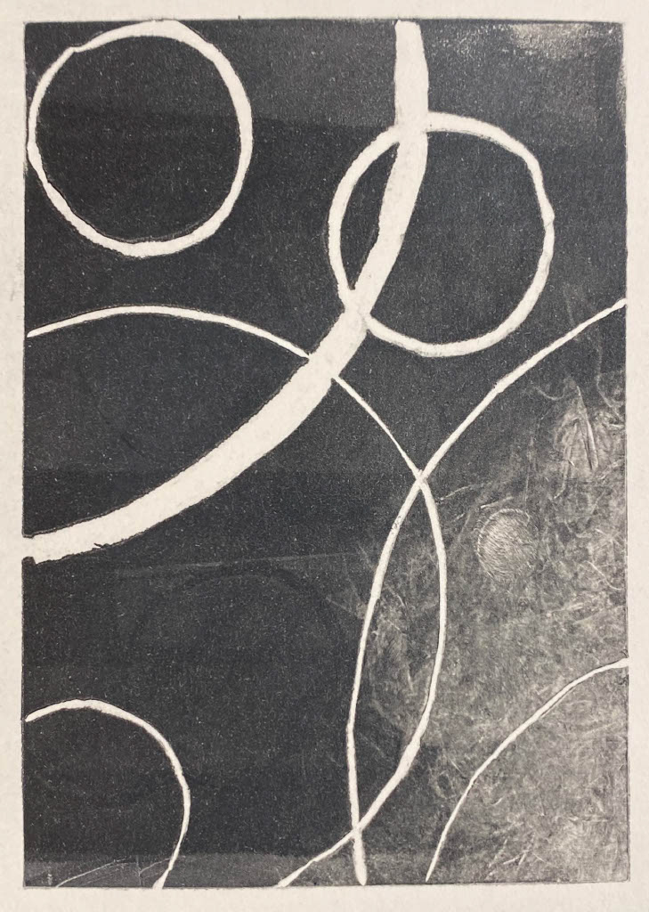
Investigated the concept of repetition and layering of circles representing the links of chain.
Initially I layered charcoal, ink and watered down acrylic to create a variety of textures. I played with the movement of strokes using full body motion and contrasted it with precise circles.
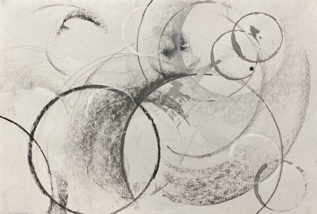
A3 charcoal and ink
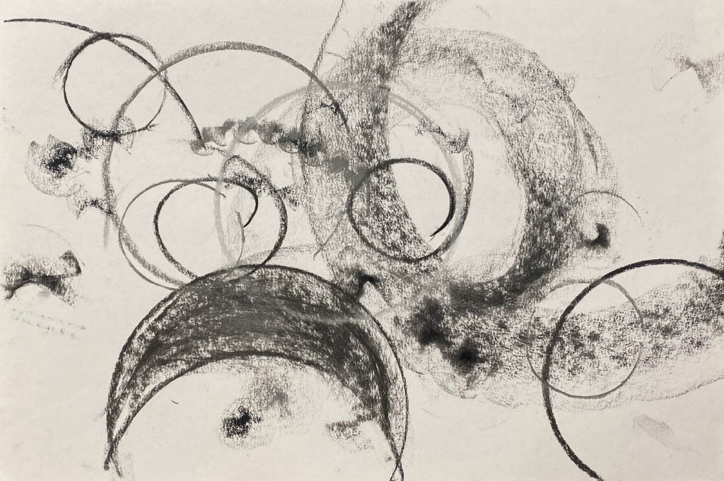
A3 charcoal and ink
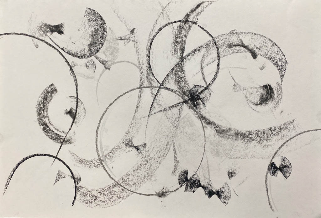
A3 charcoal and ink
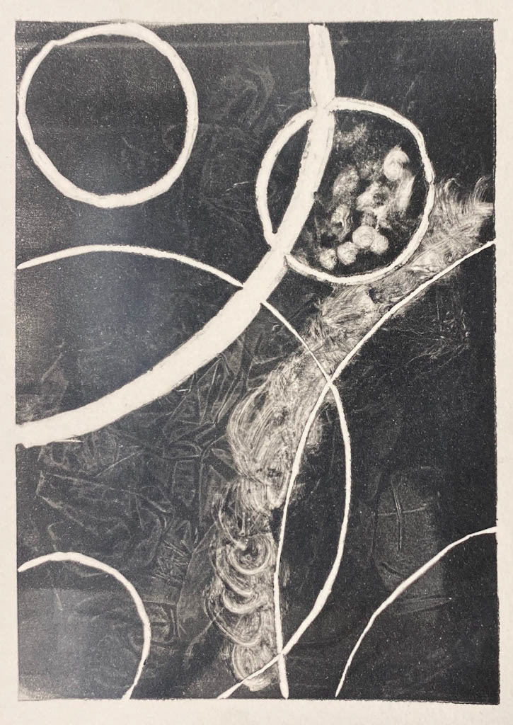
I took the quick sketches further and looked at increasing the contrast by using a neutral sand-stone coloured paper which emphasised the white acrylic. Also, I went in with an ink dip pen and using different opacity black ink, introduced fine links of chain throughout the layers of larger sweeping marks.
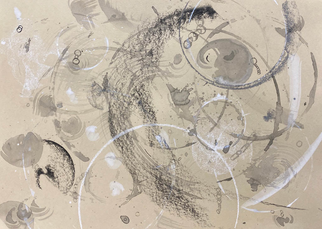
A3 charcoal, ink and acrylic
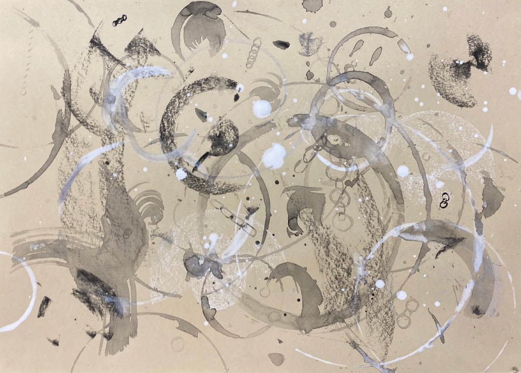
A3 charcoal, ink and acrylic
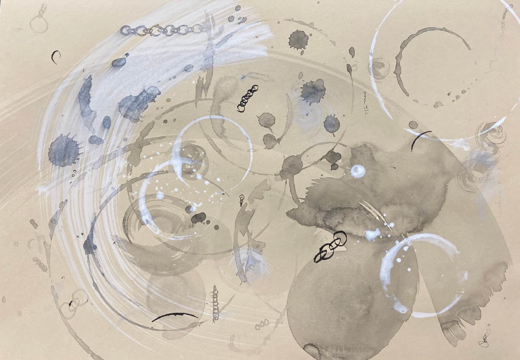
A3 charcoal, ink and acrylic
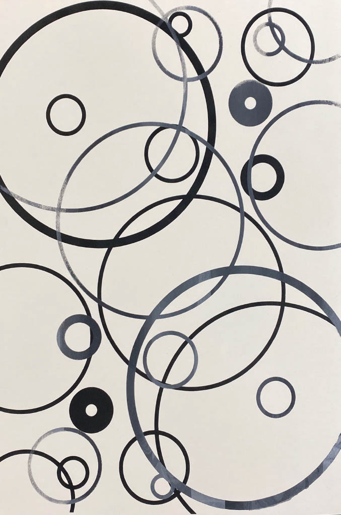
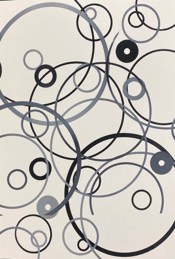
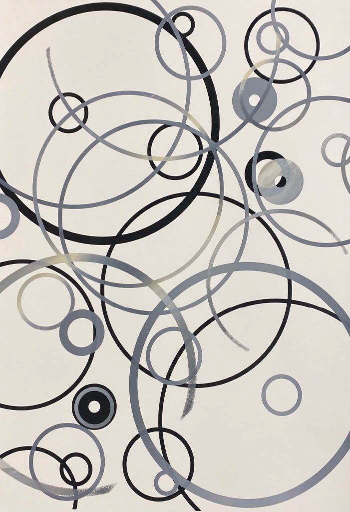
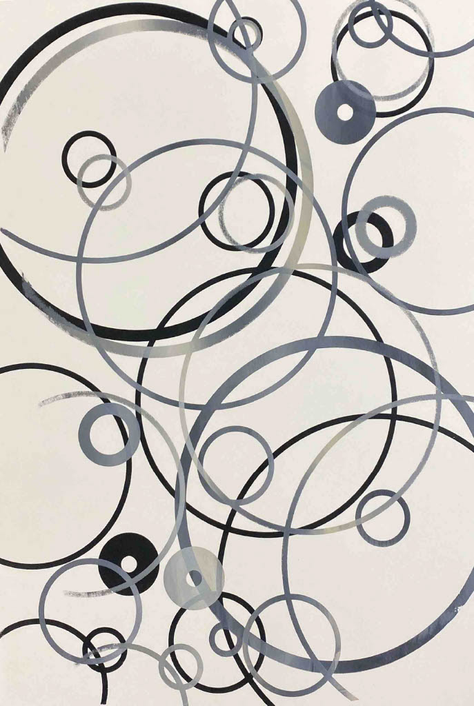
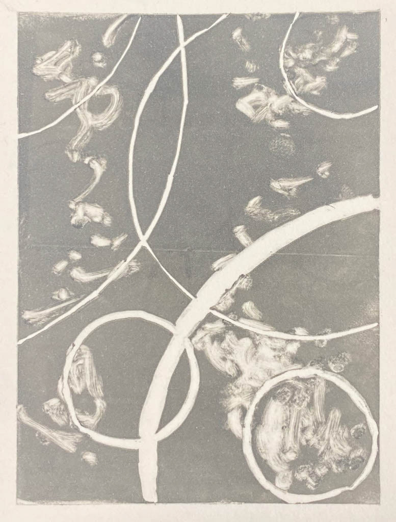
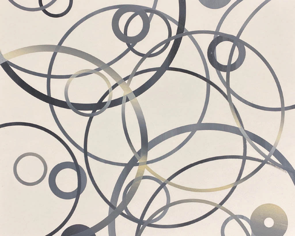
To explore the ideas of repetition during the chain making process and a final length of chain, I experimented with a mass repeatable process in print making screen printing. I created a simple design on illustrator of overlapping circles with varying line widths inspired by my sketches above. I used this to repeat screen print in different orientations and tones. As part of the screen printing process I printed the design onto a sheet of acetate which is used to align the work with the page, but also curate the composition before printing. One of the main ideas I took from these pieces was to investigate layering and how this can obstruct the image beneath.
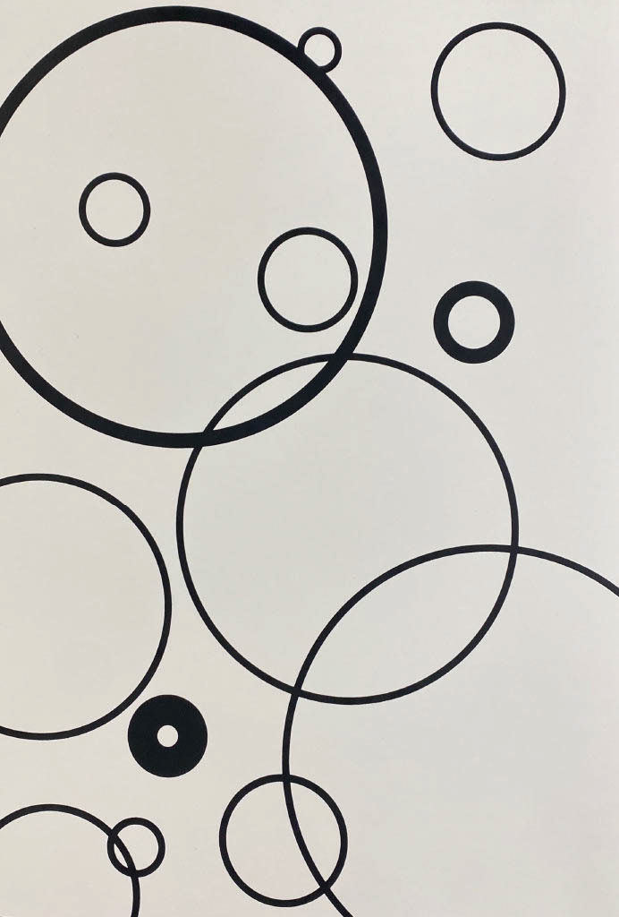
A3 screen print
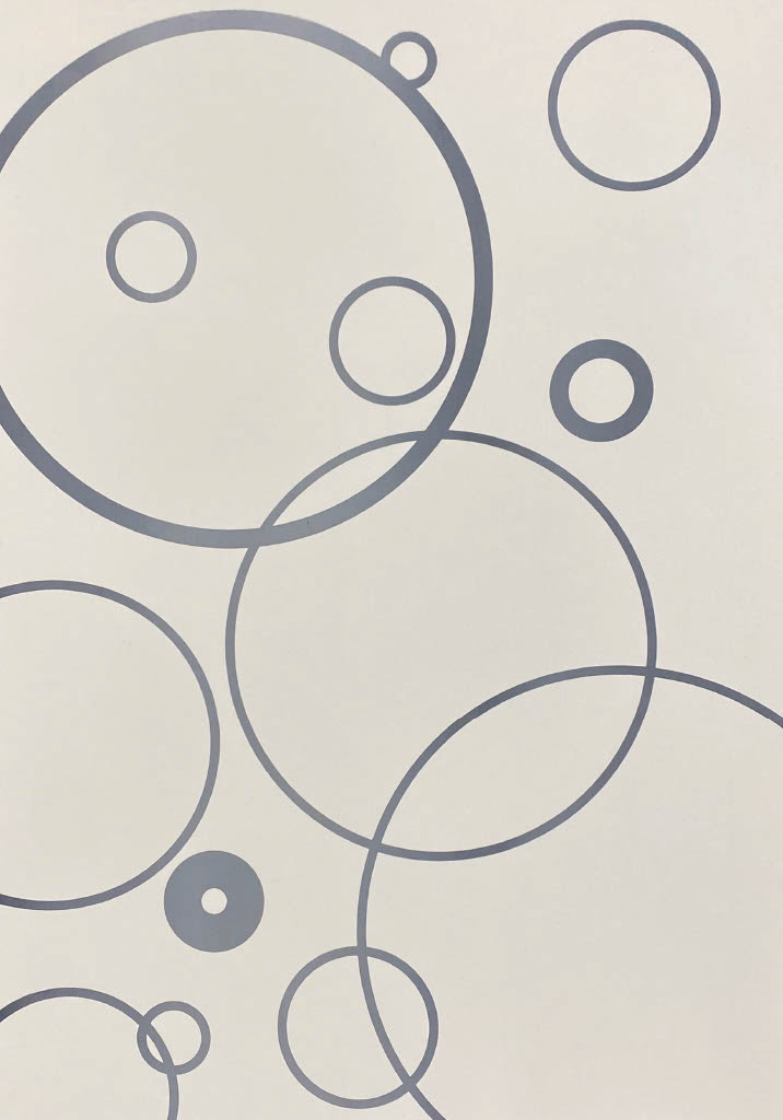
A3 screen print
A3 screen print
A3 screen print
A3 screen print
A3 screen print
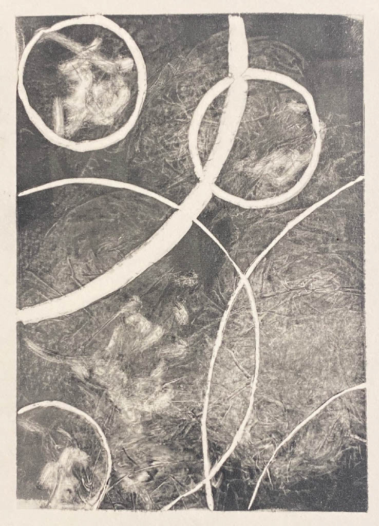
Leading on from the previous work I looked at lino printing which is a similar repetitive process but enabled me to work into the ink and remove or distort the image making each piece unique.
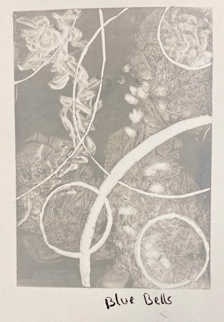
11 x 8 cm lino print
11 x 8 cm lino print
11 x 8 cm lino print
11 x 8 cm lino print
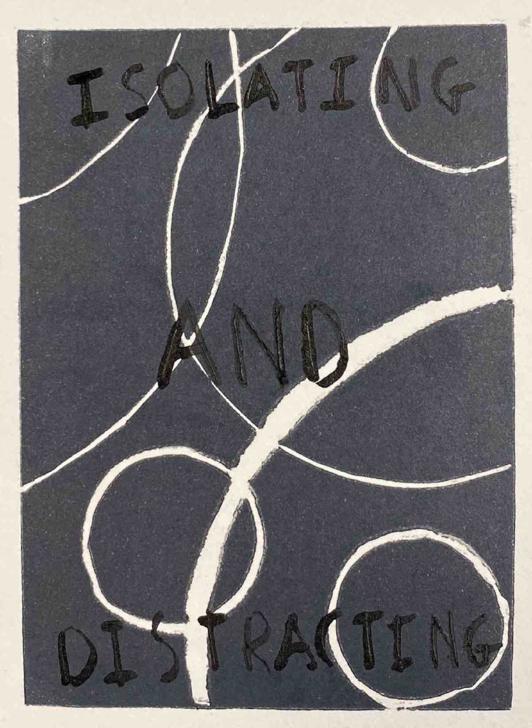
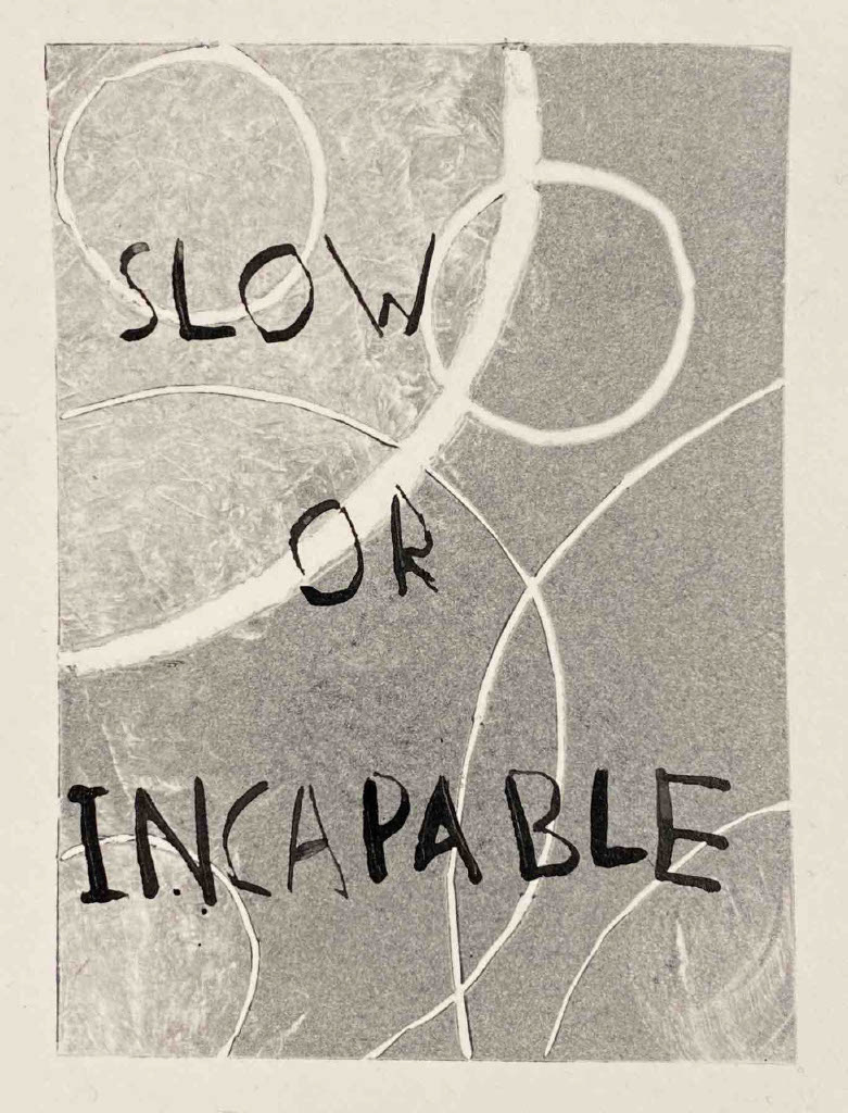
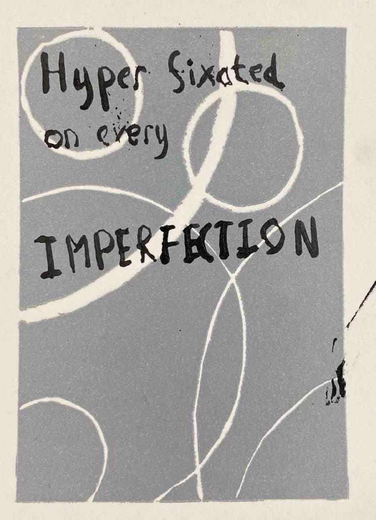
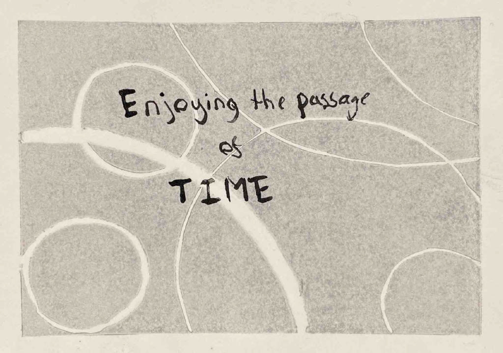
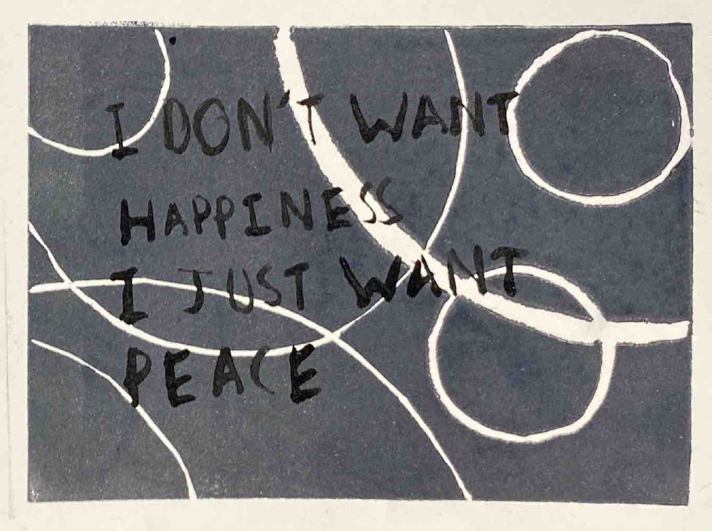
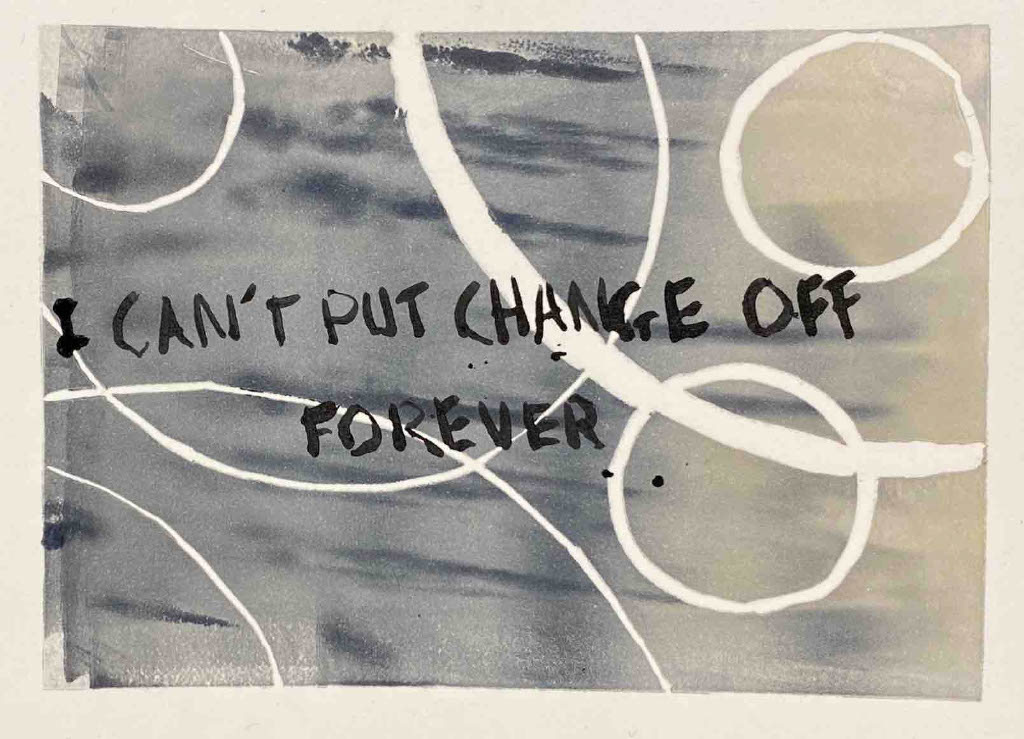
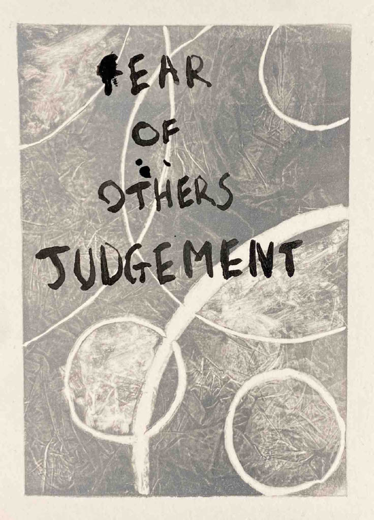
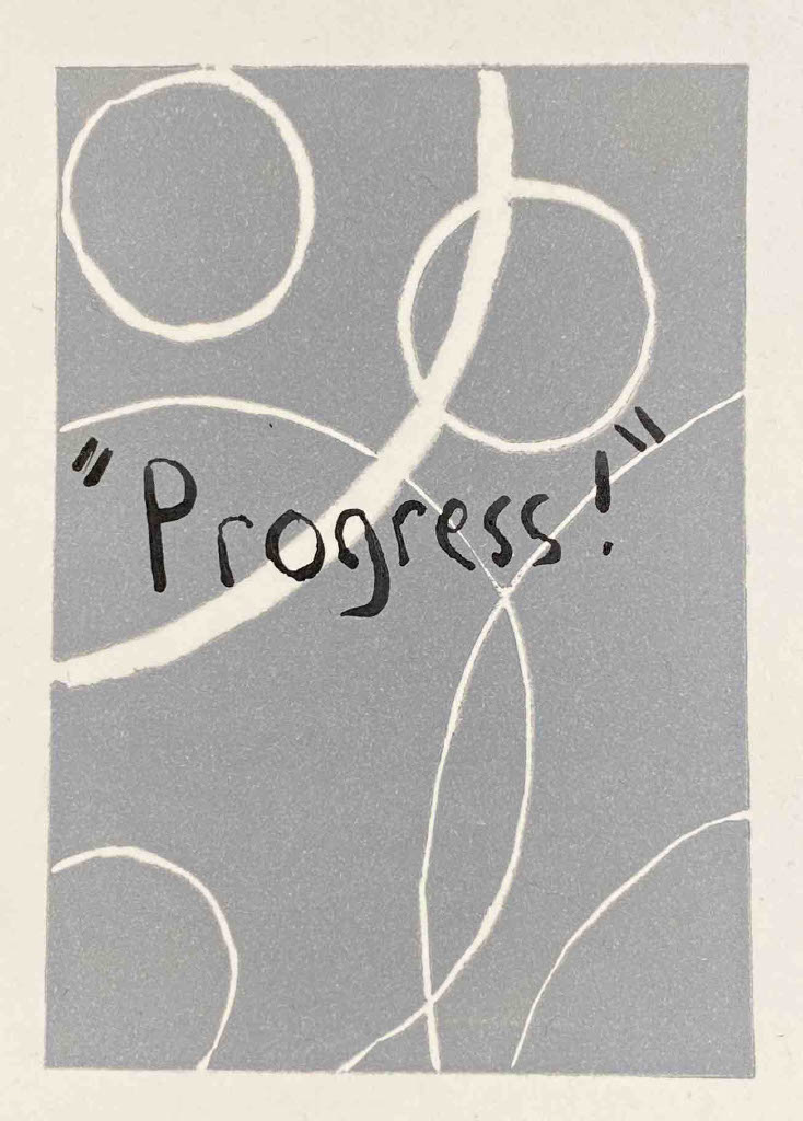
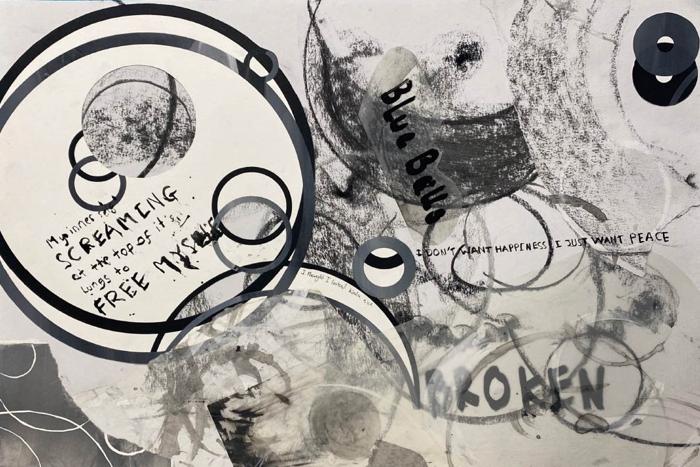
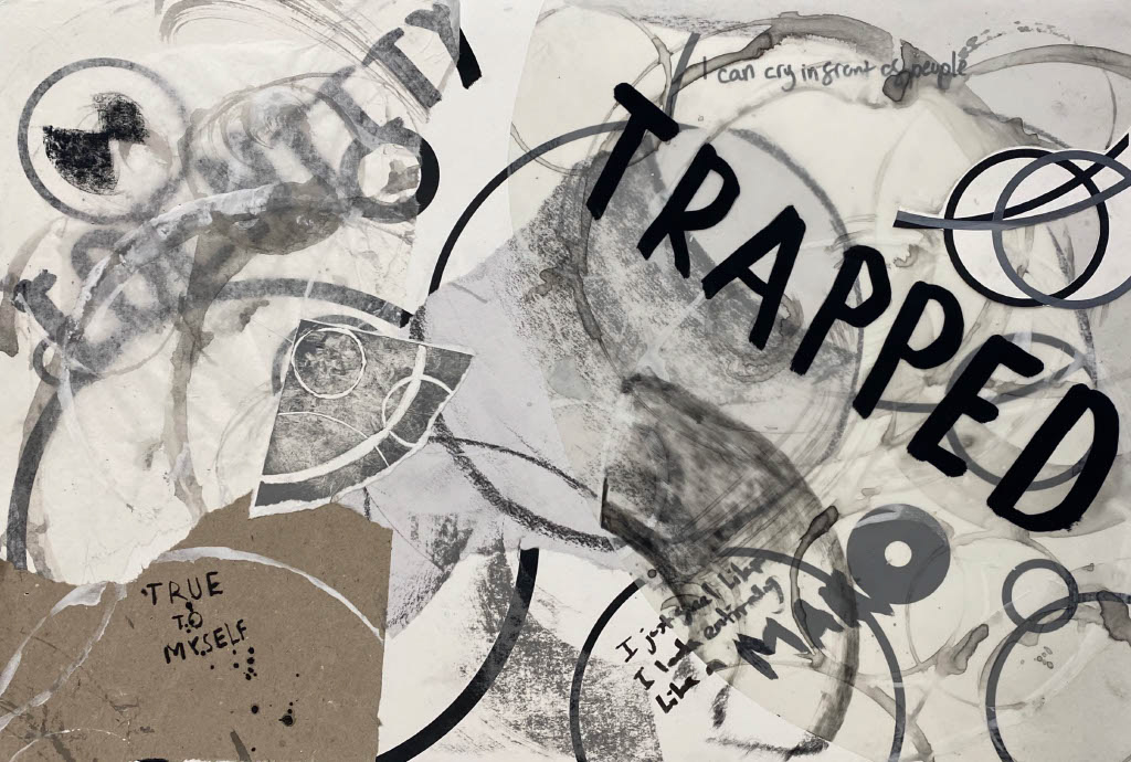
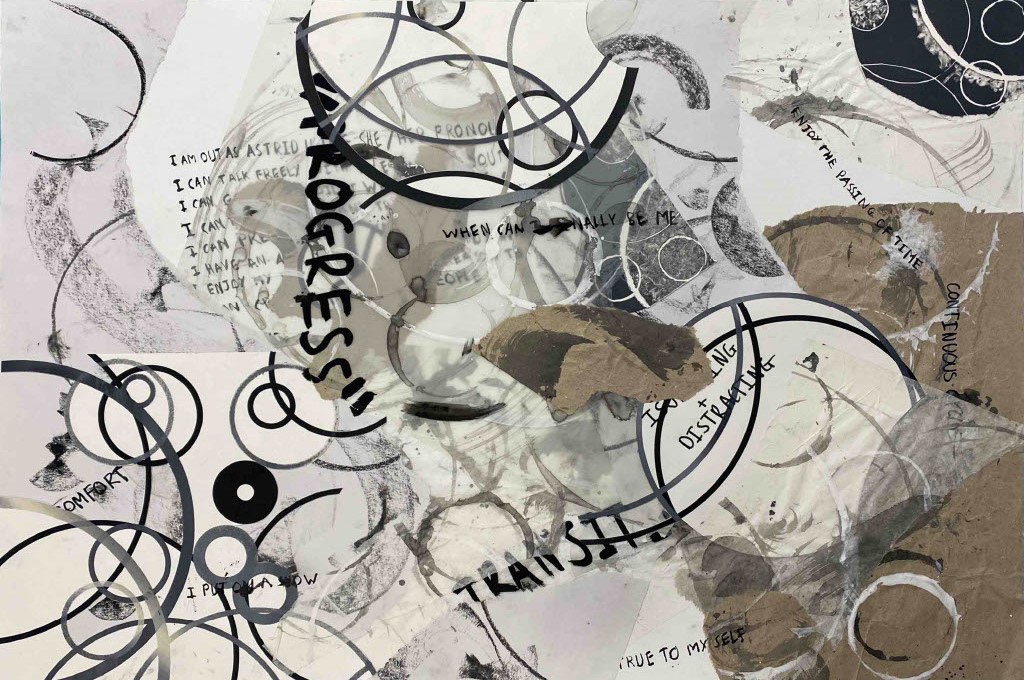
With this next set of lino prints I introduced phrases and themes that ran throughout my personal diary from the past three years. I wanted to look at the way I could start to bring my story into chain making. I extracted these short phrases and paired them with each print, looking at the interaction between text and background, but also the clarity of the text due to slight tonal differences or interference between lines and script. Furthermore, I looked at the spacing and use of capitalising the words to place emphasis on different areas. I used a dip ink pen to write as it gives a raw and unrefined aesthetic to the script, hiding no flaws in my writing.
I feel that these phrases are a snapshot of emotion taken from singular moments in my life which maybe one-offs or a recurring theme. I think that these could be used by other trans people to speak their emotion without saying out loud. Text has been a way that I have learned to communicate my thoughts that I would find difficult to say otherwise, and I feel that this is a common theme in the trans community. I also believe that these pieces span over many communities, not just the thoughts and experiences of trans individuals.
I would like to use these prints as a springboard to generate ideas into how to use emotions or phrases in my 3D work. Currently I don’t know if I want to use script in my 3D work, but I feel that this needs exploring before any decisions are finalised. I also feel that it is important for me to explore the concept of memories and bringing them out into my work.
11 x 8 cm lino print
11 x 8 cm lino print
11 x 8 cm lino print
11 x 8 cm lino print
11 x 8 cm lino print
11 x 8 cm lino print
11 x 8 cm lino print
11 x 8 cm lino print
11 x 8 cm lino print
I created a series of collages to bring together the different mediums and study the relationship between the repeat circles and the phrases from my diary. I focused on the idea of obstruction and interference of word and shape, challenging the viewer to explore the page. Also, questioning what I wanted to show through and open to the public eyes.
A3 collage
A3 collage
A2 collage
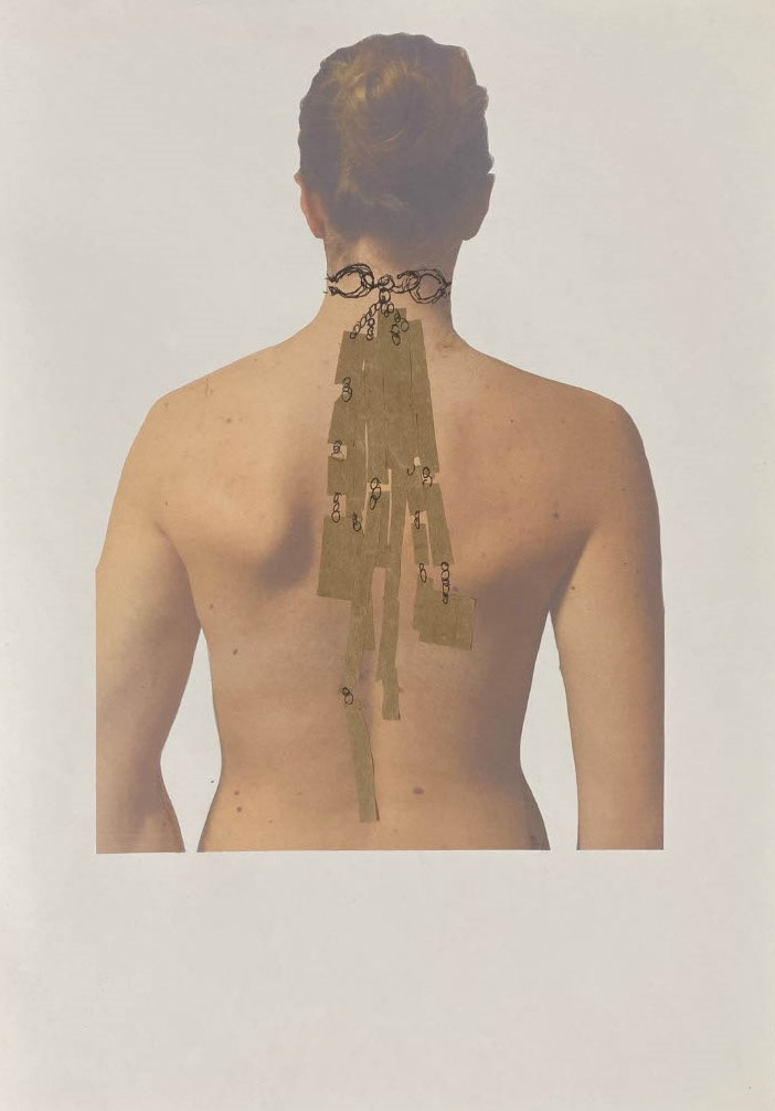
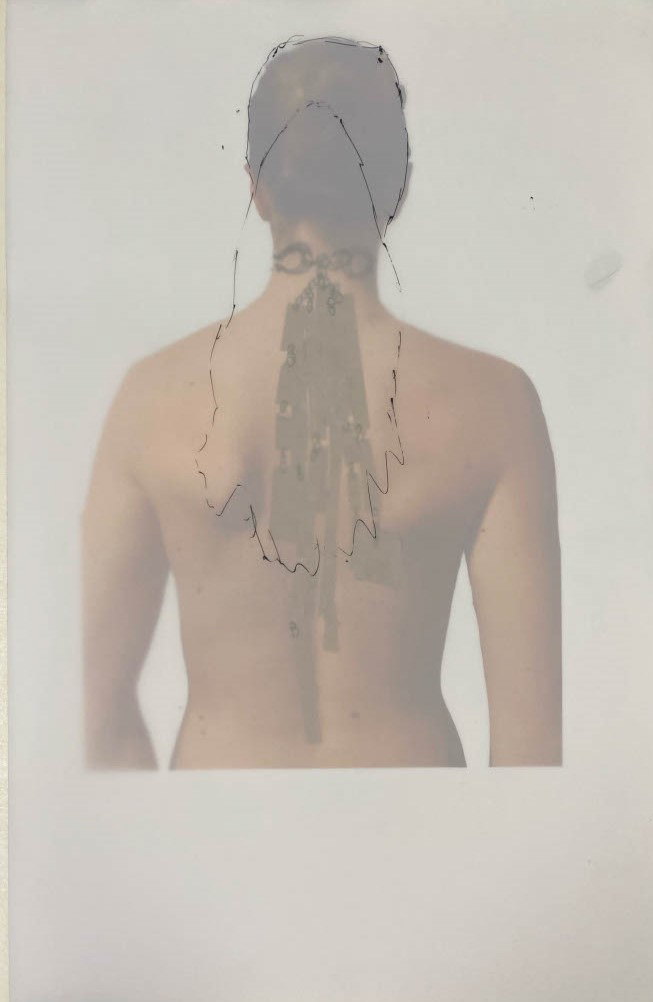
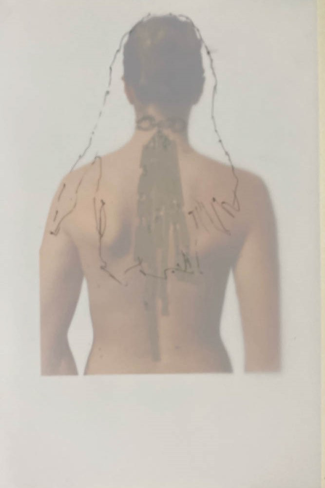
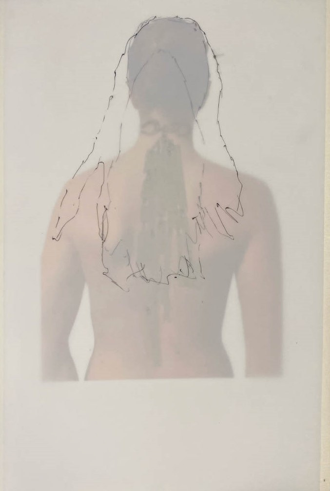
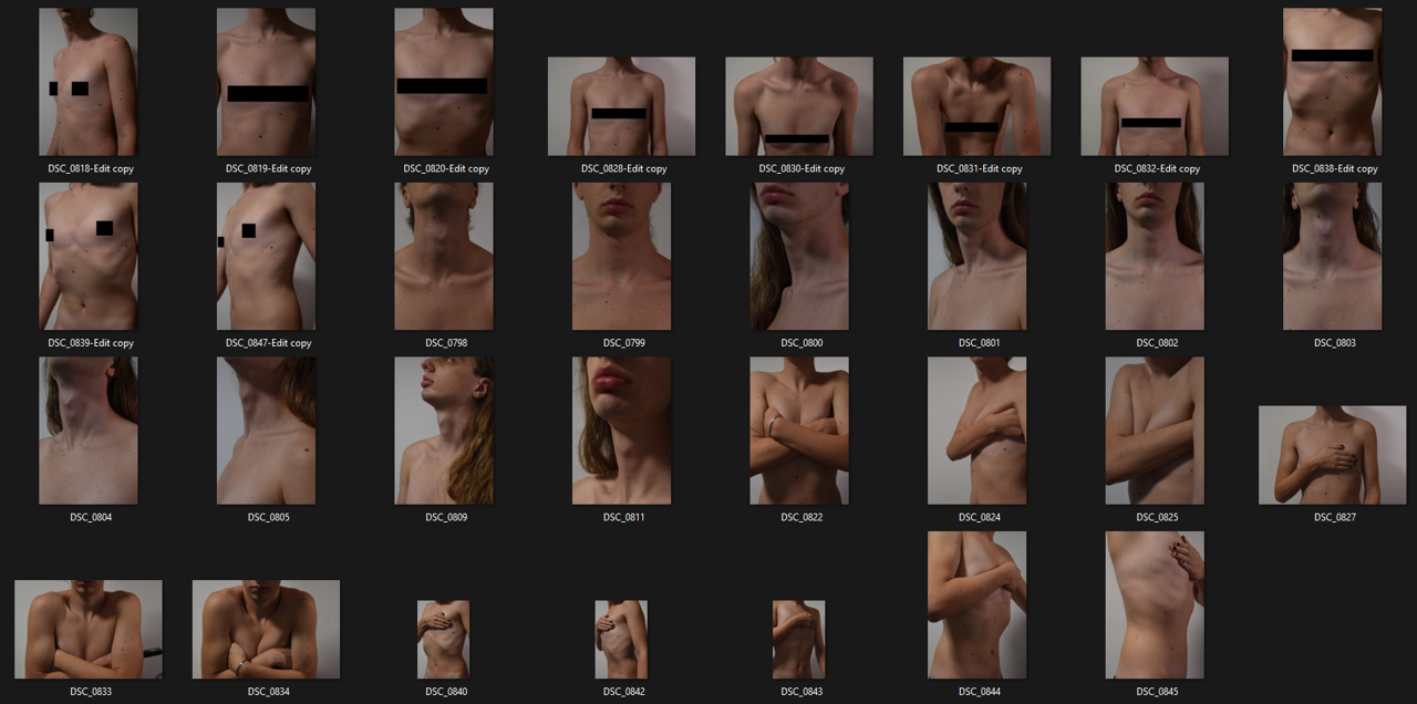
To develop my drawings onto the body to generate initial ideas for wearable pieces I took a series of self-portraits, exploring different sections of the upper body. I reflected on my own insecurities that ran throughout my diary and focused on freezing these moments in time through photography. I explored how to manipulate my body in front of the camera through movement and lighting to emphasise different areas and forms. I also looked at the concept of censorship, through composition, covering sections with my hands and arms and placing black bars or boxes over the images. Not only to regulate what others are allowed to witness but also to challenge society’s ideas of what separate genders are meant to look like and what they are meant to publicly show.
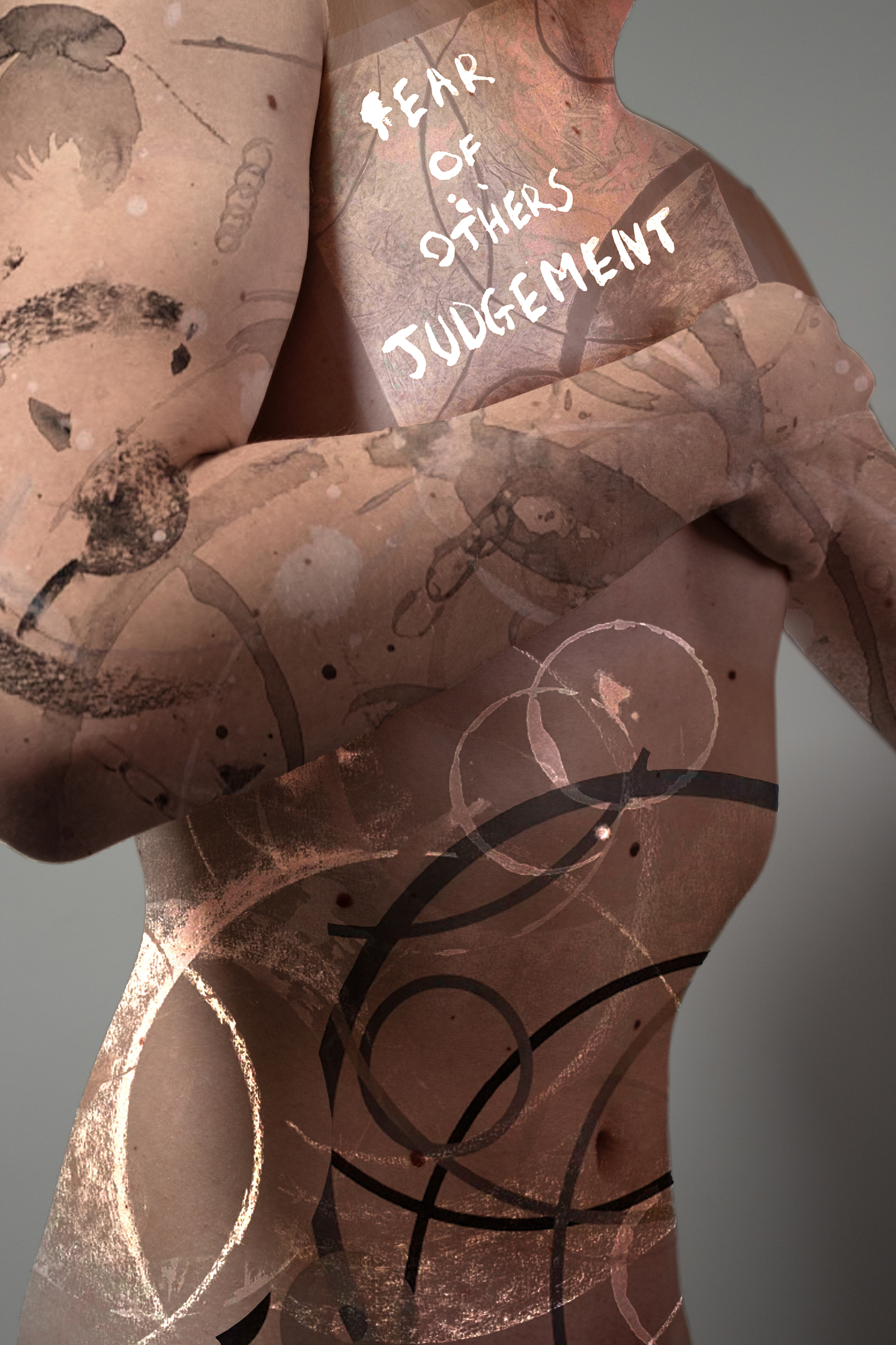
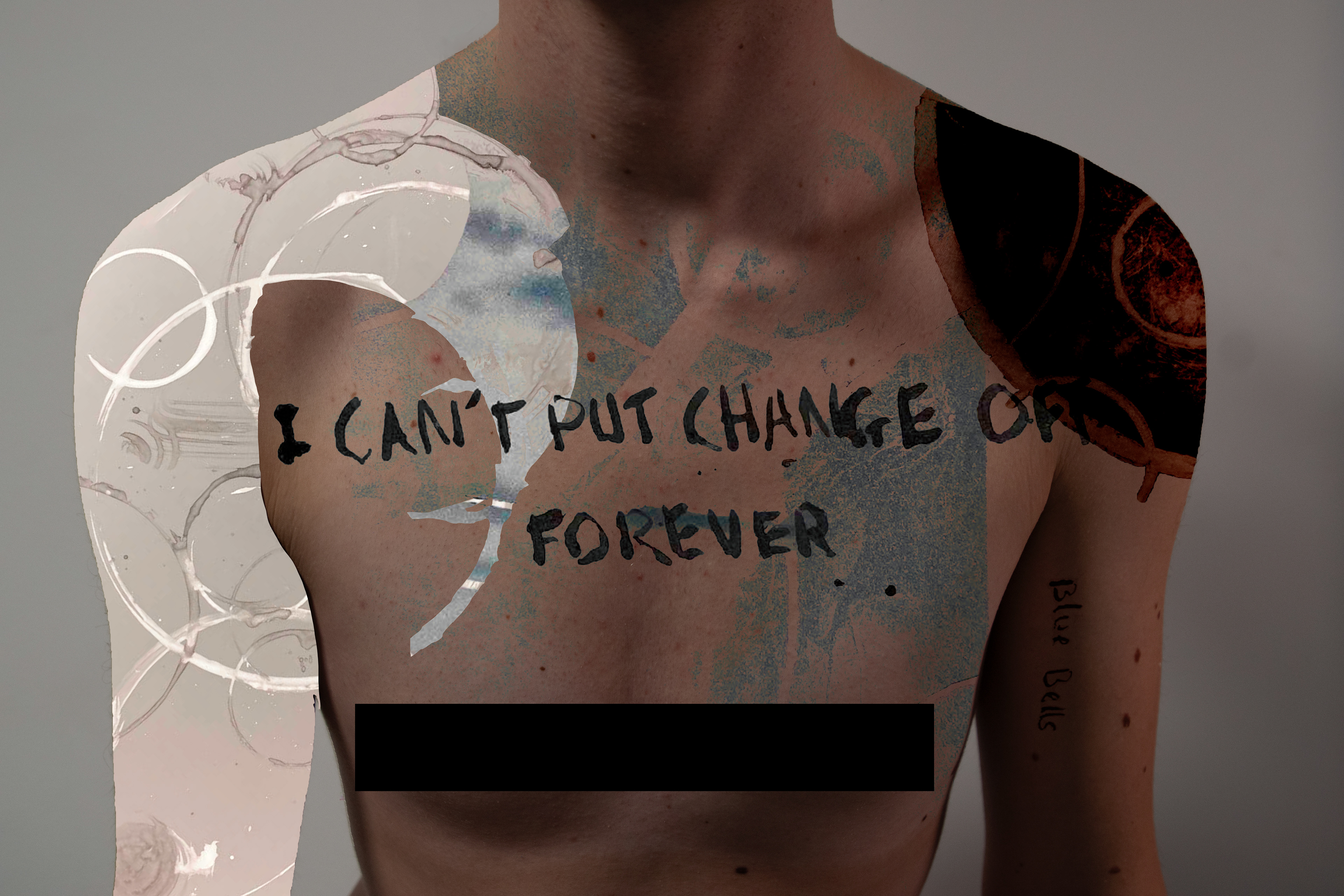
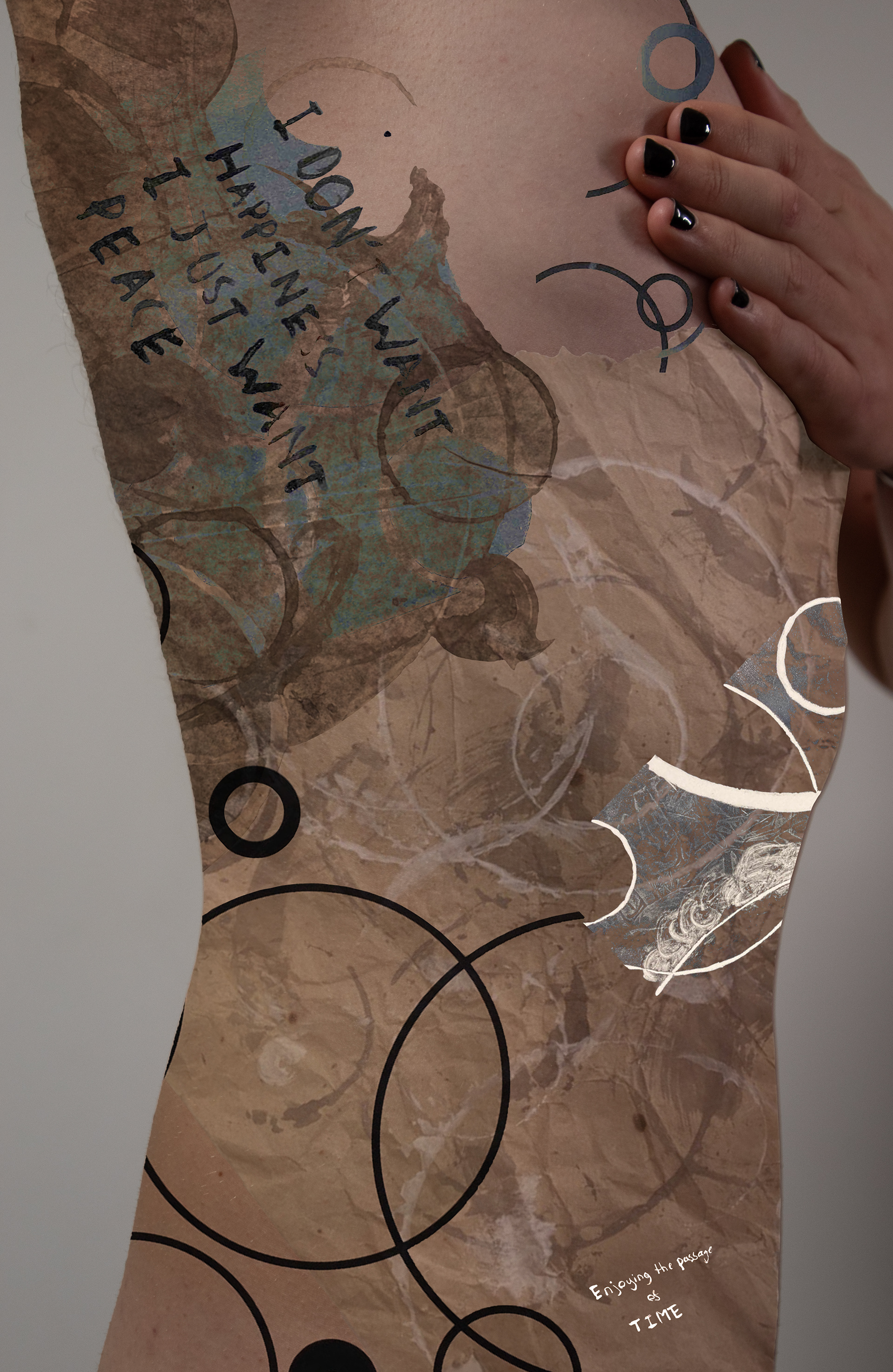
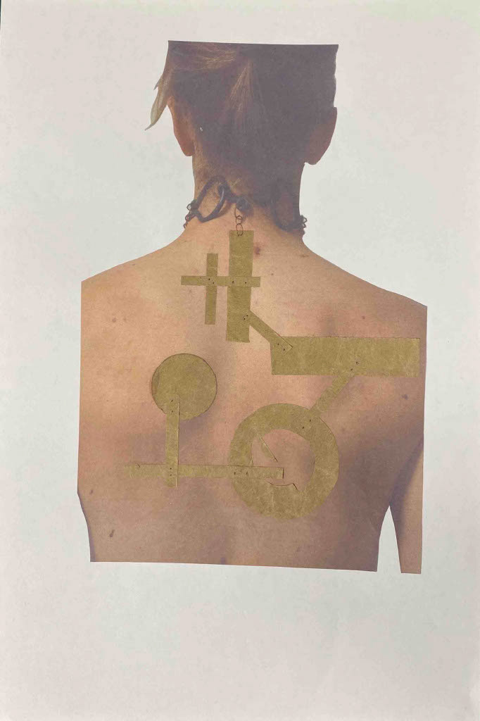
I created a series of digital collage overlaying my prints and sketches onto the body. I focused on layering elements of circles and texture by creating masks and different overlays. The placement of these were important to investigate the way of distorting and censoring different parts of the chest and upper body. I explored scale of the circles and larger colour blocking techniques to draw the eye or distract from my view of imperfection. I also included text from my prints overlaying them onto the skin. I tried to create the effect of these words and thoughts from my diary being burnt onto the body for everyone to see. I feel that this is a way make these thoughts physical. Initially I didn’t think about these being a tattoo or having that aesthetic but upon review I think that this helps reinforce the idea of the permanency of thoughts in our mind and how they will always affect us.
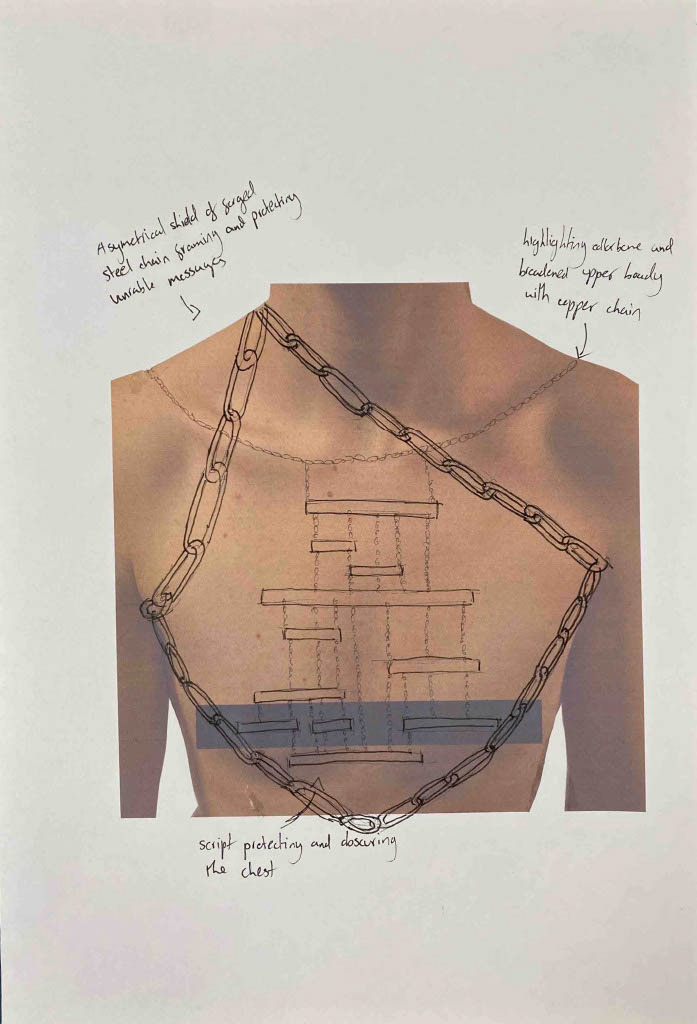
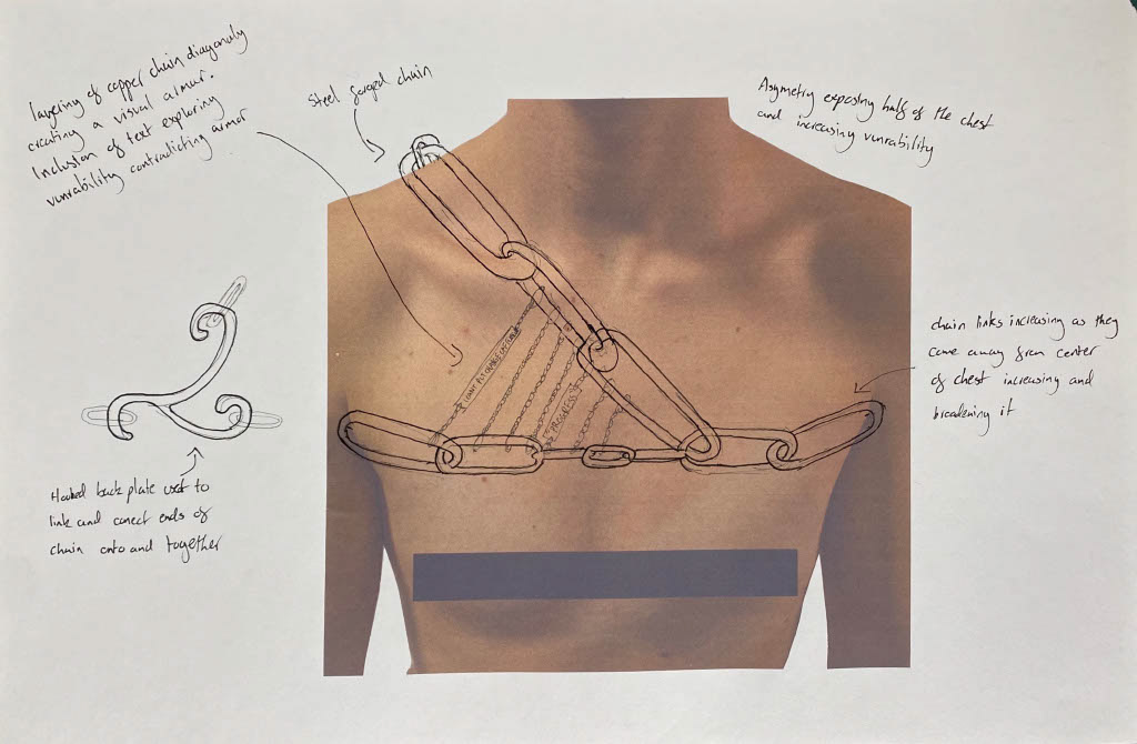
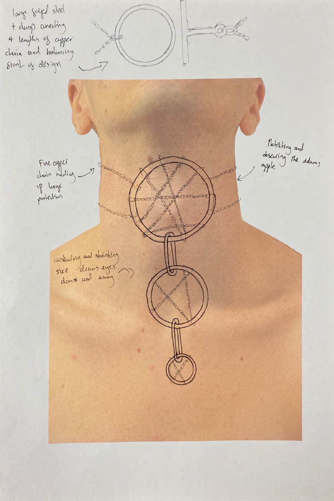
Taking inspiration from my Digital collages I drew over my raw photos to create a series off initial designs. I focused on the interaction between the larger steel forged chain and the copper soldered chain. I explored the contrast between the weight and texture of the steel, and the precision and simplicity of the repeating copper chain. I investigated how placing chain over the body could highlight or protect areas of insecurity, often using asymmetrical designs to draw the eyes in. Whilst sketching I constantly referred to this list of key words which steered my designs and ensured I was creating intentional designs:
Identity
Censorship
Protection
Weight
Contrast
Placement of script
Main inspirations for these designs came from Agnes Larsson, Lucie Gledhill and Joanne Thompson (see research)
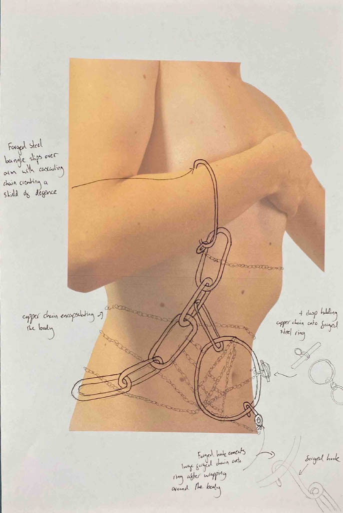
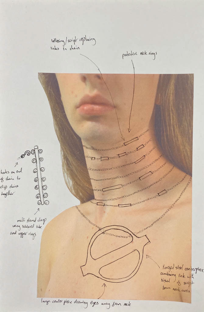

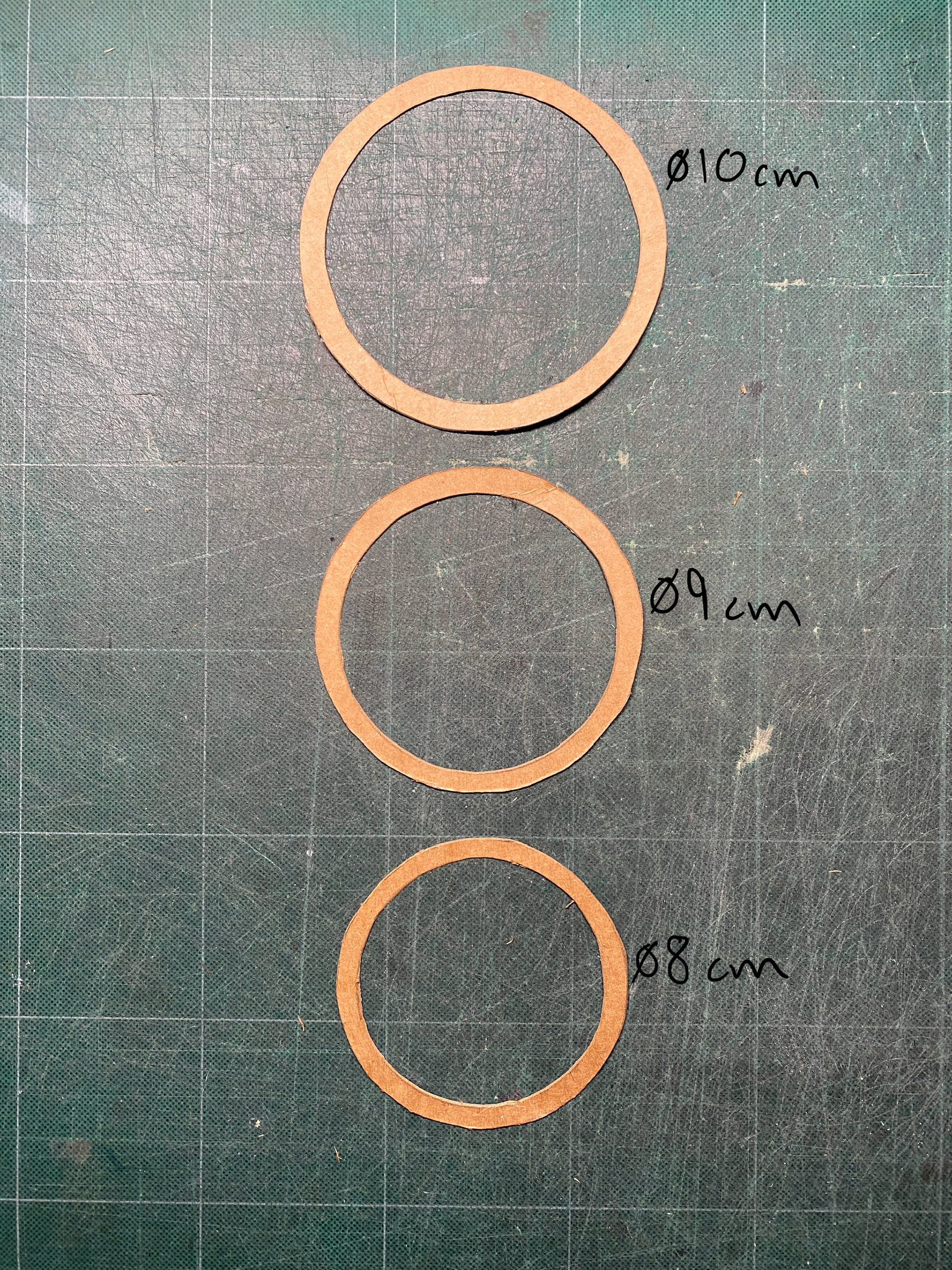
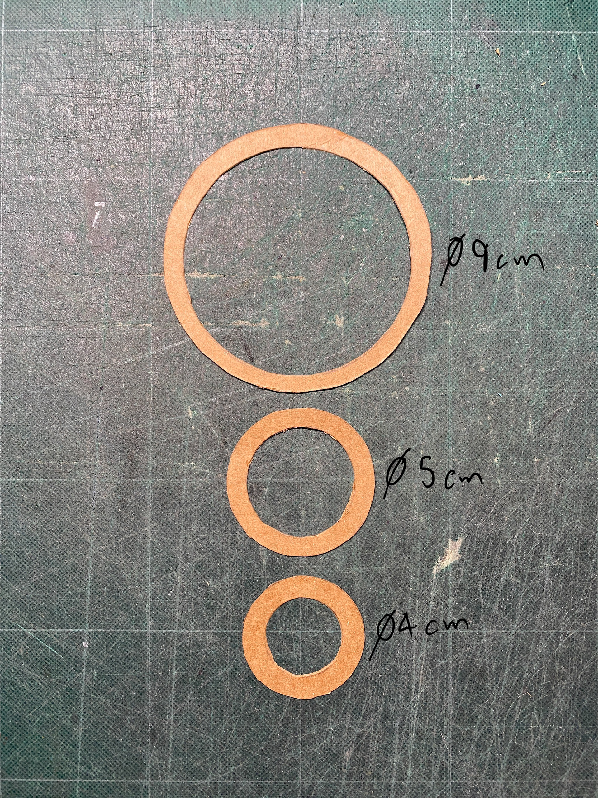
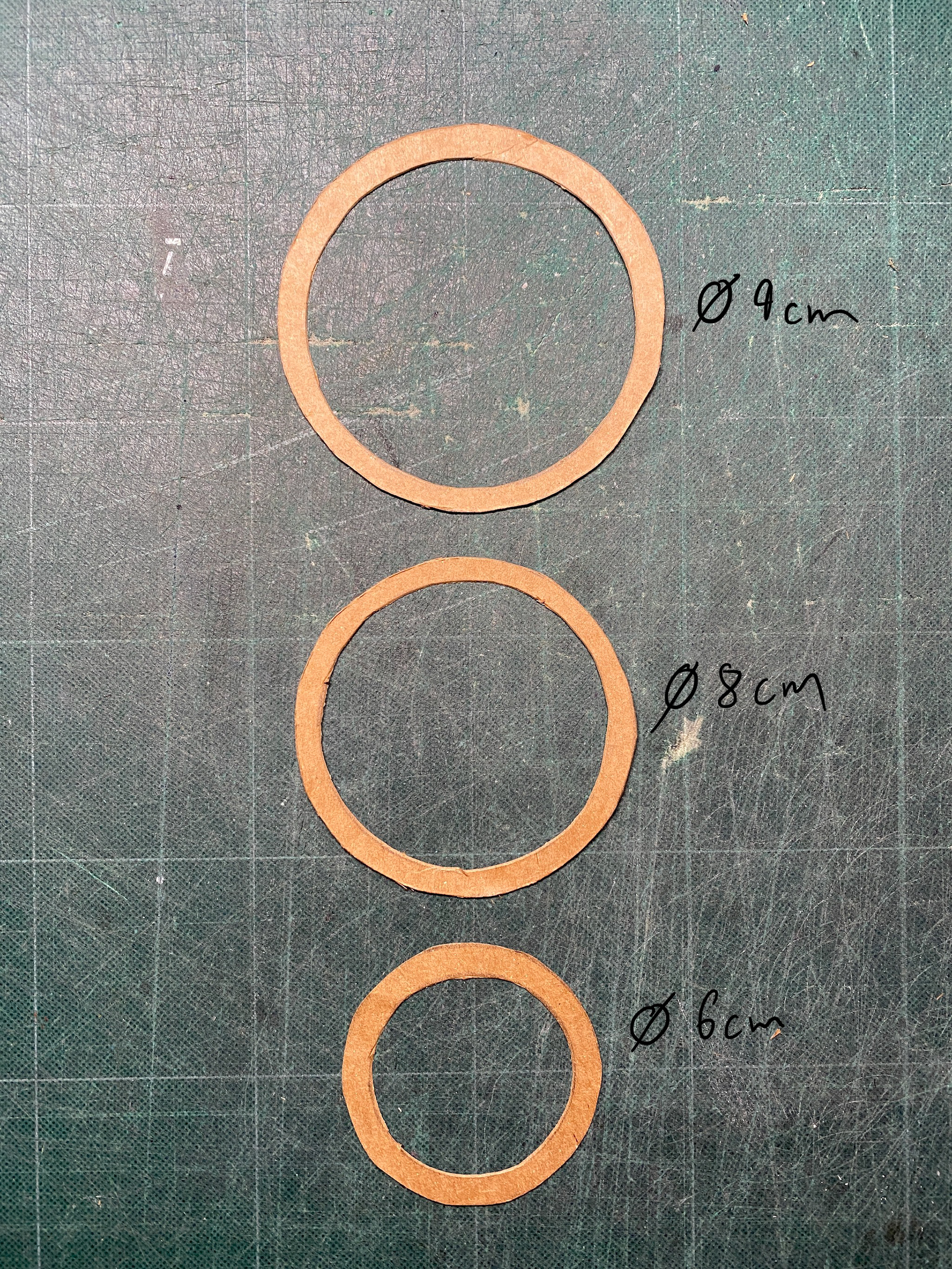
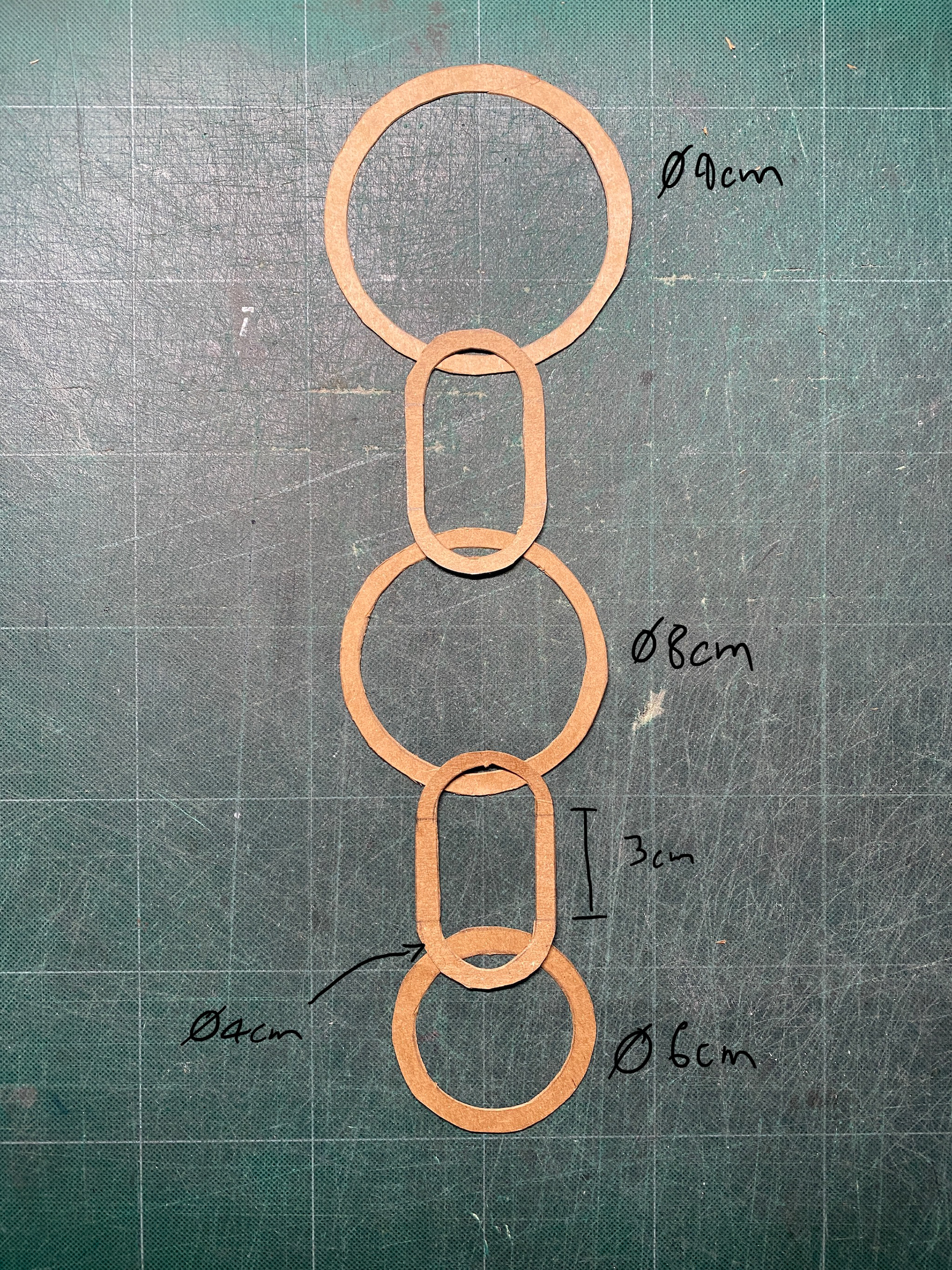
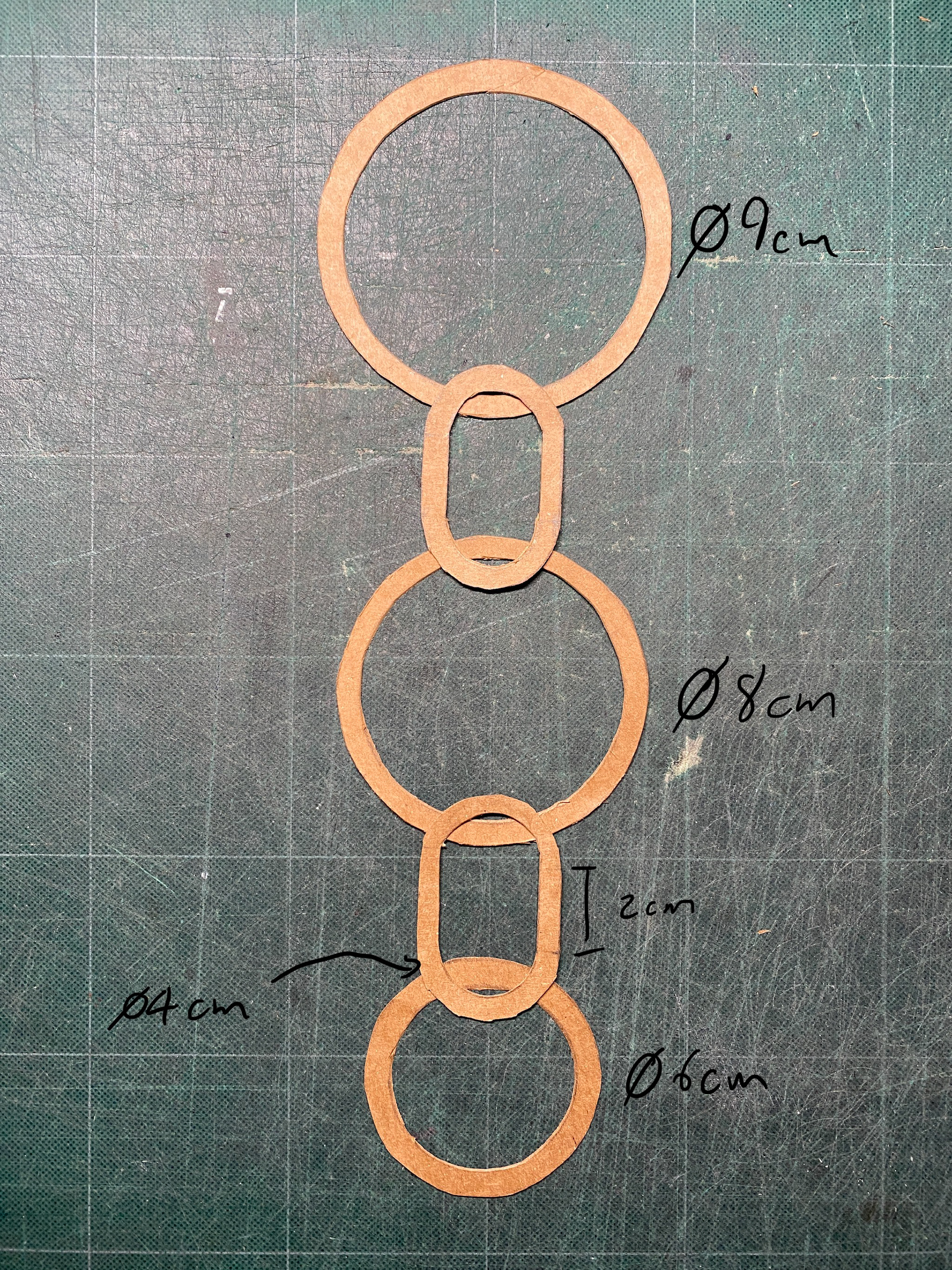
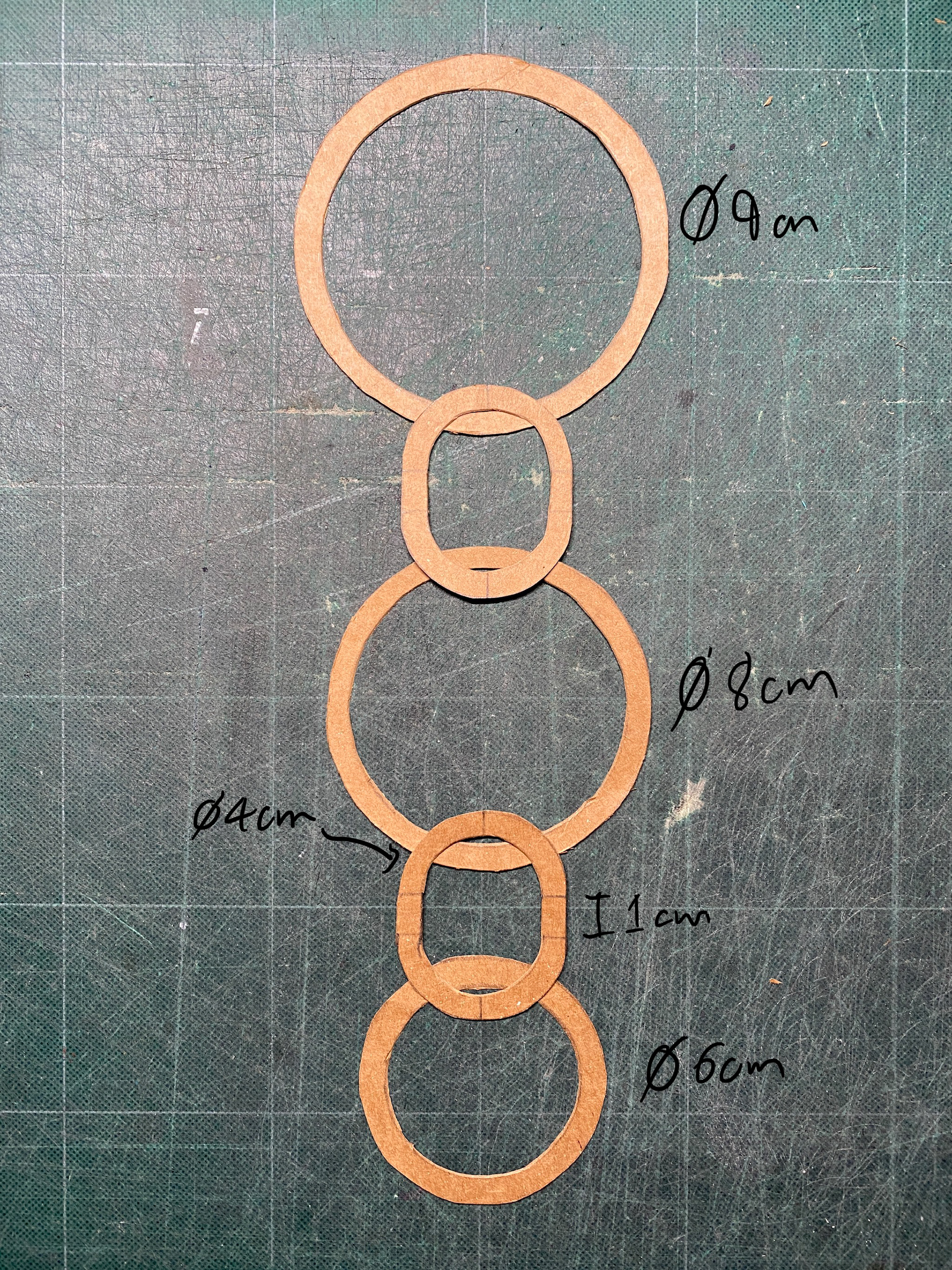
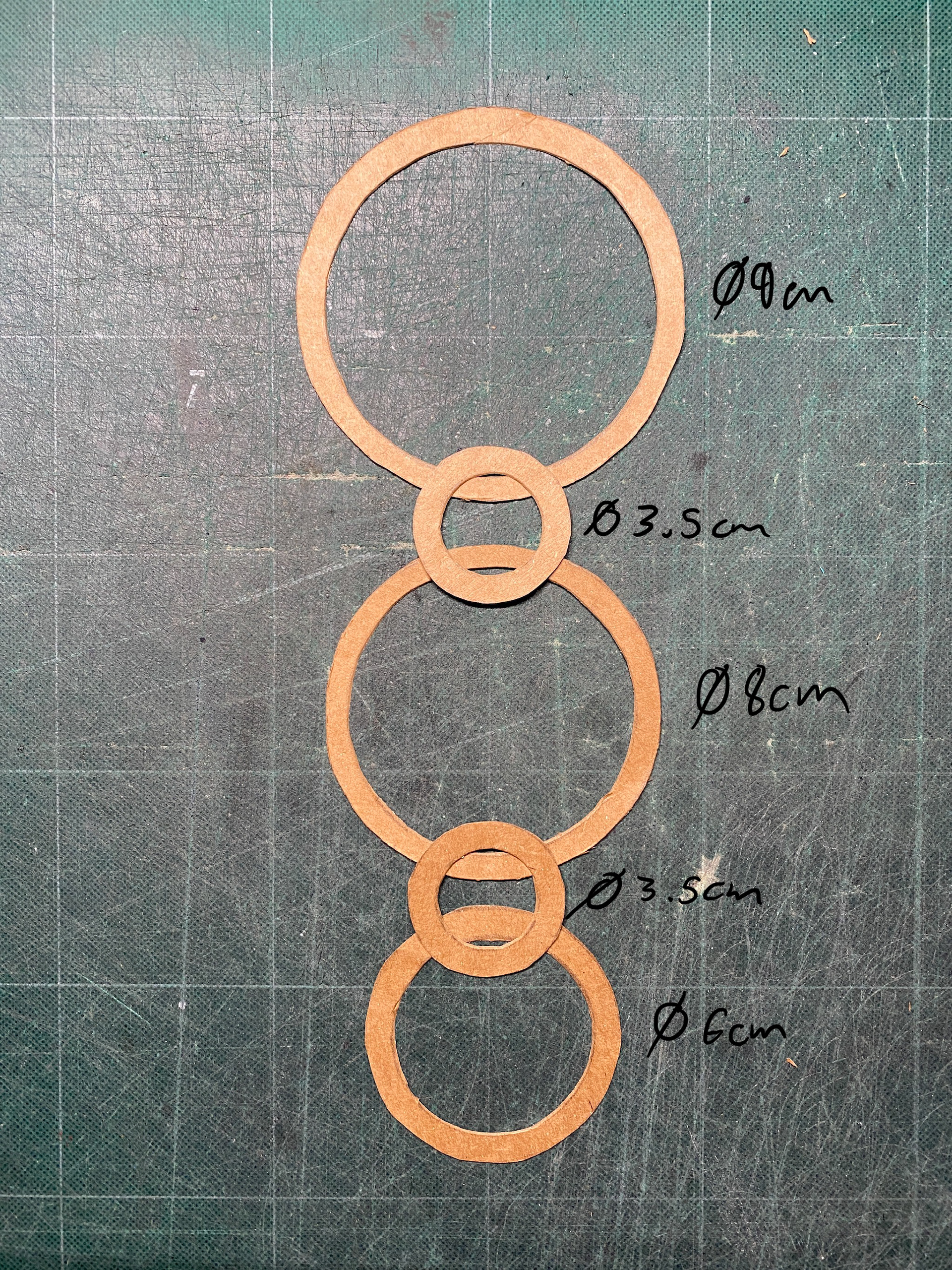
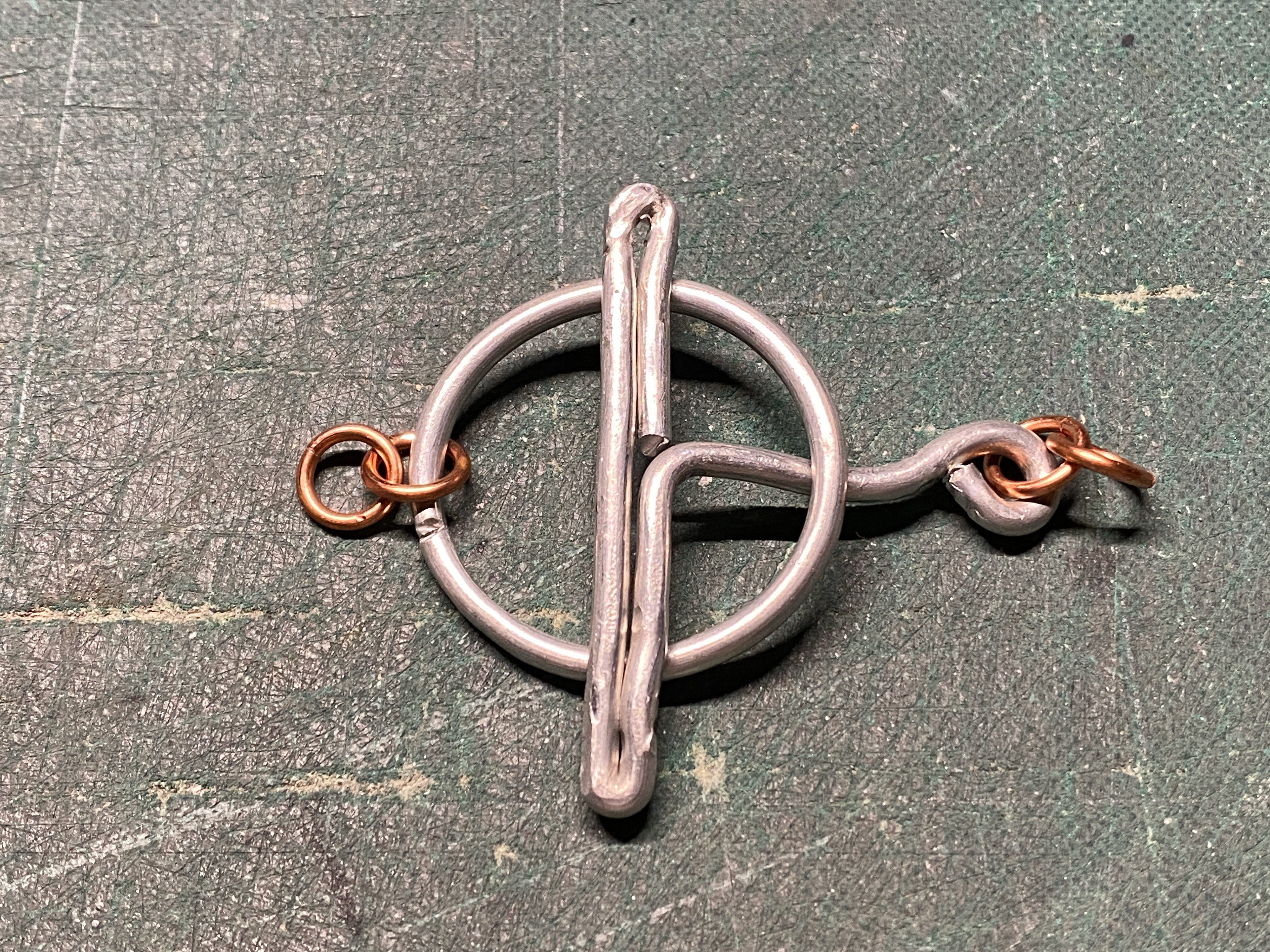
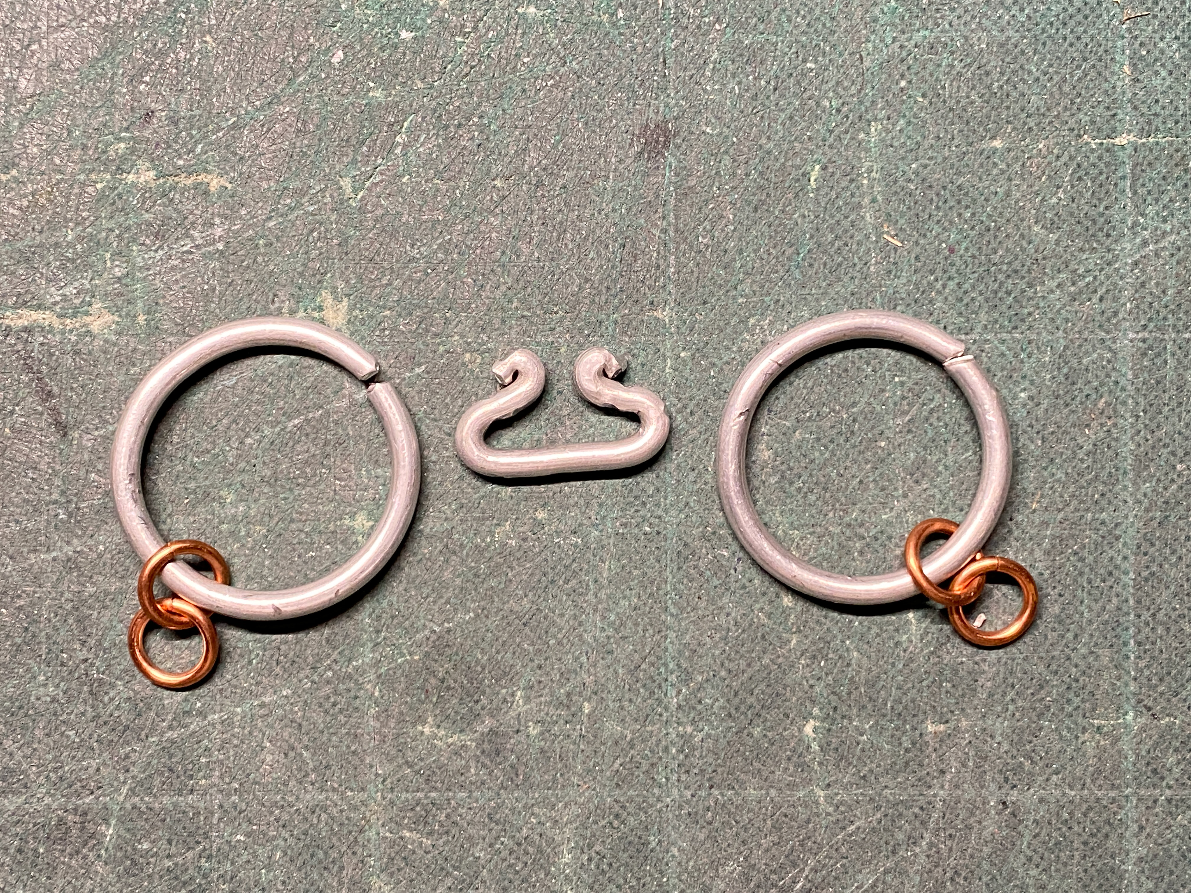
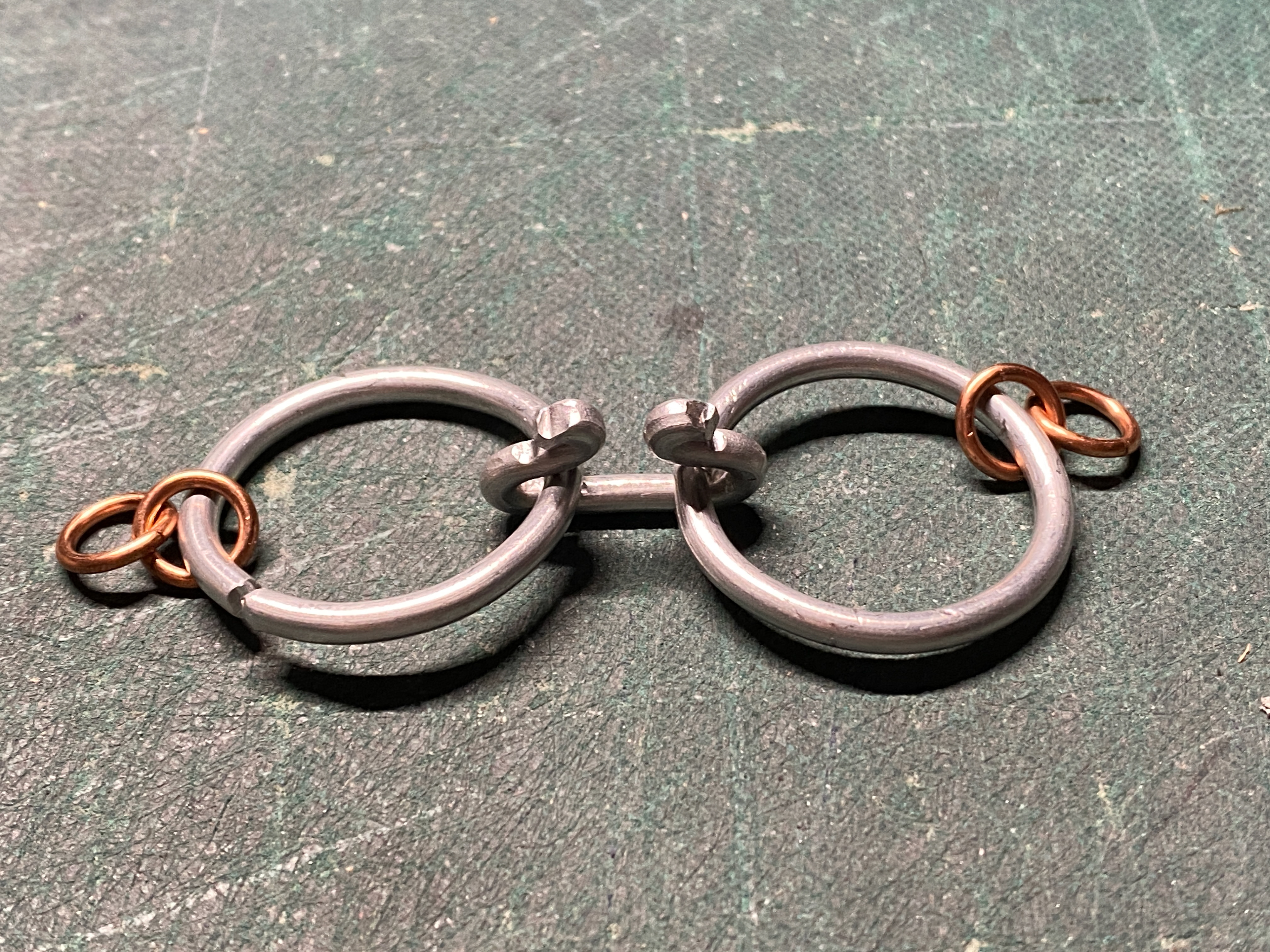
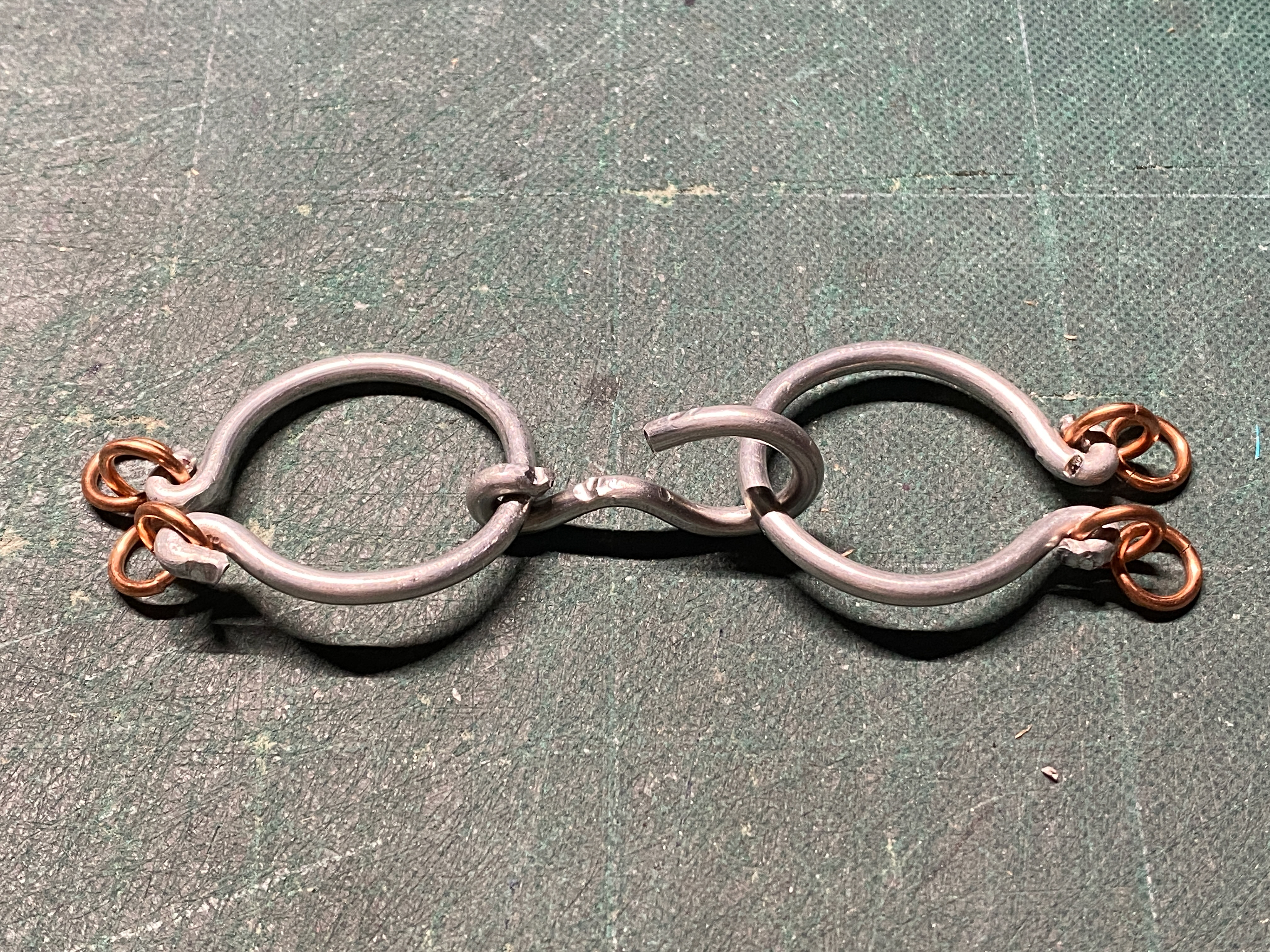
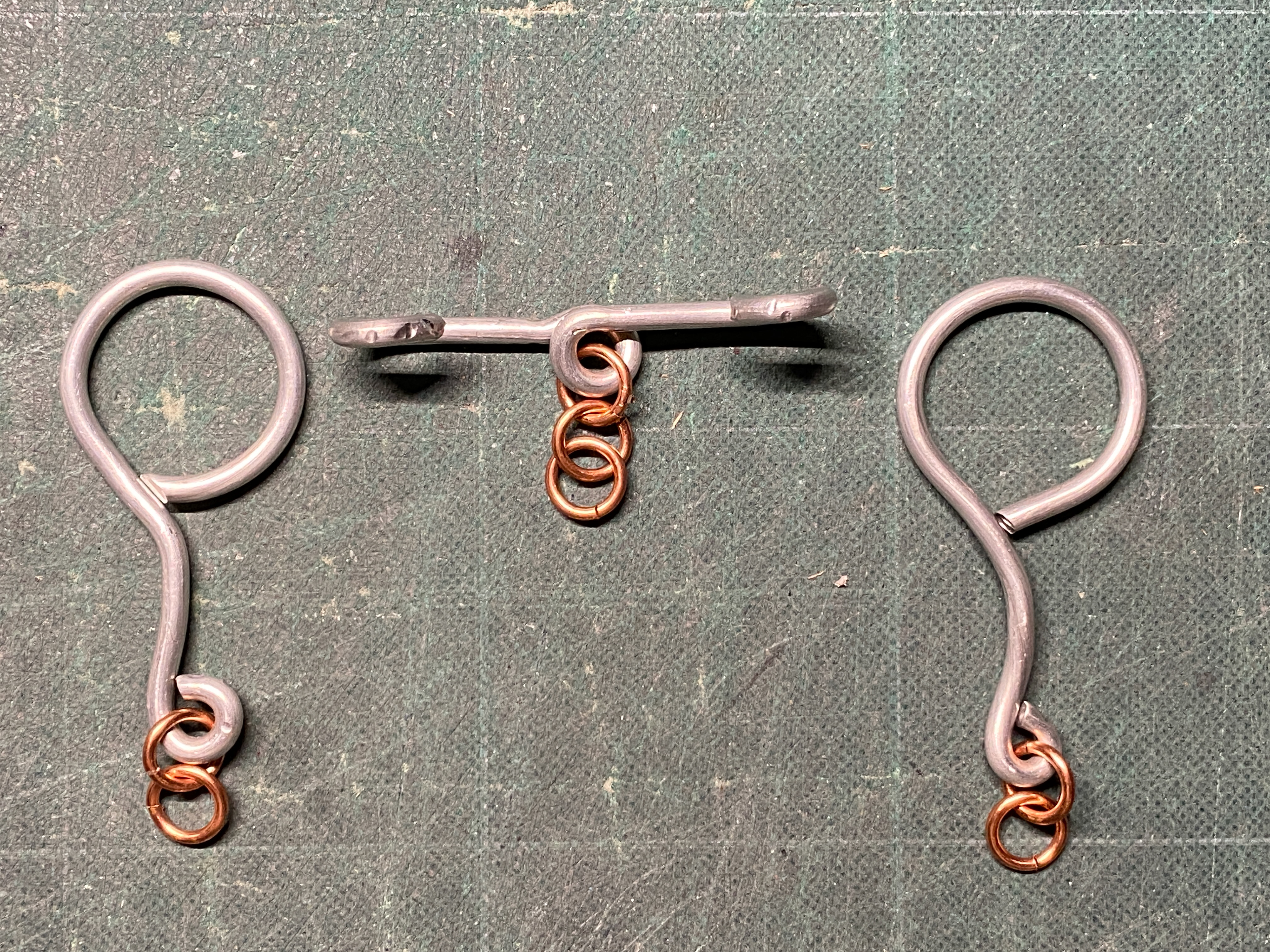
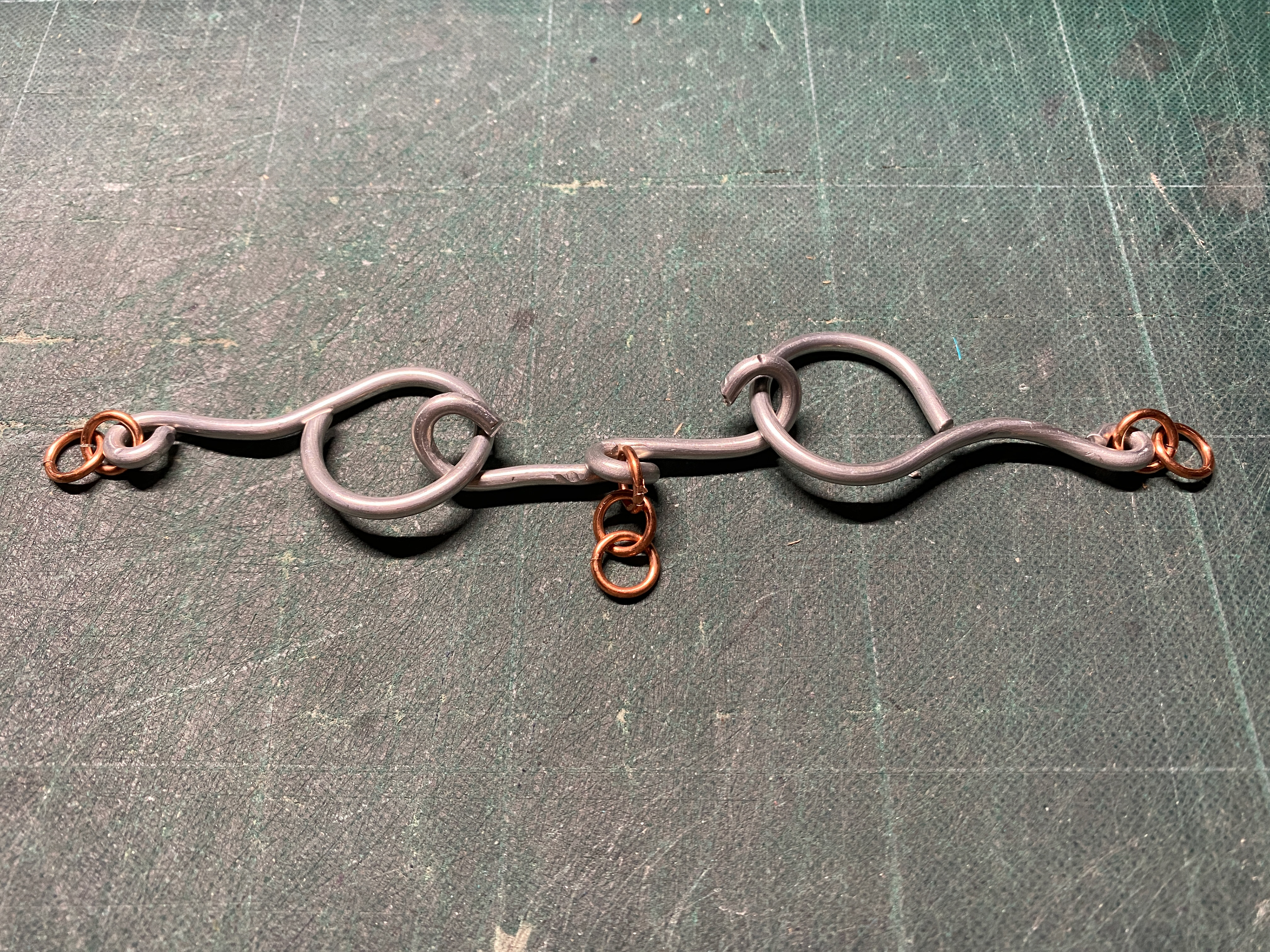
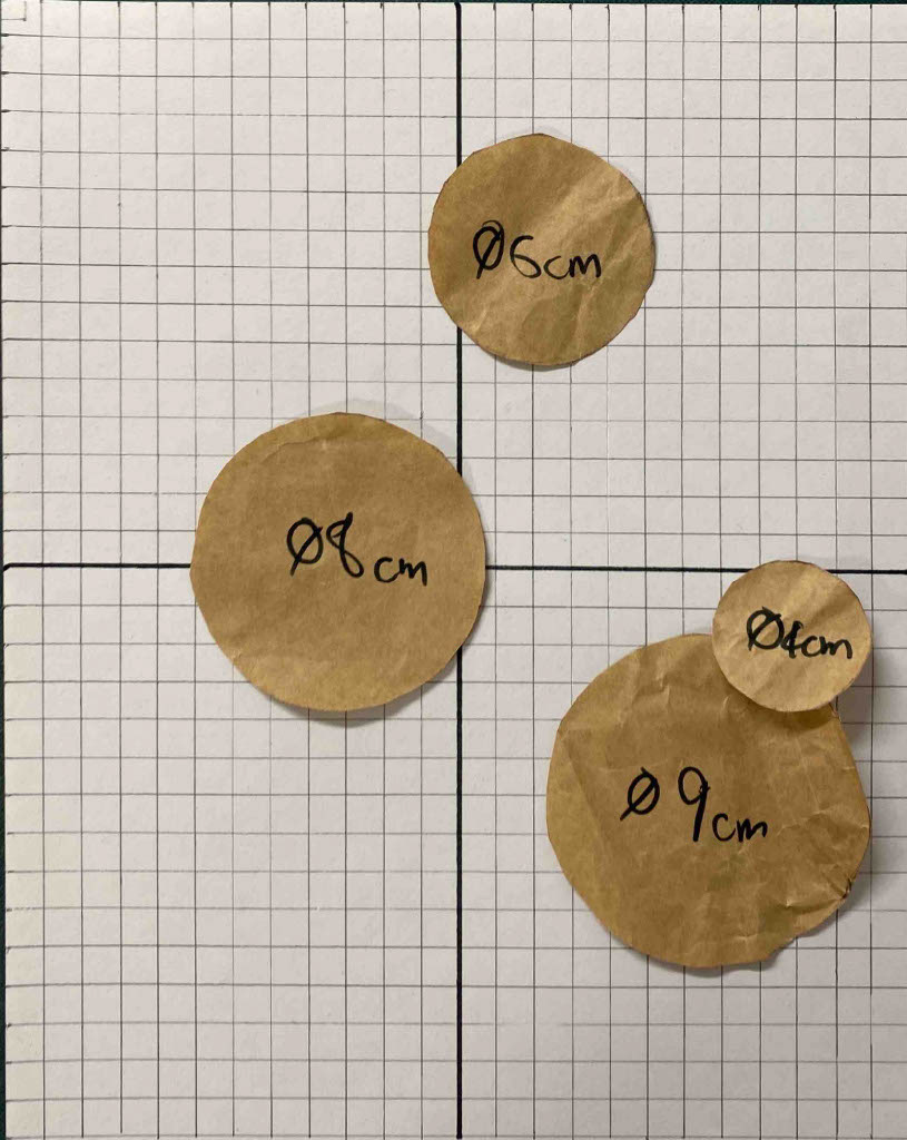
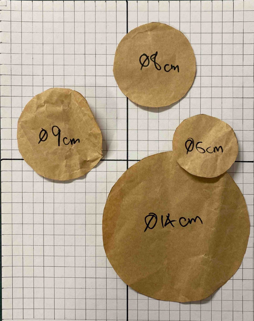
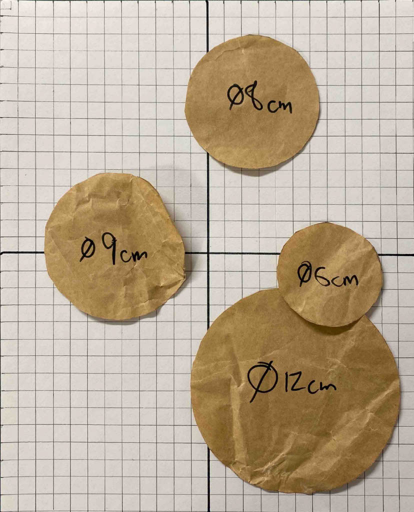
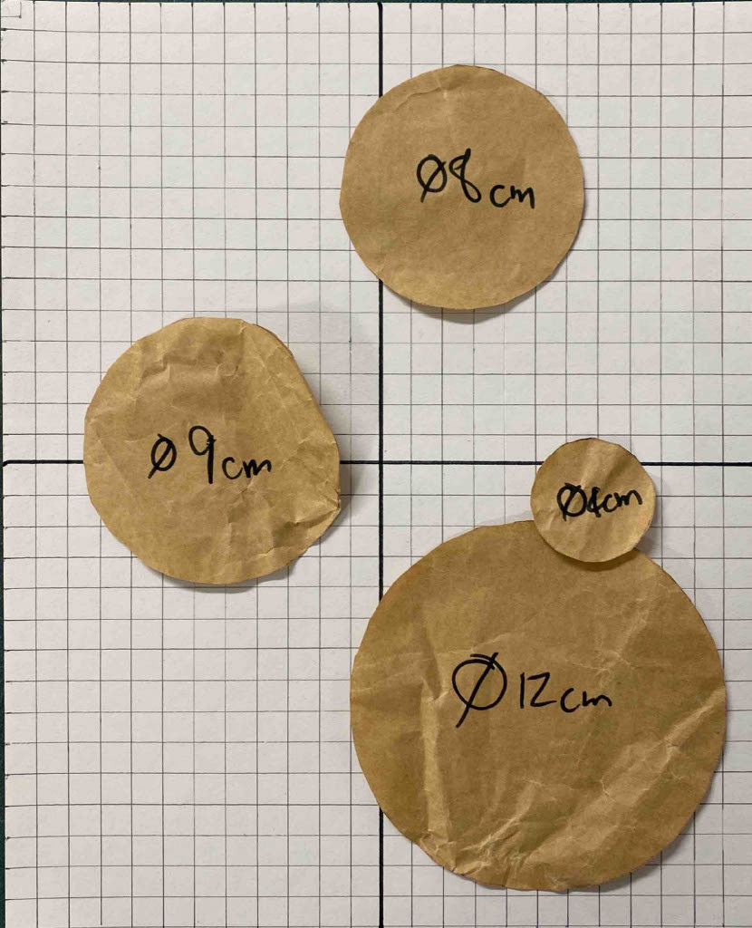
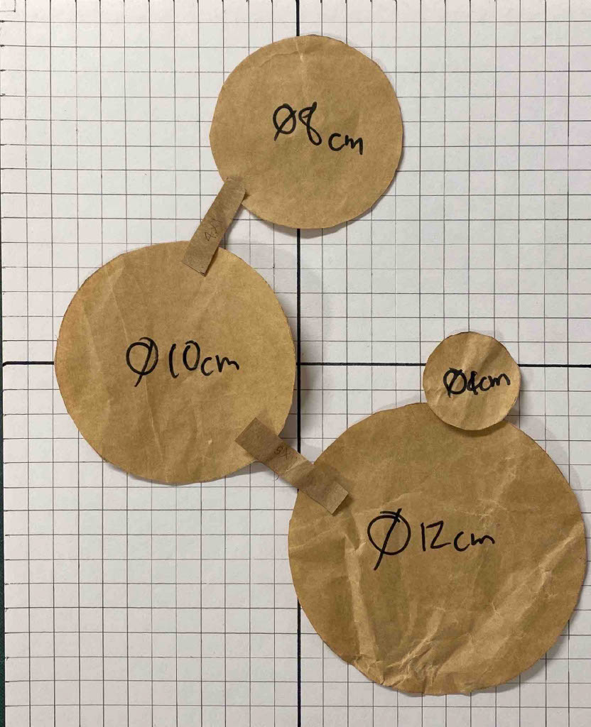
I chose the choker necklace design as I felt it was the strongest at representing the narrative of protection and covering up the insecurities of my Adams apple. I then experimented different sizes of links in cardboard to then be forged in steel. I wanted to create the largest internal area to cover the insecurities and have as much room to fit the copper chain into. I found that the 10cm diameter ring was too big on the neck and therefore chose a 9cm diameter ring for the top link. I chose the test on the right to take forward as it created the tapered look that draws the eyes down and away from the Adams apple.

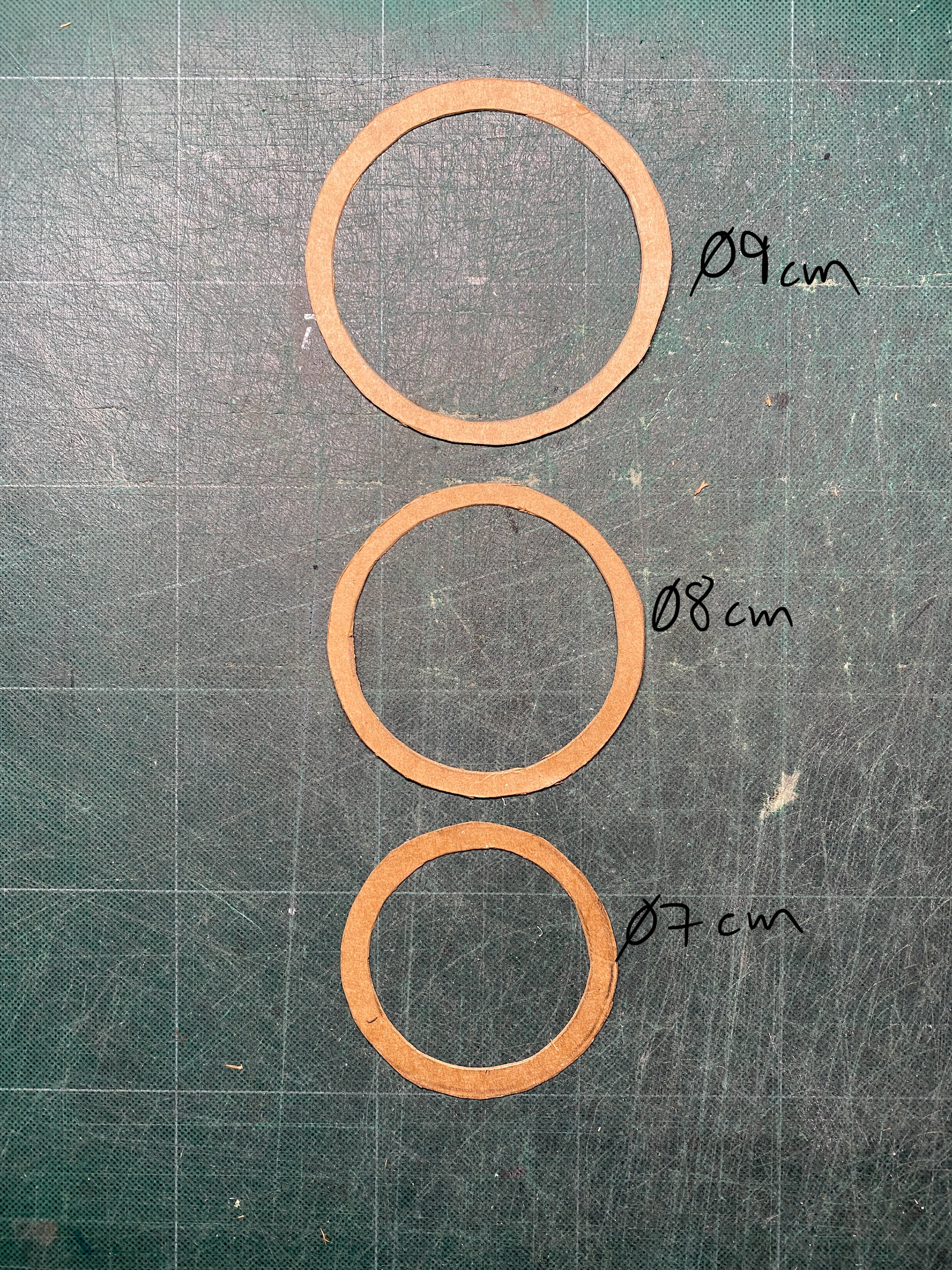
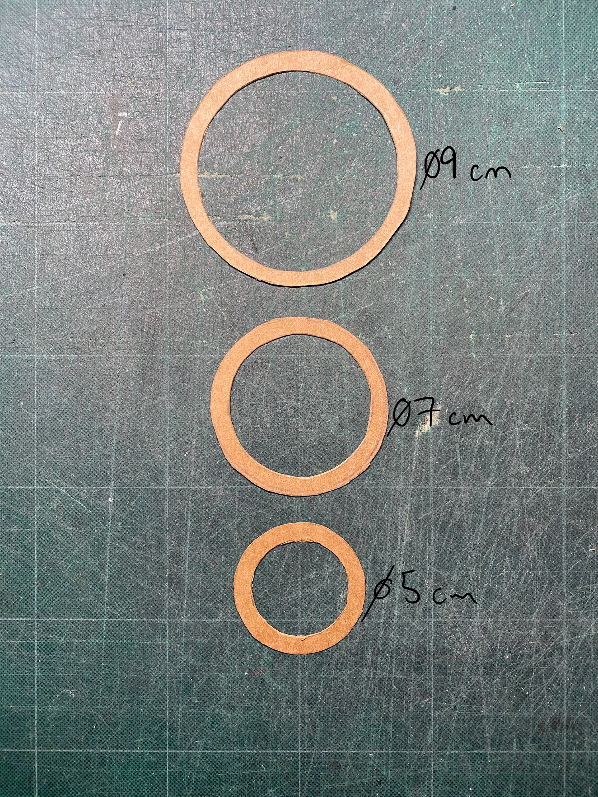
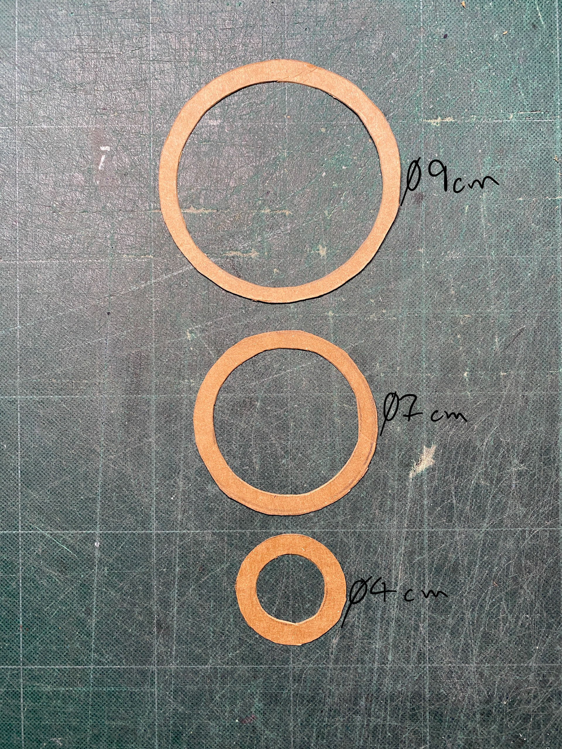

I then looked at the connecting links and initially looked at pill shaped links from the drawing but found that they stretched the design too far down the chest and made the design too rectangular compared to triangular. I therefore went for 3.5cm diameter round links as this created a more cohesive design. Furthermore, a smaller connection link makes the piece of chain sit flusher with the neck.
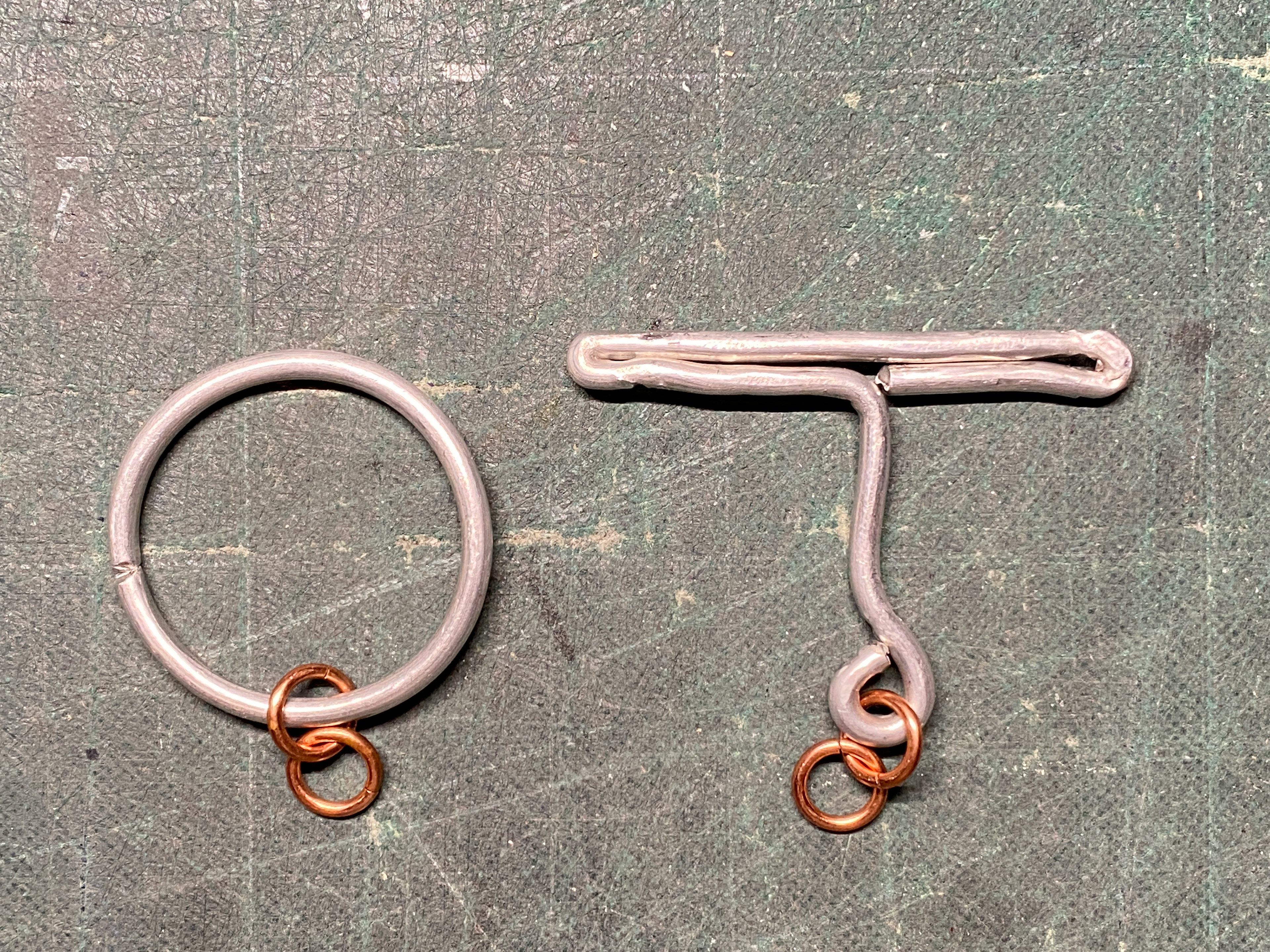
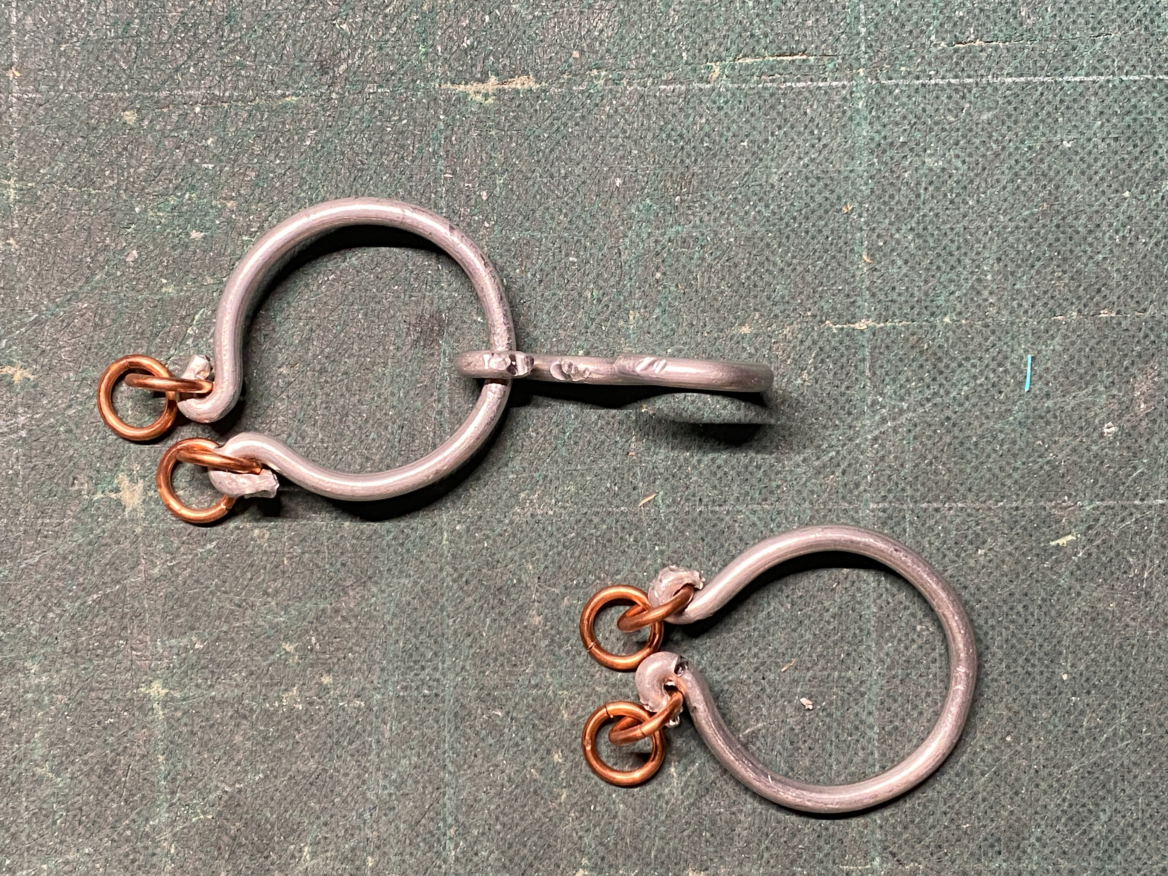
I then looked at the clasp mechanism and realised that a simple T-claps didn't heighten the narrative of protection and censorship, only performing the tasks of closing the piece. Therefore, I experimented with 3mm aluminium wire to quickly mock-up some designs that looked at embellishing the back of the neck. I investigated the idea of hidden beauty that could lie underneath hair or behind the front protecting choker section. I primarily looked at using curves and twisted chain links to create the forms and a cohesive aesthetic with the wider piece. I also wanted to look at adding chain and script that fell down the back of the neck, creating a metaphorical weight. Therefore, I included loops that a start of a length of chain could be suspended from.
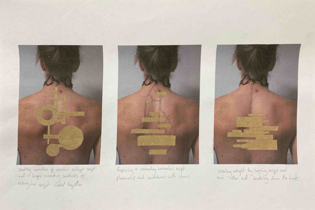
Reviewing the back section of my design I want explore the placement of script down my back creating a metophorical weight of my words pulling me downwards which is rienforced with the physical weight. I created a series of initial collages using monochrome papper to represent the copper ensuring I didn't design using contrast. I wanted to create the back section entirely from copper to create a uniform design but also put the focus on the stamped script.
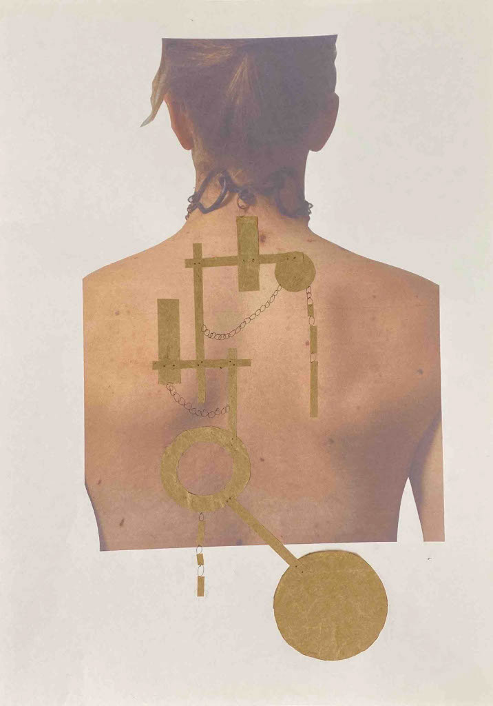
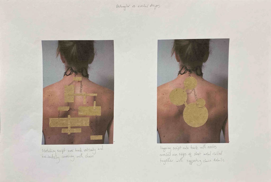
I experimented with the use of rectangle shapes to emulate the writing of text in a physical or digital diary. I also used circles to creatre a consistent visual aestetic from the circular chain throughout the design. I looked at using primarely chain to conect these differnet sections together but also explored using rivets to create a fixed conection. I also considered how chain and sheet would lie agianst the body and react to the gravity pulling the desing together and downwars. This resulted in my designs revolving around the center of the back and a vertical compoistion.


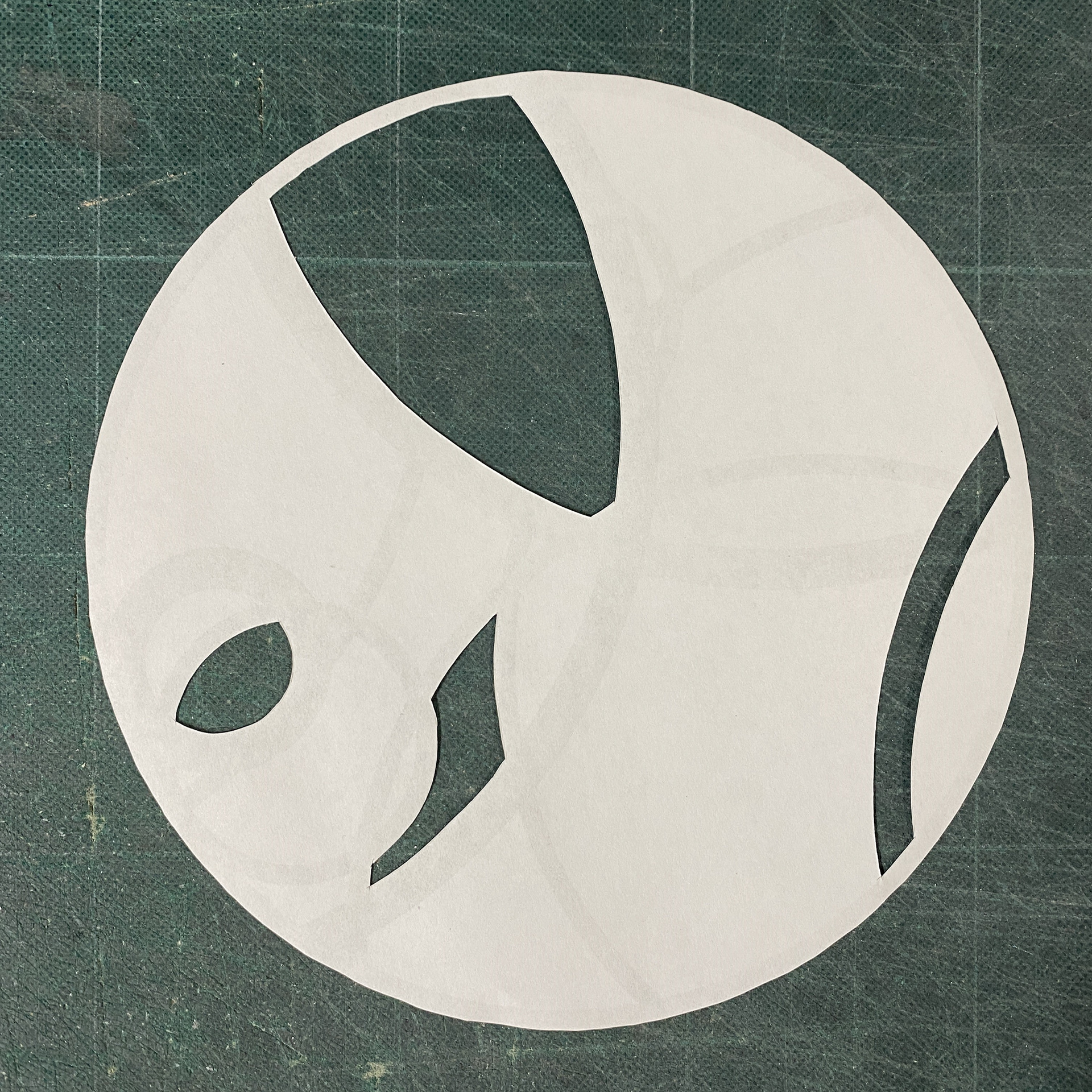
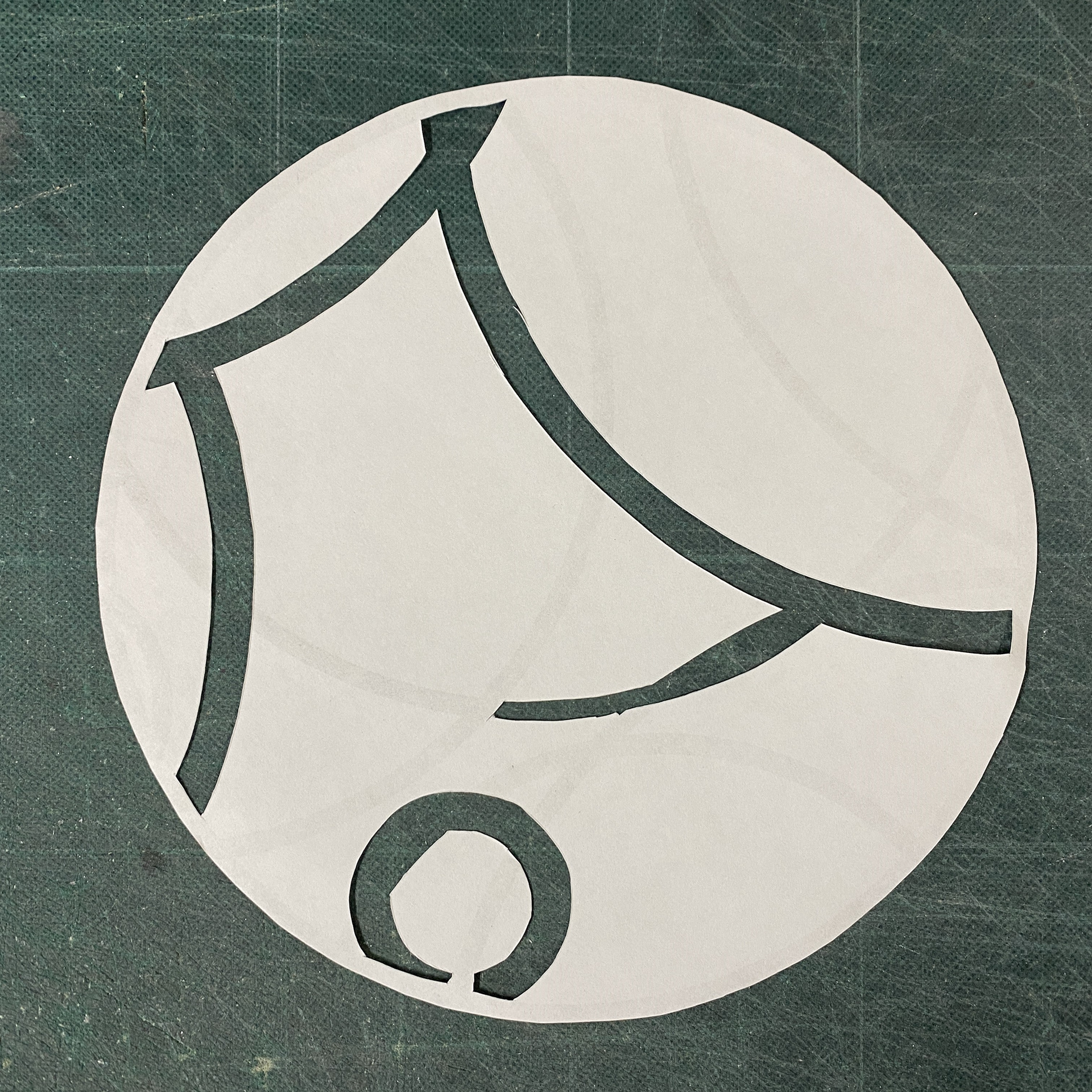
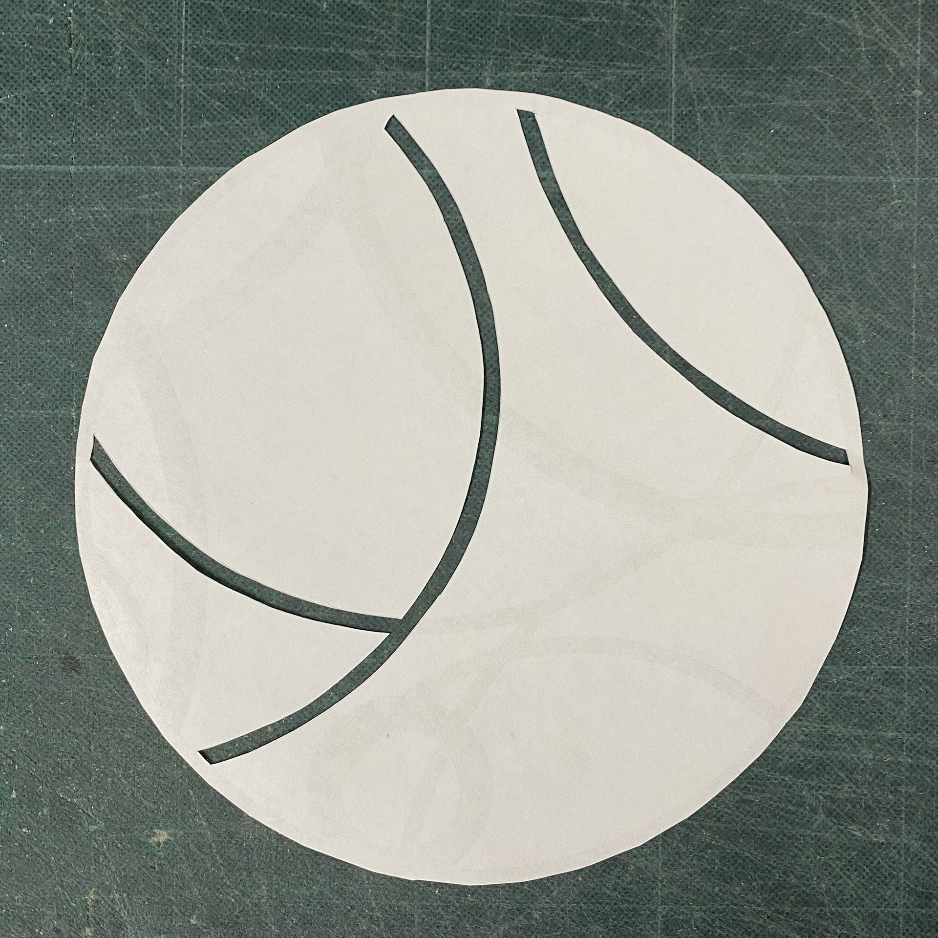
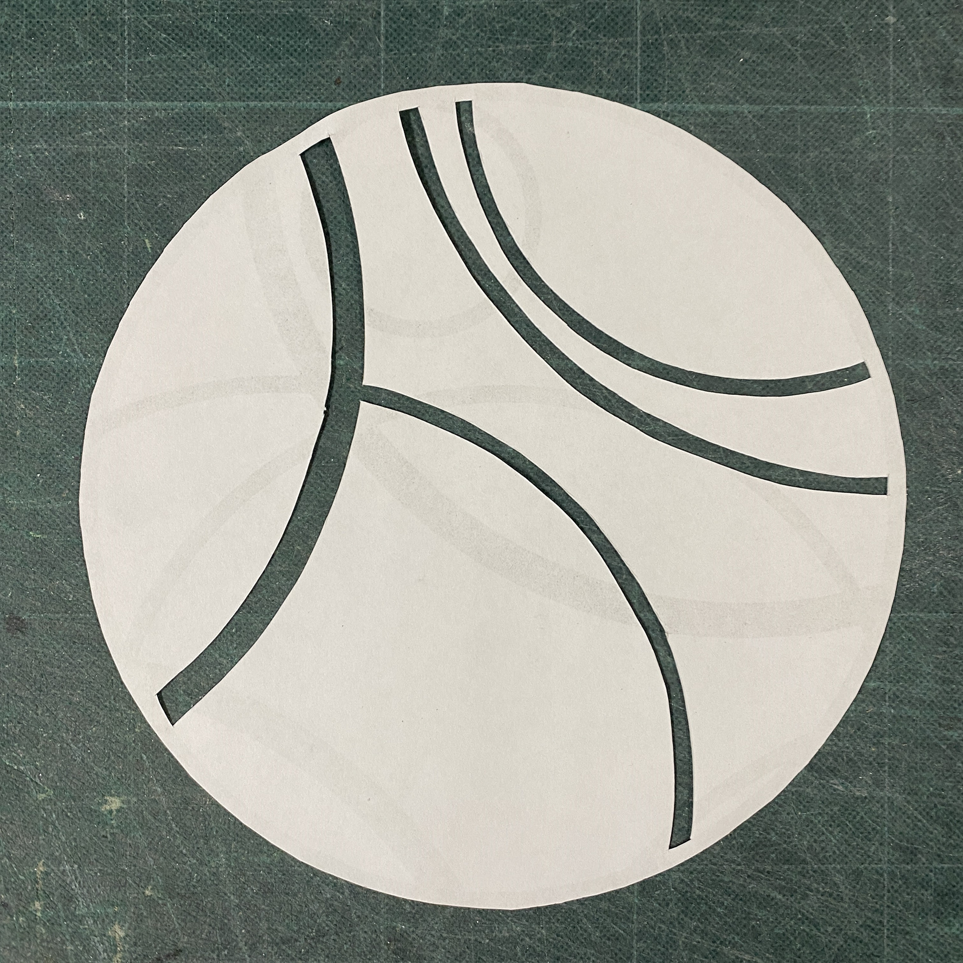
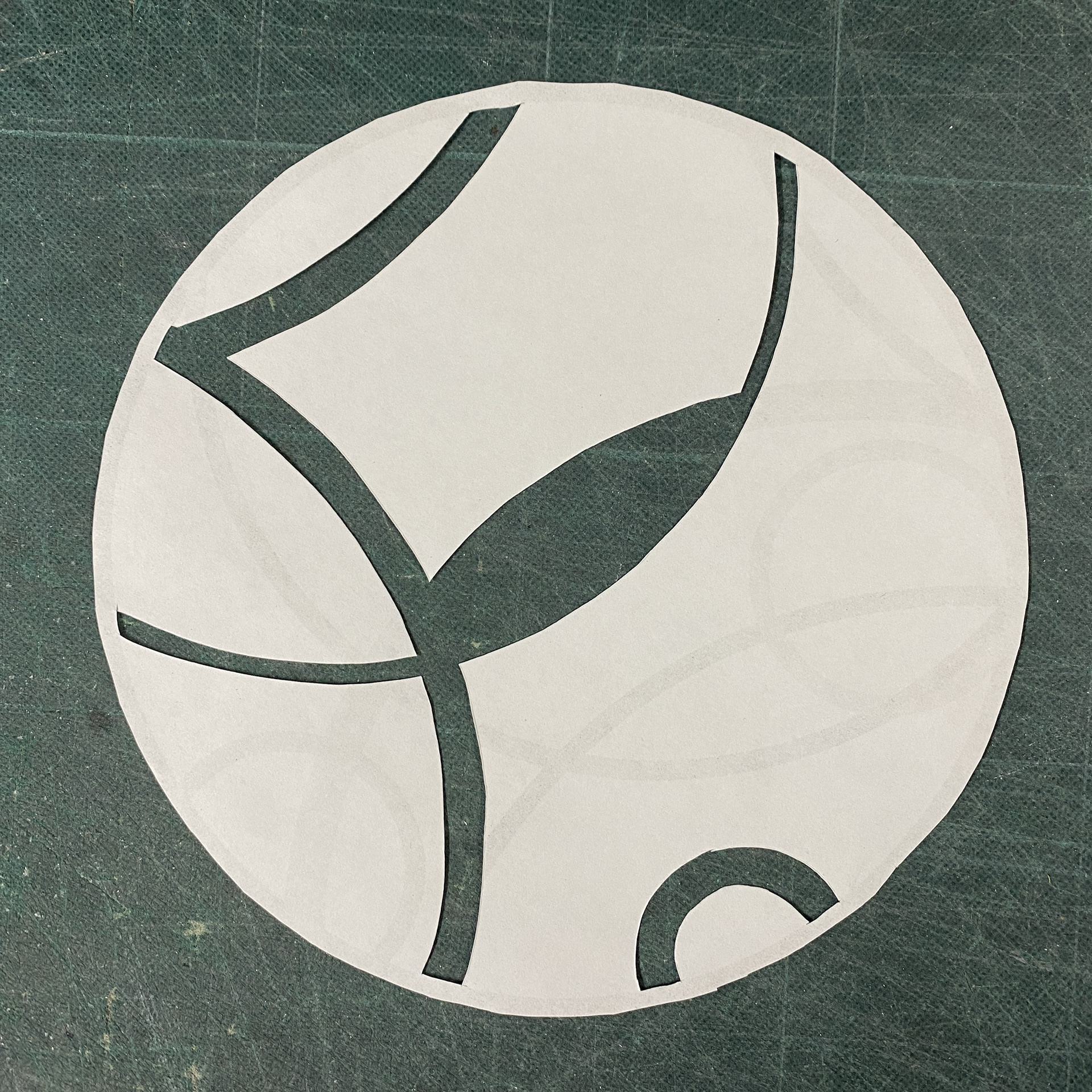
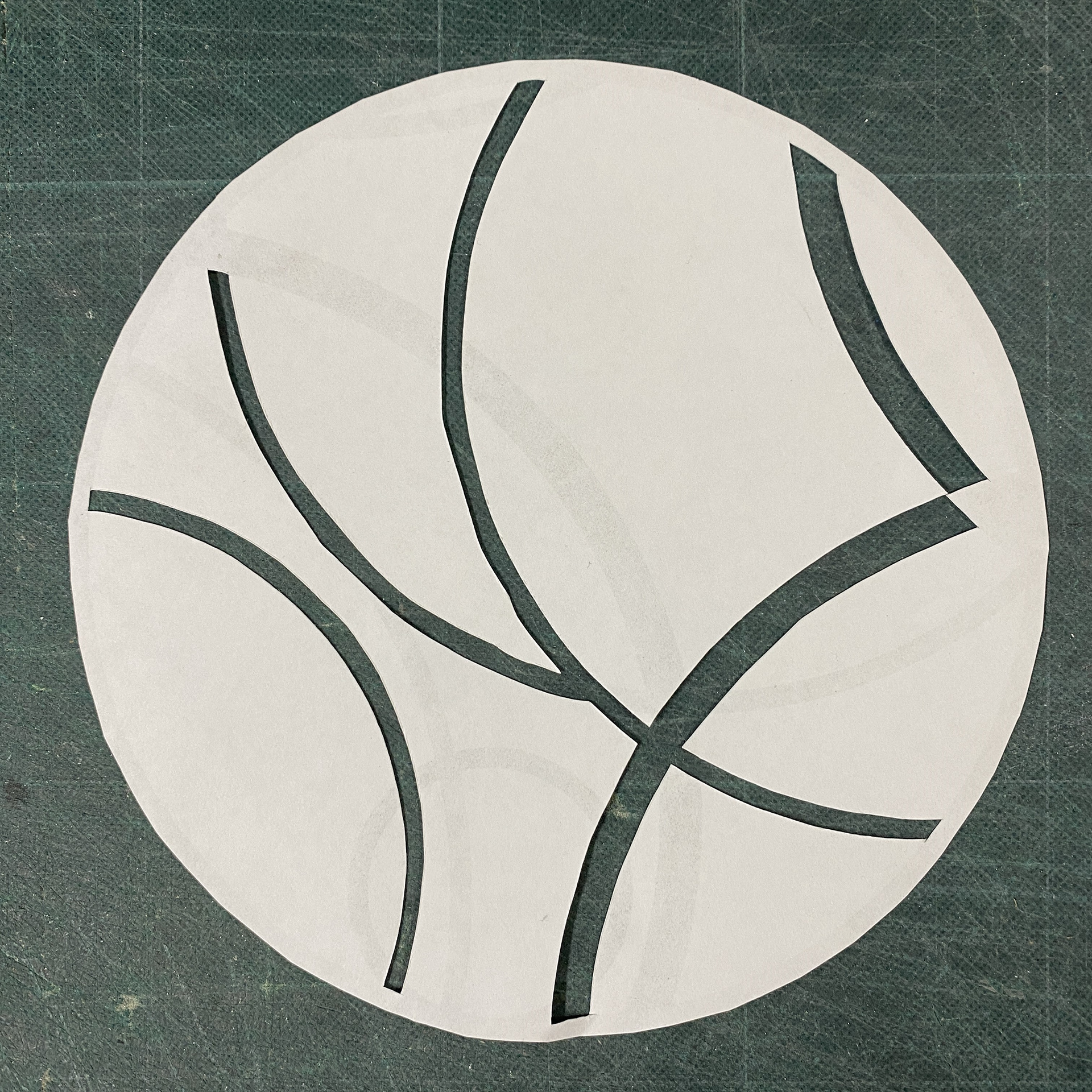
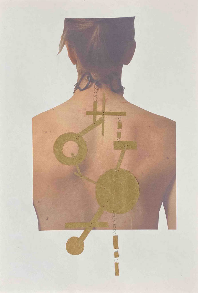
I liked the circular aspects of my drawings that will have the layered collaged script but found that I needed to break them up to explore the ideas of censorship and distortion. Therefore, I extracted circles from my screen printing and explored cutting out sections. I initially looked at removing the negative space between the marks but found this created awkward shapes and angles that didn't align with the design. I then looked at taking away the lines from the prints which gave the effect of a sweeping arc that was wiping away the script interrupting it.

I developed my designs further increasing the size of the collage to create a closer representation to life size and how the shapes and chain would interact with each other. I explored the idea of contrasting the back design with the front by creating asymmetry but still wanted to create a visually balanced composition. I designed around riveting the general structure together and draping chain with script down off of it.
Reflecting on these designs I felt that they used the back as a canvas and lied on top of it too flat rather than working with the body.
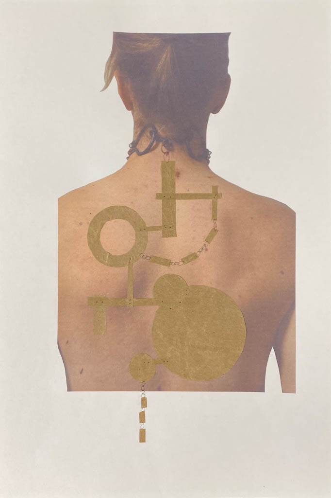
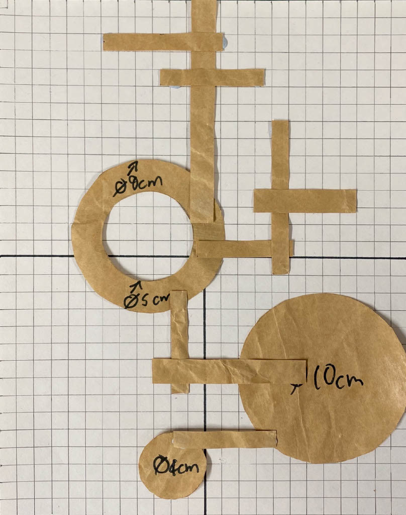
I went back to my original circular design as I like the simplicity and placement of the shapes over the back. I would then look at introducing the cut-out drawings I did previously to disrupt the circles. However, when making a mock up full size out of paper I found that the design was very heavy and would dominate the overall piece drawing too much attention away from the front.
I then explored the initial design that combined rectangles and circles and created a full-scale mock up and changed the sizes of to cover as much of the back as possible. I also looked at distributing the weight evenly between the piece as it would be suspended at a singular point from the neck clasp.
Upon reflection all these back designs don't convey the narrative of vulnerability or protection. Also, there is too much of a focus on single lines of script, not allowing the viewer to investigate and explore piece as I wanted. Furthermore, I feel that the piece is too geometric and modern creating a divided between the forged steel and the back section.
After exploring more complex design I decided that a better approach to the back piece was to utilise my previous samples ideas of interspersing the script throughout the length of chain. I wanted to focus more on the script aspect and have lots of layering sheet that had a mixture of collaged and singular linear phrases all scattered on top of each other. I also wanted this to move with the wearer and if the viewer wanted could investigate the different script through moving and separating it out from the pile. This furthers the ideas of allowing the viewer into my personal thoughts and conveys the ideas of showing vulnerability.
To further the idea of expressing vulnerabilities through the back section, I explore the interplay between the piece and the hair. I overlayed where my hair falls over the back in different styles so that I could decide the positioning of the script. I wanted it to poke out slightly when the hair is fully down only giving a glimpse of the full picture that lays underneath, and once put up unveils all. This would empower the wearer to decide the extent to which they want to show the vulnerability to the public.