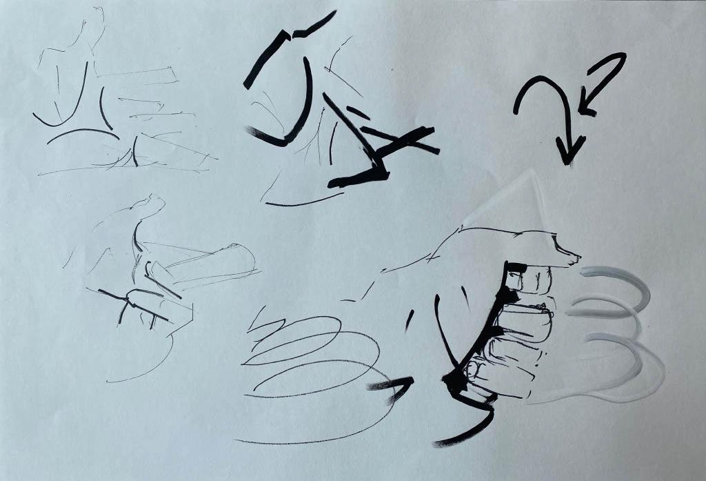
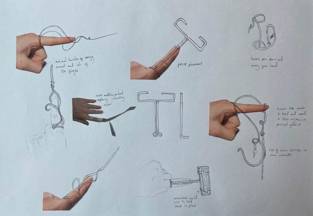
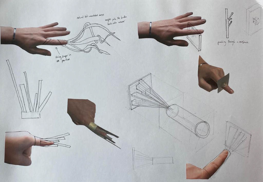
Initially I investigated the movement of the hand through film and drawing to record the positioning of the hand and energy during different gestures.
Look at Investigating gestures of the hand to see more.
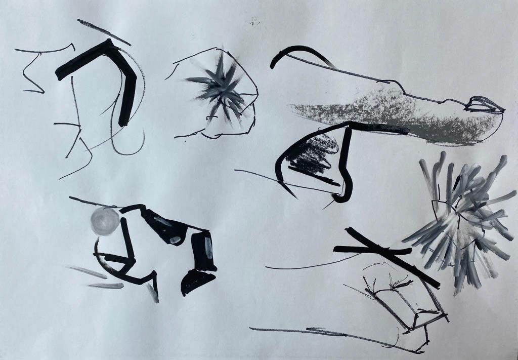
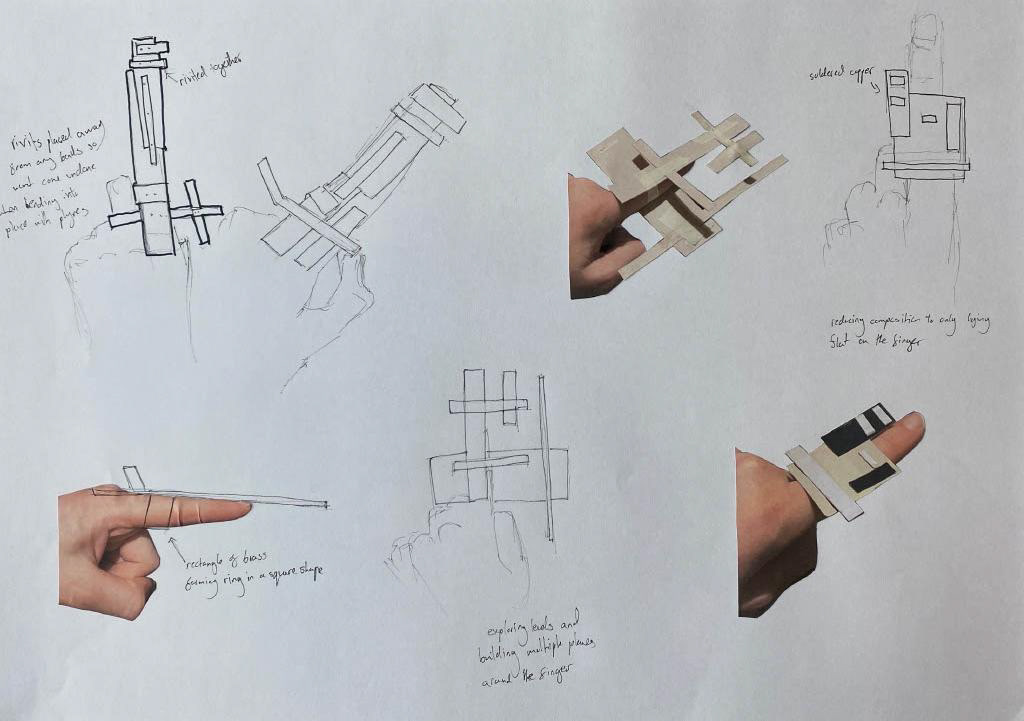
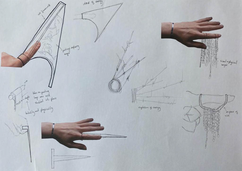
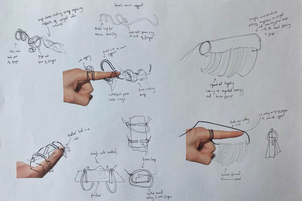
I then explored how I could create a visual representation of the gesture onto the hand that enhanced the motion or manipulated the hand whilst the user wore it. A large component of this was figuring out how the jewellery fitted onto and around the hand whilst still allowing for the desired movement. I utilised cardboard modelling and quick mock-ups allowing me to work out what was possible and where changes needed to be made for a functional and wearable piece.
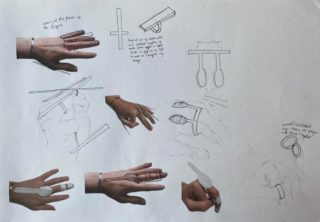
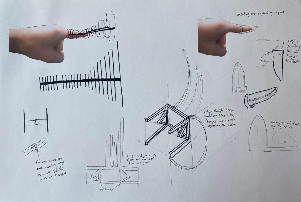
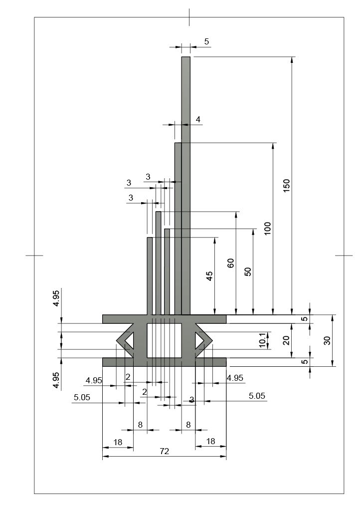
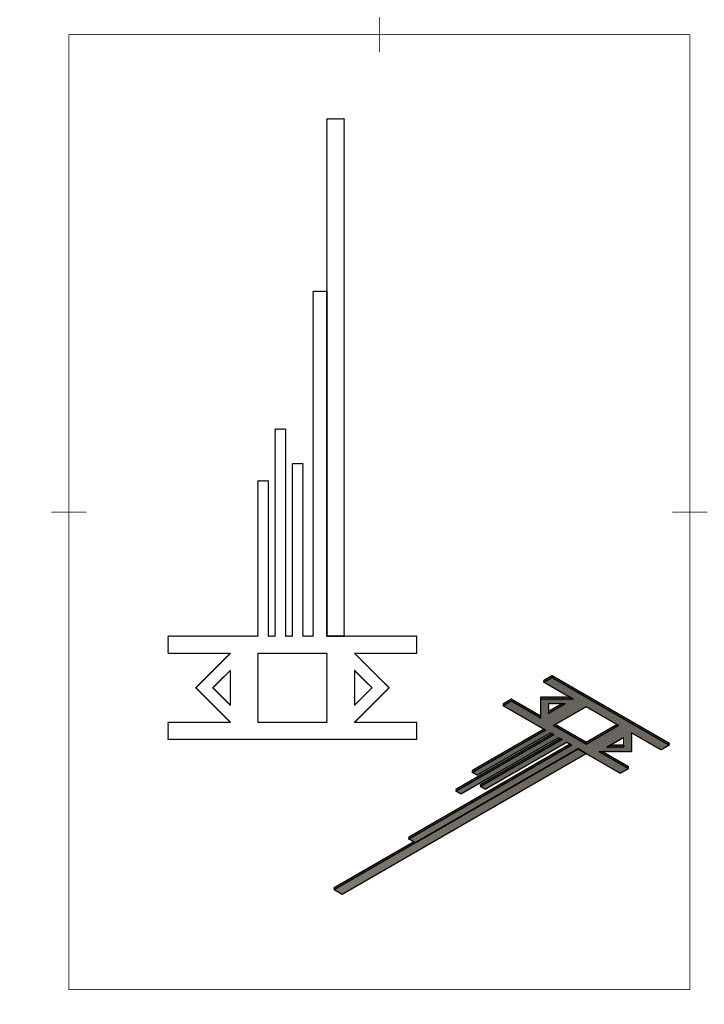
To develop the design in the middle of the right hand image above, I used CAD to create a template. Once again, I printed this off and made paper mock-ups to ensure that the sizing was correct. This I could easily change in CAD. Also, I wanted to cut the ring out of one sheet so that there was no need for any connections.
Reviewing my designs, I found that each one was trying to express different or a mixture of emotions. Therefore, I narrowed my primary research to just explore the two emotions of precision and anger when pointing.
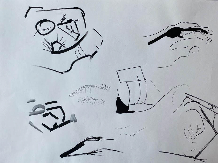
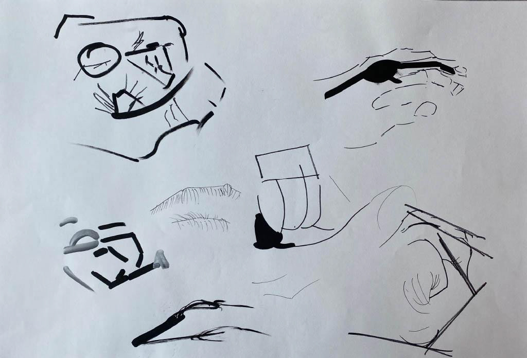
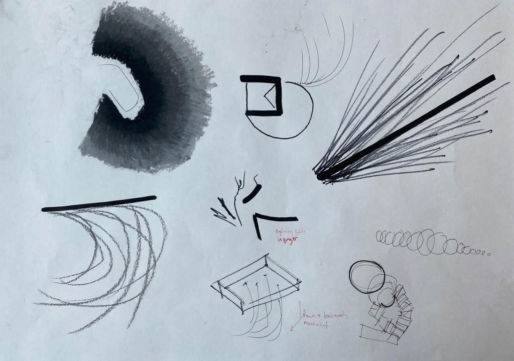
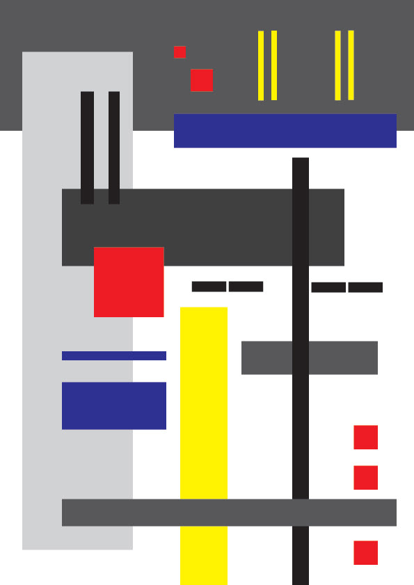
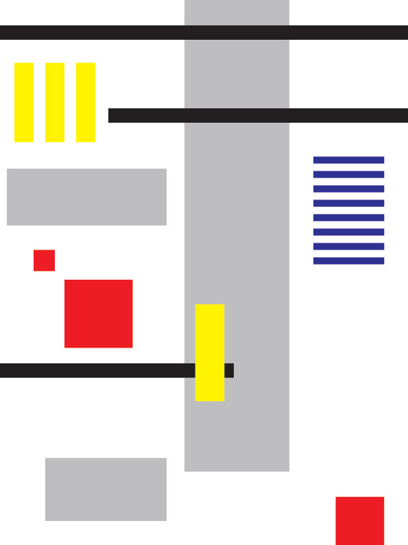
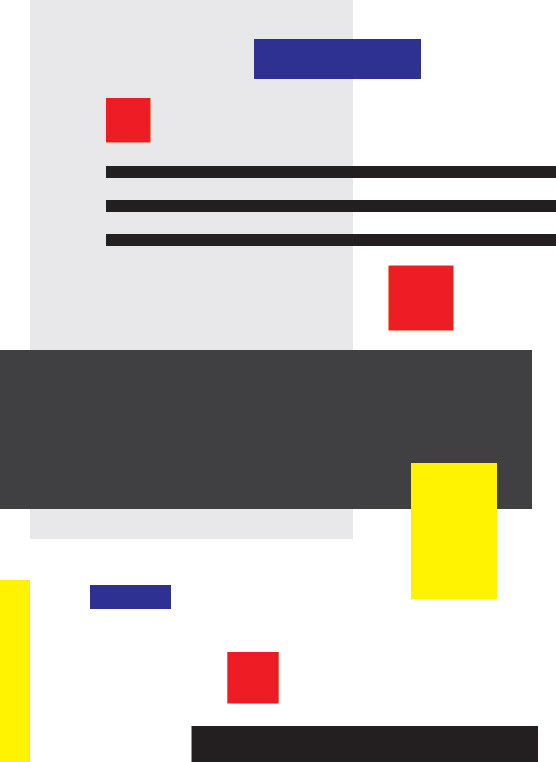
Before trying to express these emotions in 3D I tried to capture my interpretation through drawing so that I could use this as reference for my designs. I created a series of digital sketches using Illustrator and wanted to use a visual language that mirrored precision. I used mostly horizontal lines to suggest that the viewer was moving from side to side across a page. I explored the De Stijl's ideas of using colour in a uniform way, where I used the primary colours to distinguish between: vertical (yellow), horizontal (blue) and square (red) shapes. I also saw these as points of interest that draw the eye in and could be used as a starting and stopping point in a 3D piece.

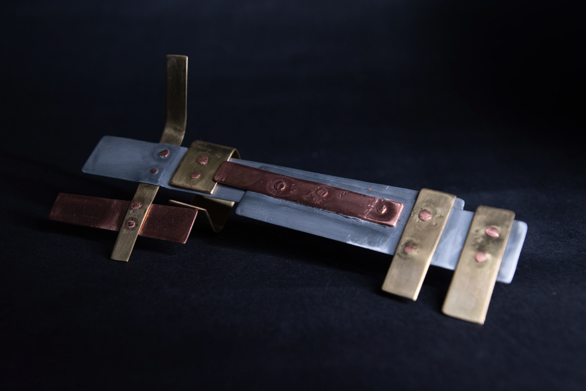
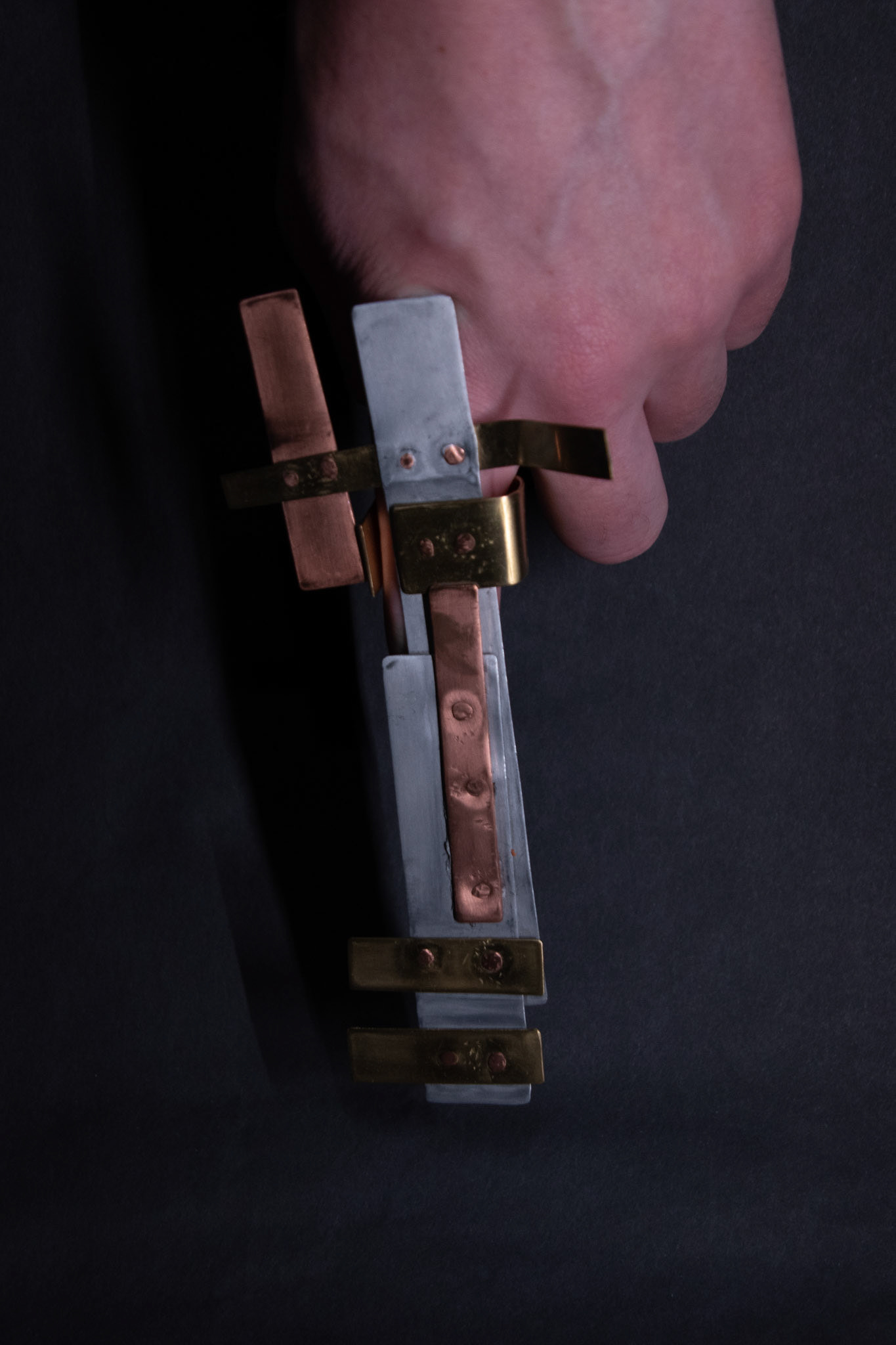
When reviewing my 3D expression of precisely pointing, I found that it didn’t convey this message. In my opinion it is clunky and restrictive, not allowing for any precise movement. Also, despite trying my best to create uniform and tidy connections between the different metals, the rivets and scratches created through the process distract and detract from the idea of layering simple, different coloured metals upon each other. With more time and skill, I could smoothen out these mistakes and polish the piece to a higher standard. However, this may result in a piece that could look mass manufactured and take away from personality and expression of the wearer.
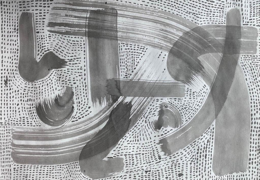
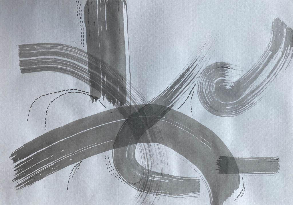
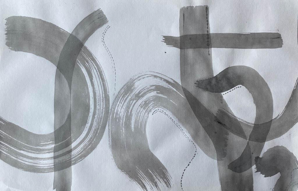
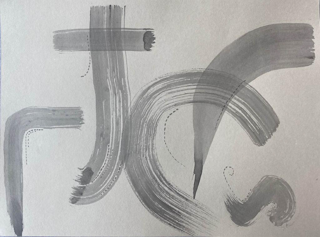
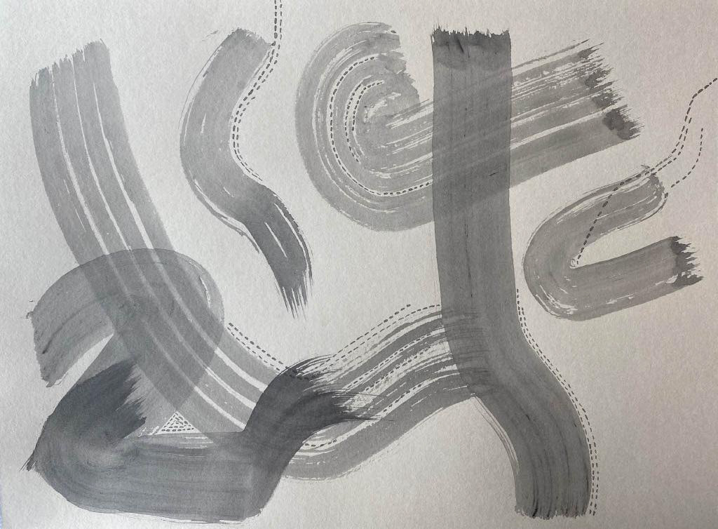
I revisited my approach at representing precision in 2D and wanted to create a more personal response. I chose to work in ink using brushes and dip pen. Varying the size of brush and quantity of ink allowed me to change the intensity of mark. Also, I removed all perfectly straight lines to show the human element in precisely pointing. During my previous experiments I found that using a perfectly straight line, although may seem the most precise, removed all human input and felt less considered.
Designed 3D outcomes
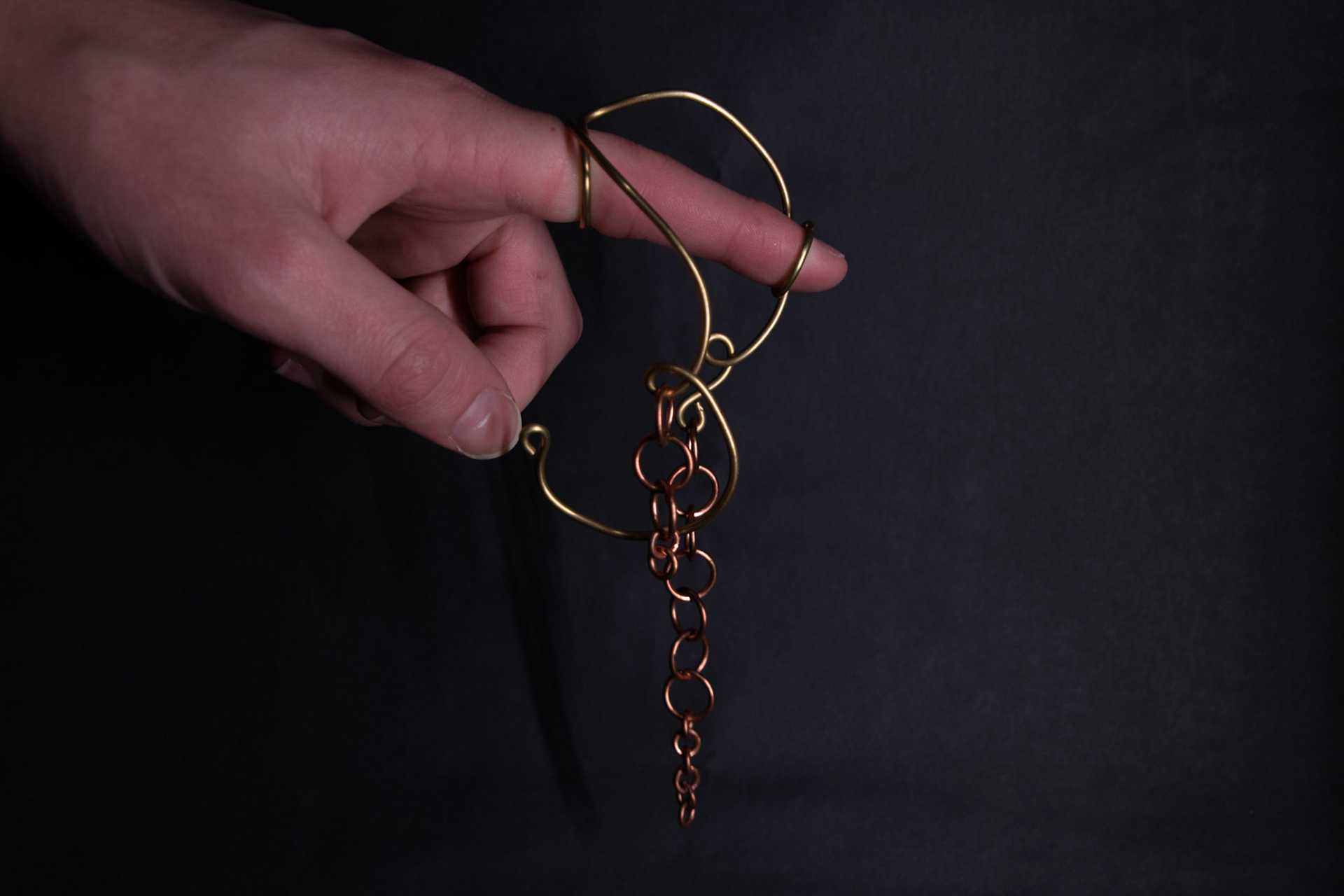
Left:
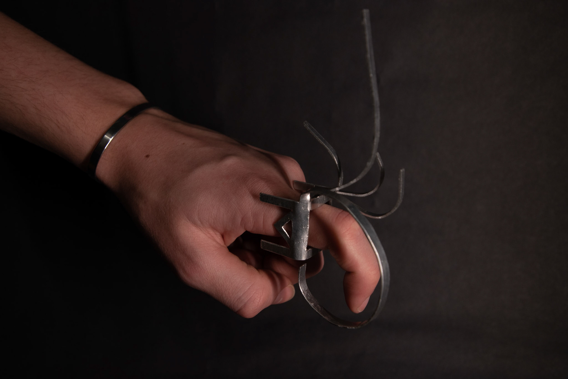
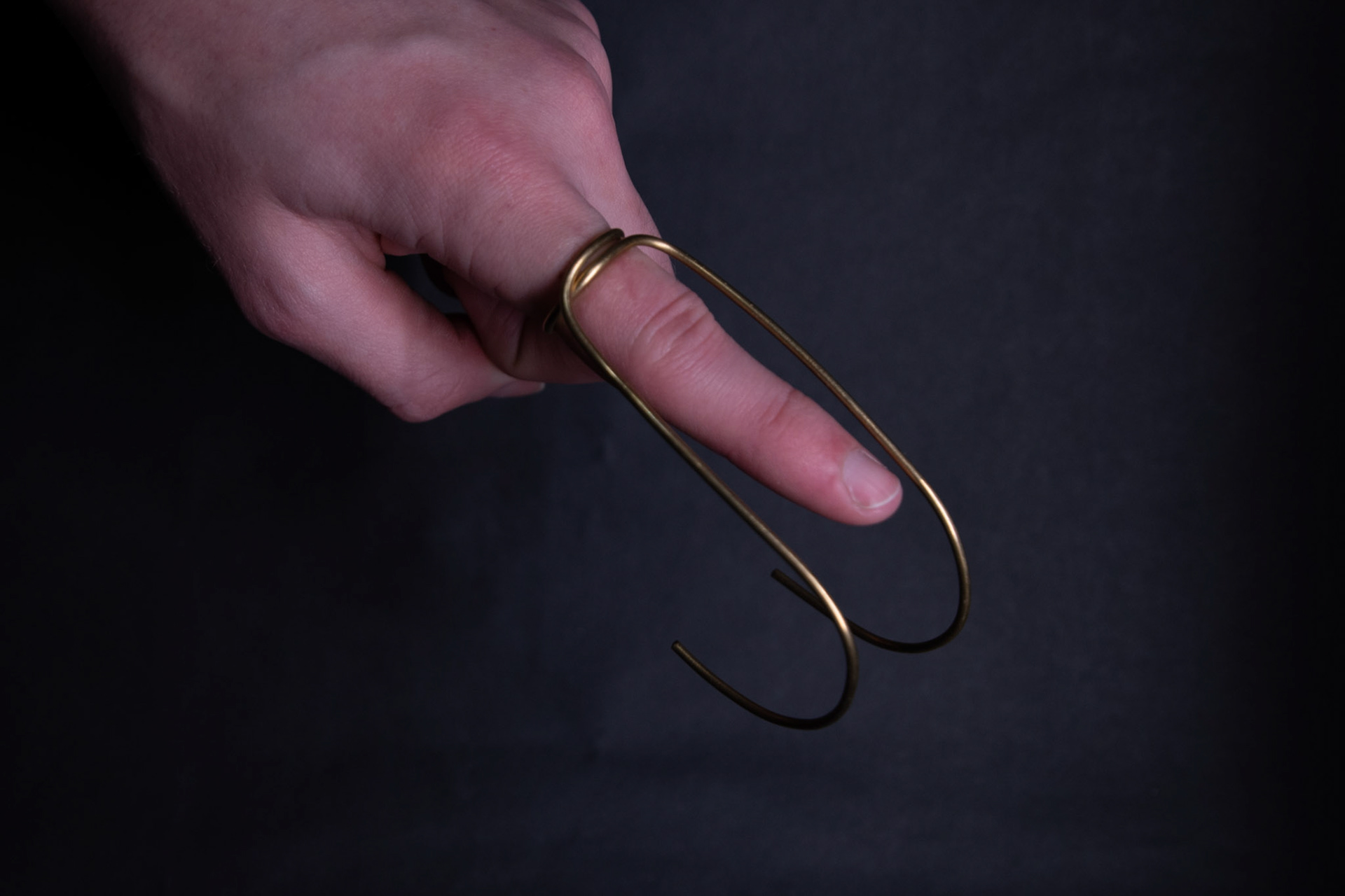
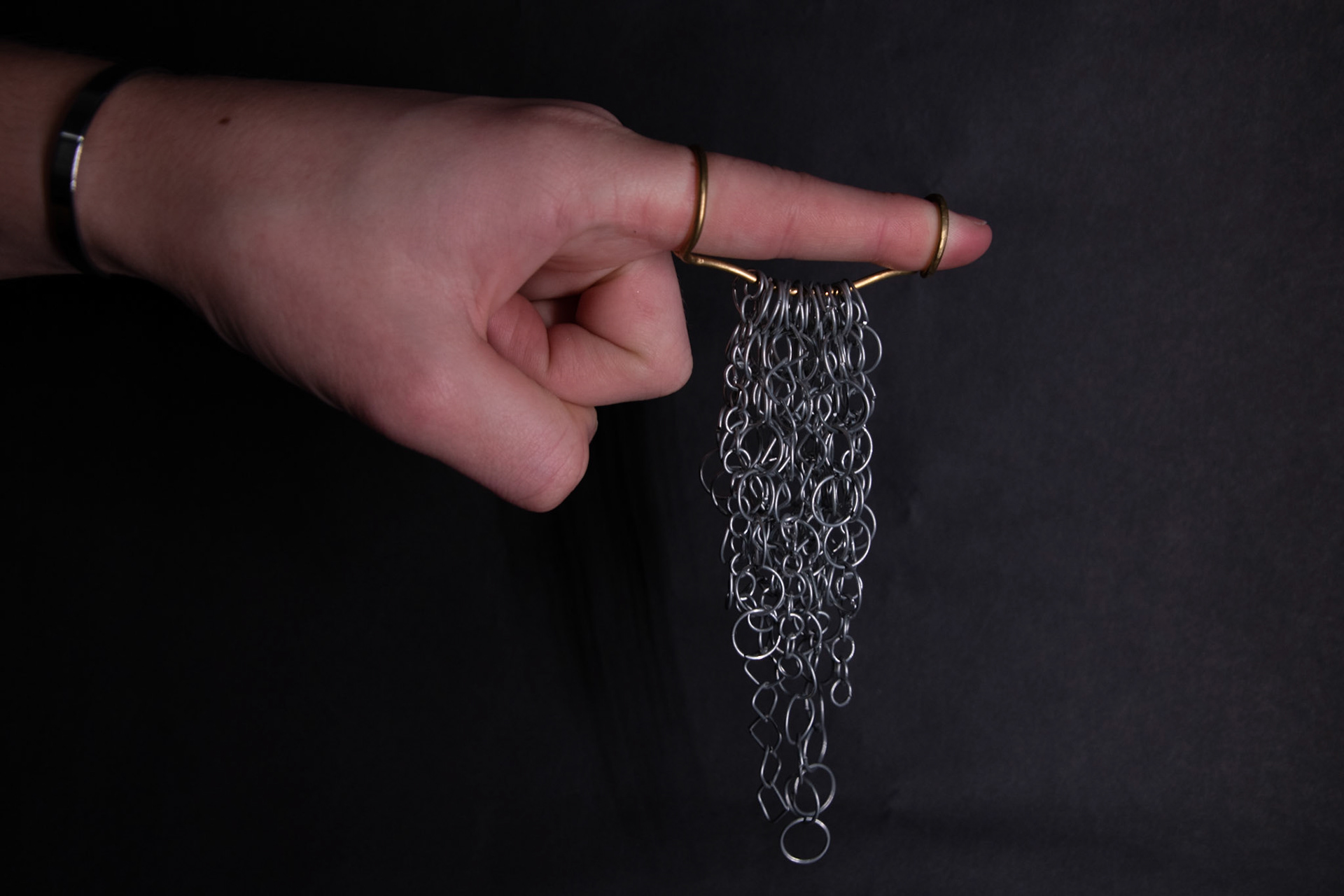
Looking at the motion and how energy flows around the finger when pointing. The two rings placed at the tip and bottom of the finger are connected with a curved bar that positions the finger slightly bent and downwards, reducing the harshness. The addition of the tapering-sized chain helps to give a visualisation of the settling and dispersing energy as the finger is flicked up out of a fist shape.
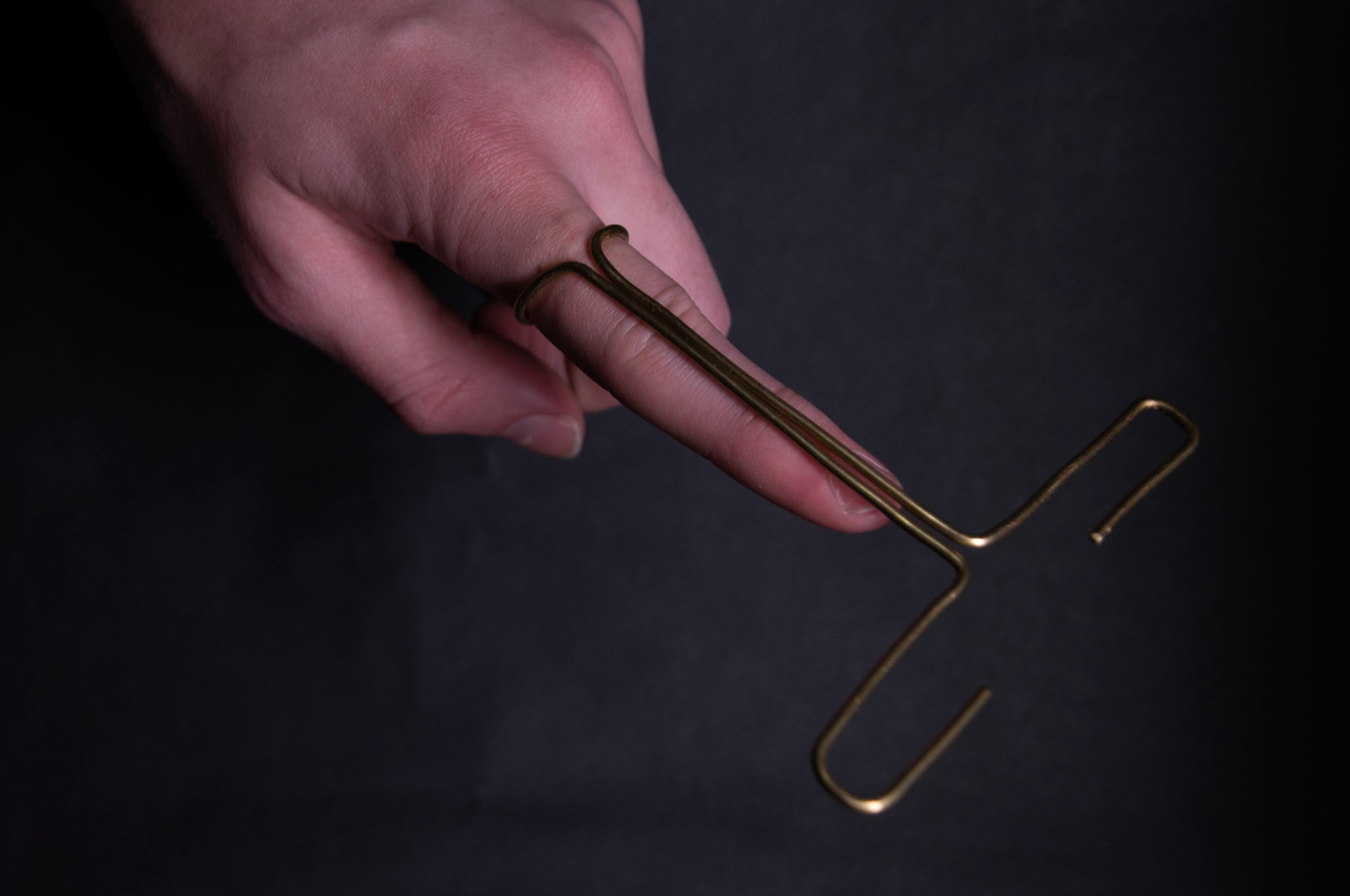
Middle:
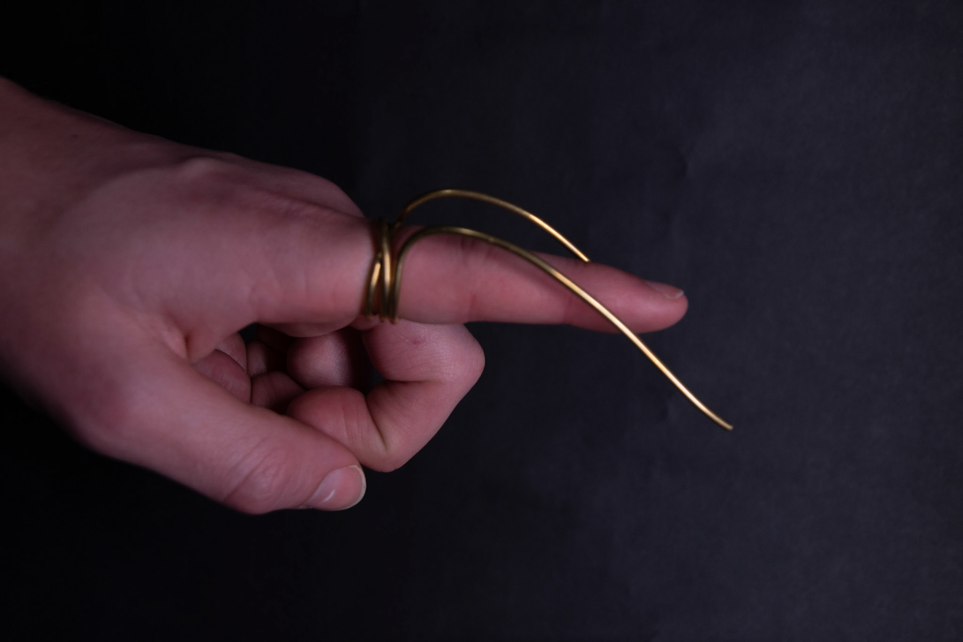
Exploring the dispersion of energy out and away from the fingertip. The T-shape also represents the way a user precisely follows the words across the page as they read. The piece works when balanced correctly however, this is very hard to get right. The addition of a second and tighter ring would help with this.
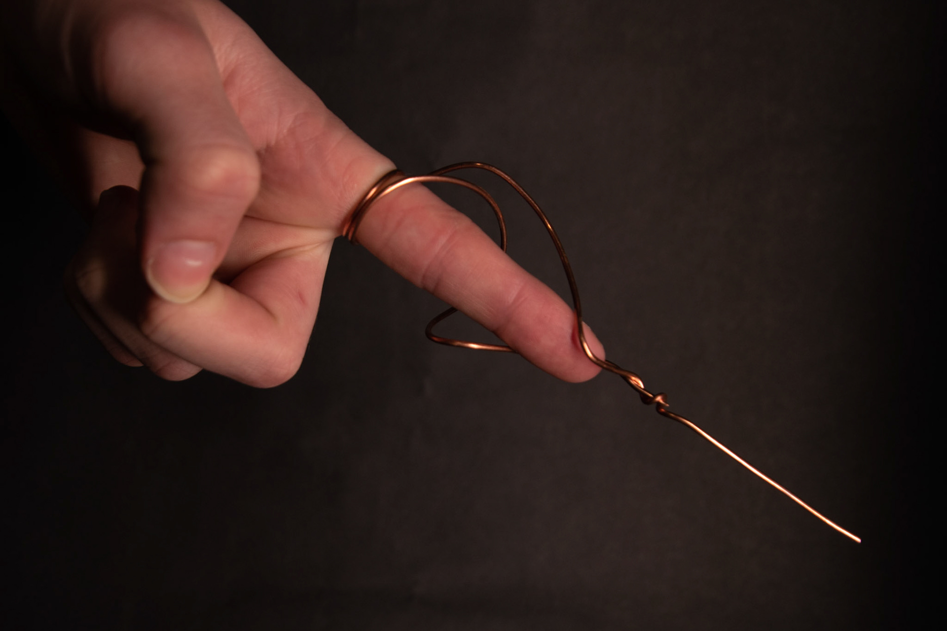
Right:
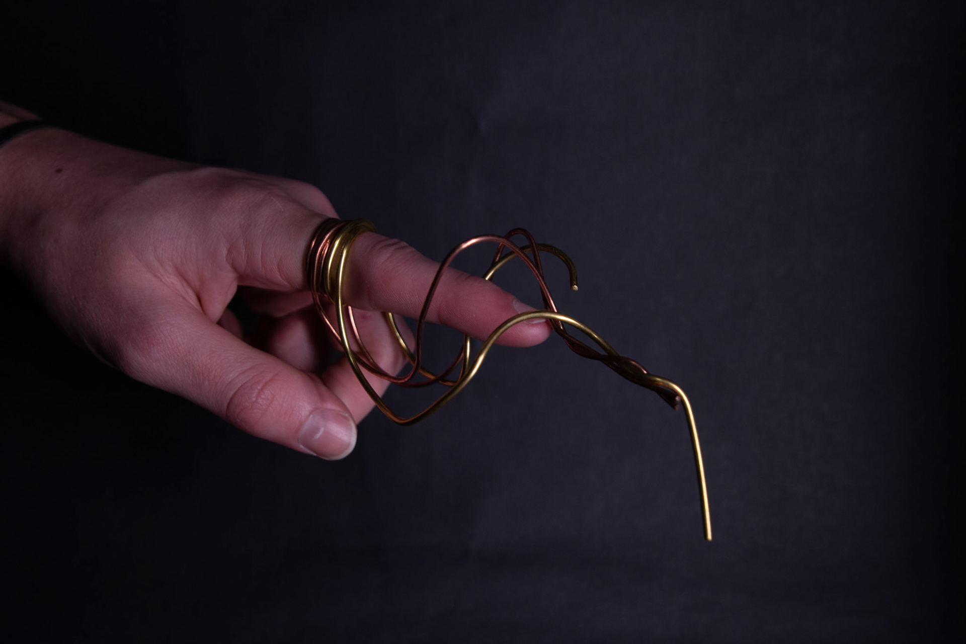
Expressing the build-up of energy and release in a collected stream. The twisting design looks at a visual interpretation of energy rather than the exact motion that is expressed. The connection point where the wire wraps together could be celebrated as currently it looks incomplete.
Through the making process of the jewellery above, I found that my interpretation of the designs wanted to evolve and adapt. Therefore, I created more work that wasn't sketched out as I usually would, but was designed through the making process. I wanted to listen to the material as I bent it around stakes and manipulated it with pliers. Also, I constantly changed the shape and visual elements to represent precision as best as I could with each piece.
Left:
Expressing the simple flicking up motion using two lines that wrap together at the base of the finger. This is less effective than I initially thought it would be. The design is made square and symmetrical to reflect precision however, the finger isn’t perfect and interrupts this.
Middle:
I reverse the direction that the energy is representing when pointing and made the two sides uneven to solve the issue of the design on the left. I also increased the number of wraps at the base of the finger to illustrate the idea of building up the energy.
Right:
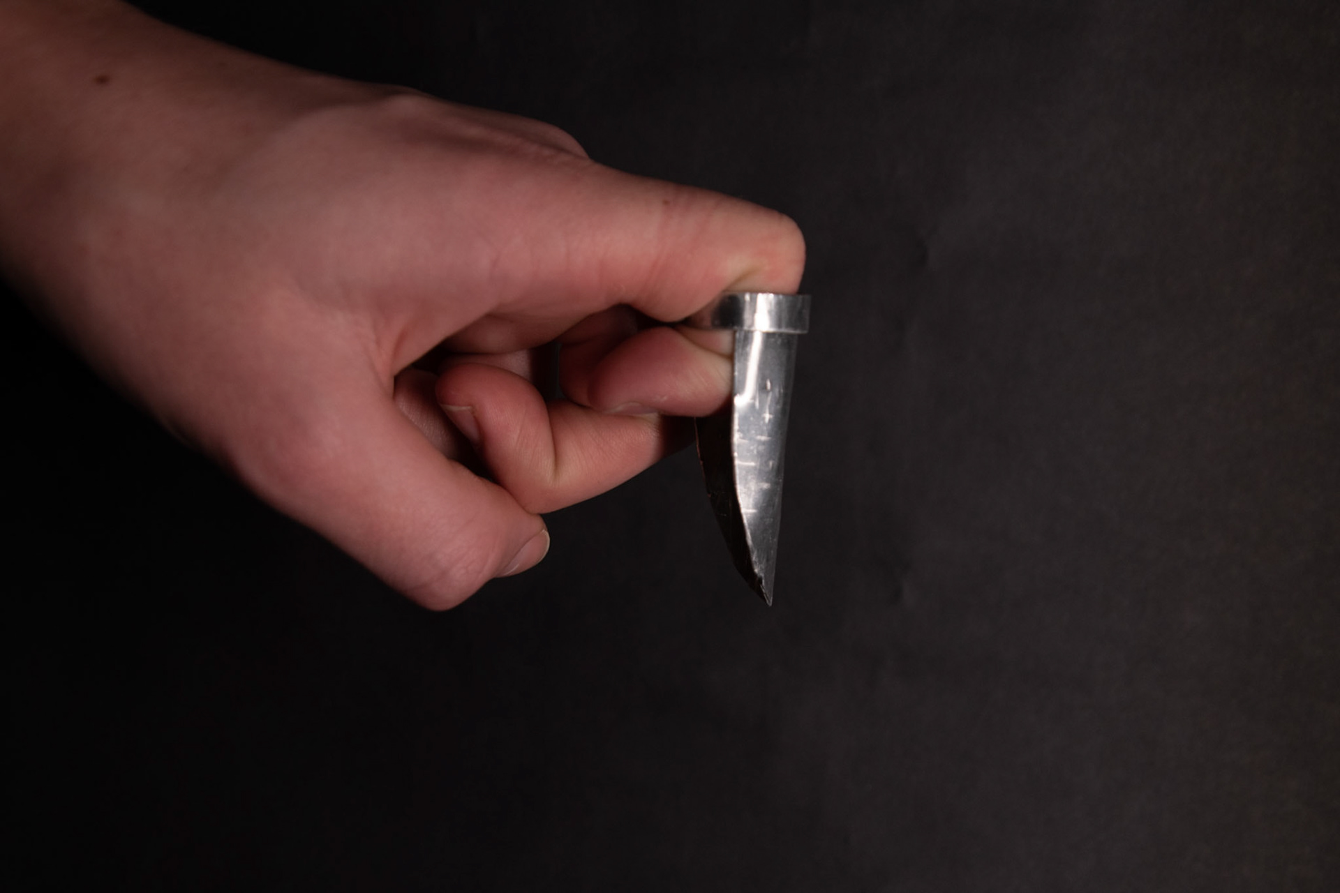
Exploring adding more wires that twist and build up the energy further. The addition of a downward facing tip also directs the energy away from the finger, softening the point. This could be used to read or accurately direct as a placement tool.
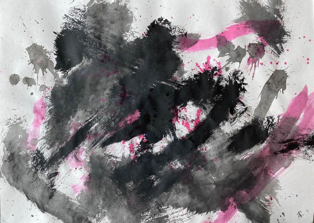
I repeated the process of primary research to explore anger using a mix of inks and paint. This time I focused on the recording of the emotion through the motion of the marks. I found that repetition and harsh marks were the most effective. The layering of my marks this time tended to hide and almost replace the previous, resulting in a history only the painter could understand. Although small moments can be seen through the texture and the damage done to the paper. This outcome contrasts with the pieces I did to explore precision, where visible overlapping showed intention.
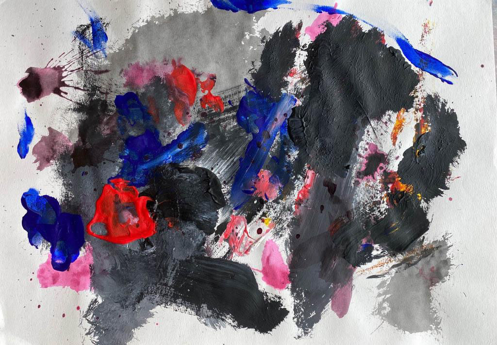
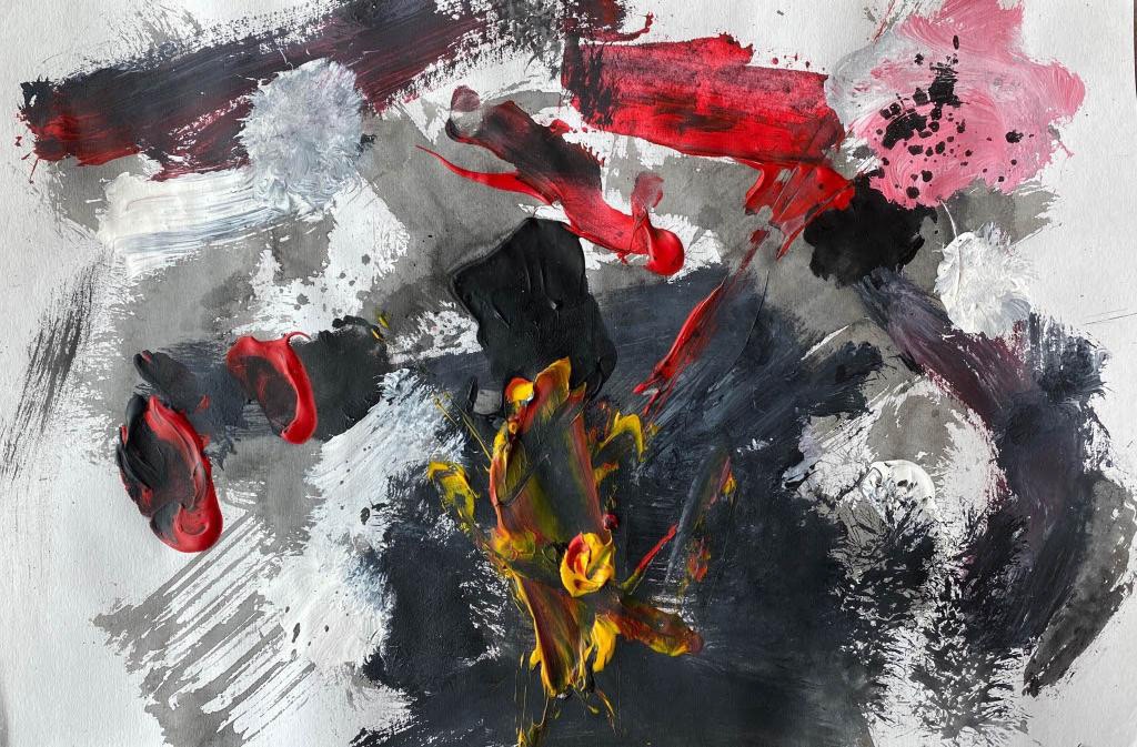
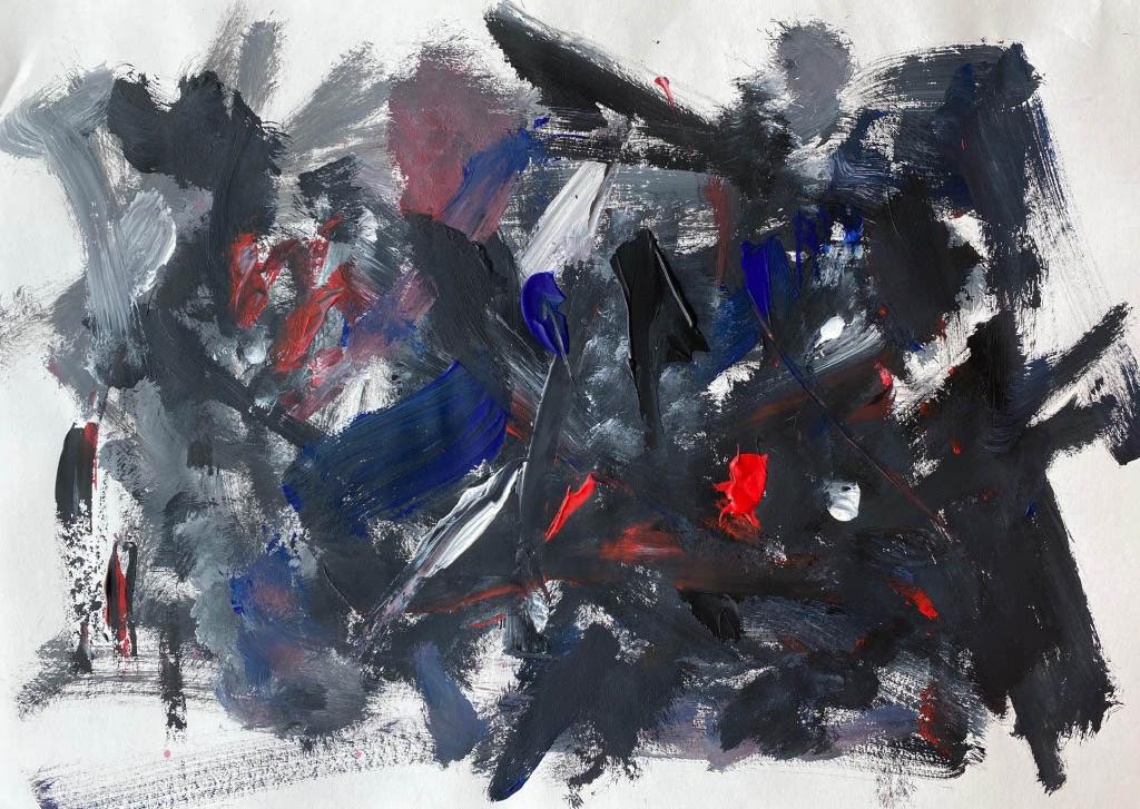
Investigating the fusion of harsh marks made in the paintings and the force of the motion during angrily pointing.
Left:
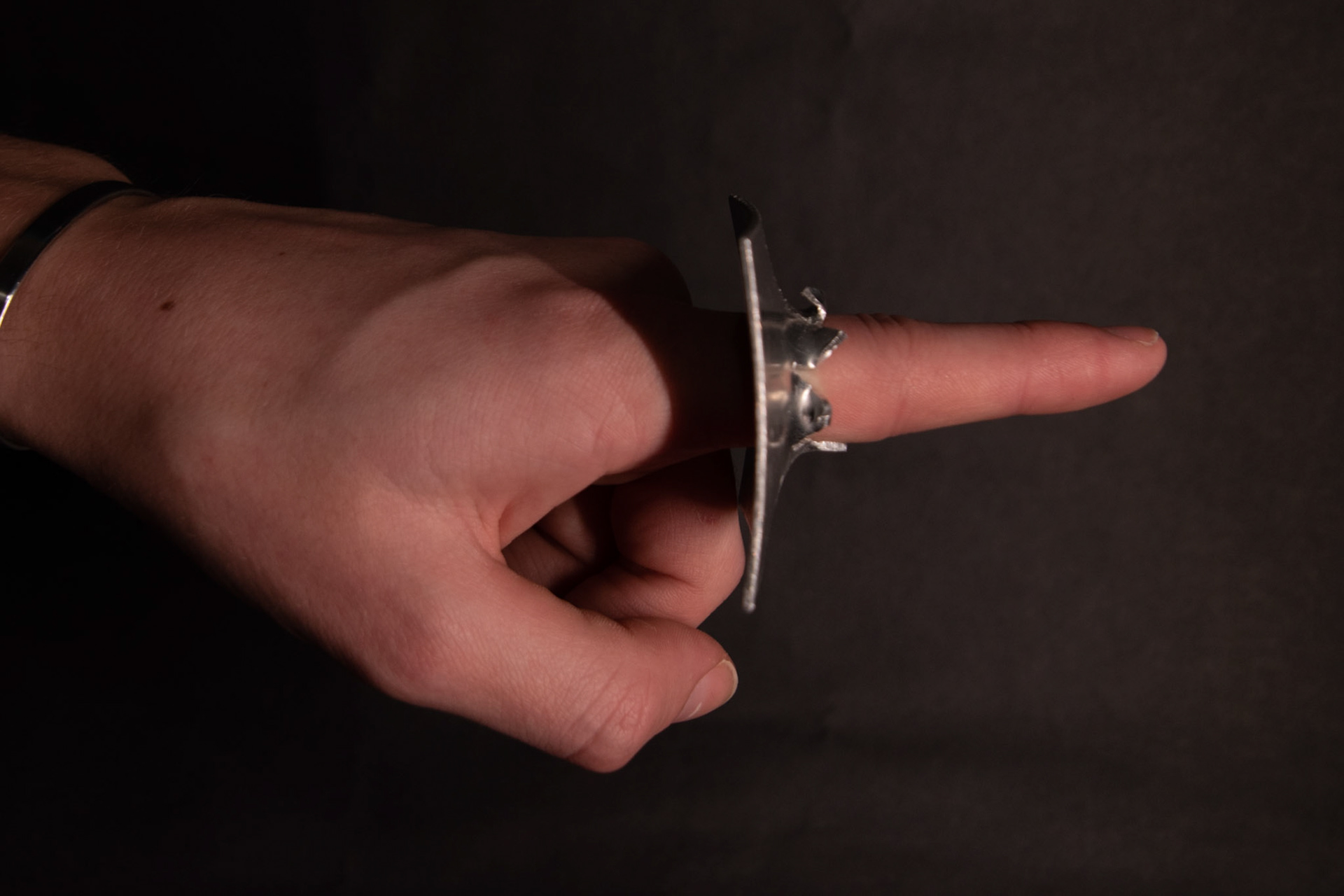
I wanted to create a piece that looks like the wearer punched through a surface whilst pointing. Capturing pure rage. This was created by cutting small lines into the centre of the piece and using a doming punch and hollow cylinder to break through the material. I adjusted and enhanced the bursting aesthetic using pliers. I like how the squared sheet bent and curved due to this process. Also, the marks left behind from the force against the cylinder.
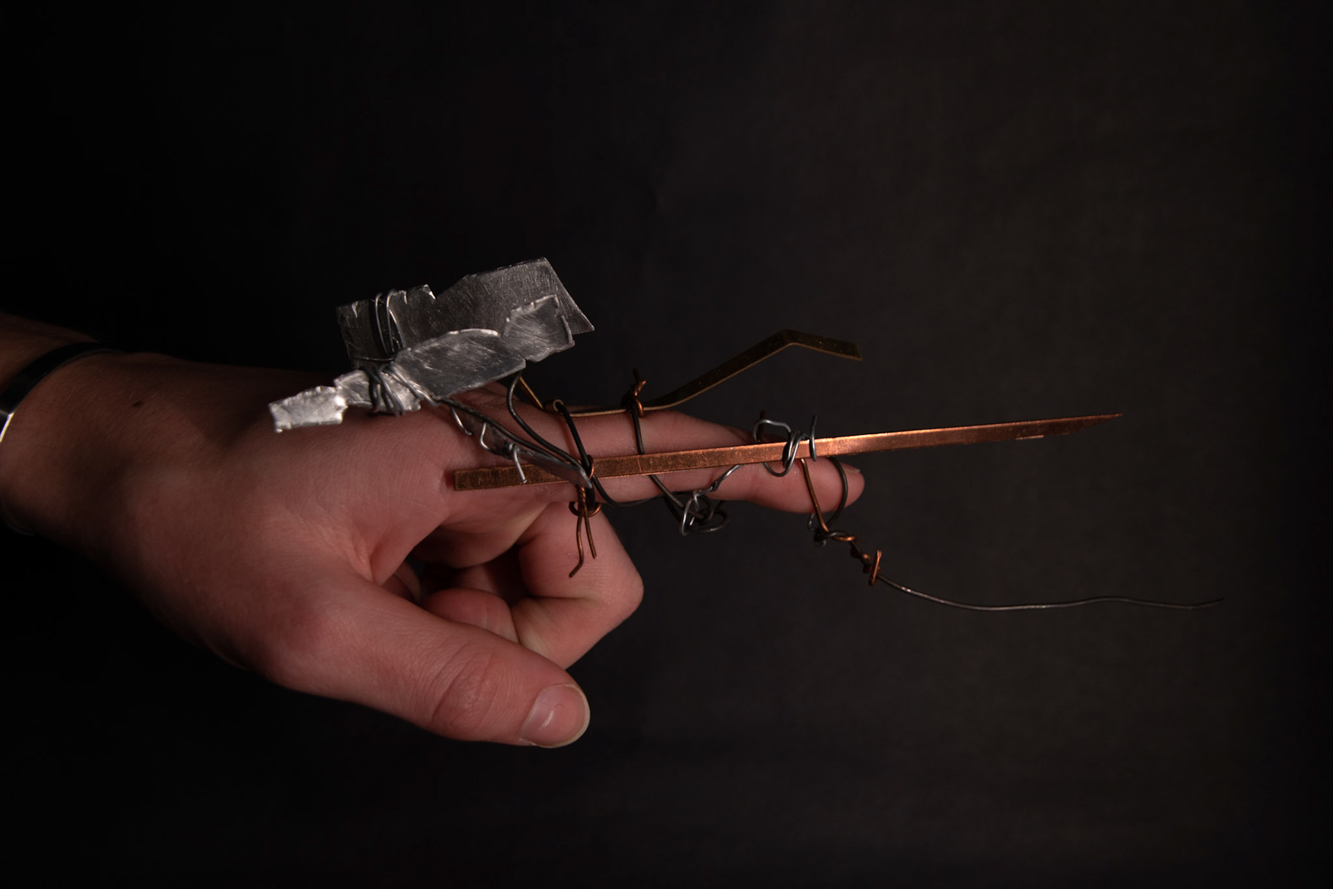
Right:
Exploring this idea further, I extended one side to sit against the fingers and knuckles, acting as a barrier from the fist and enhancing the point. Also, the process of forming curves the left hand edge, creating the illusion of pure force from the finger. I would like to have polished the area with no marks from the forming process to enhance the brutality of the burst section.
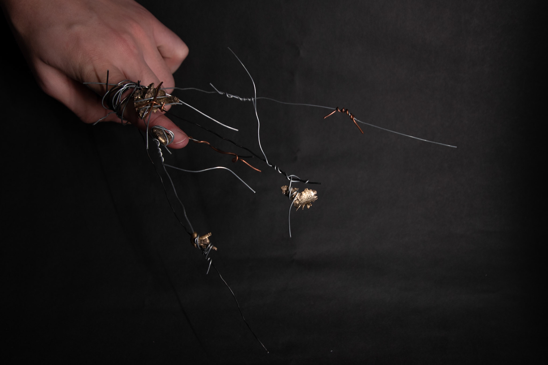
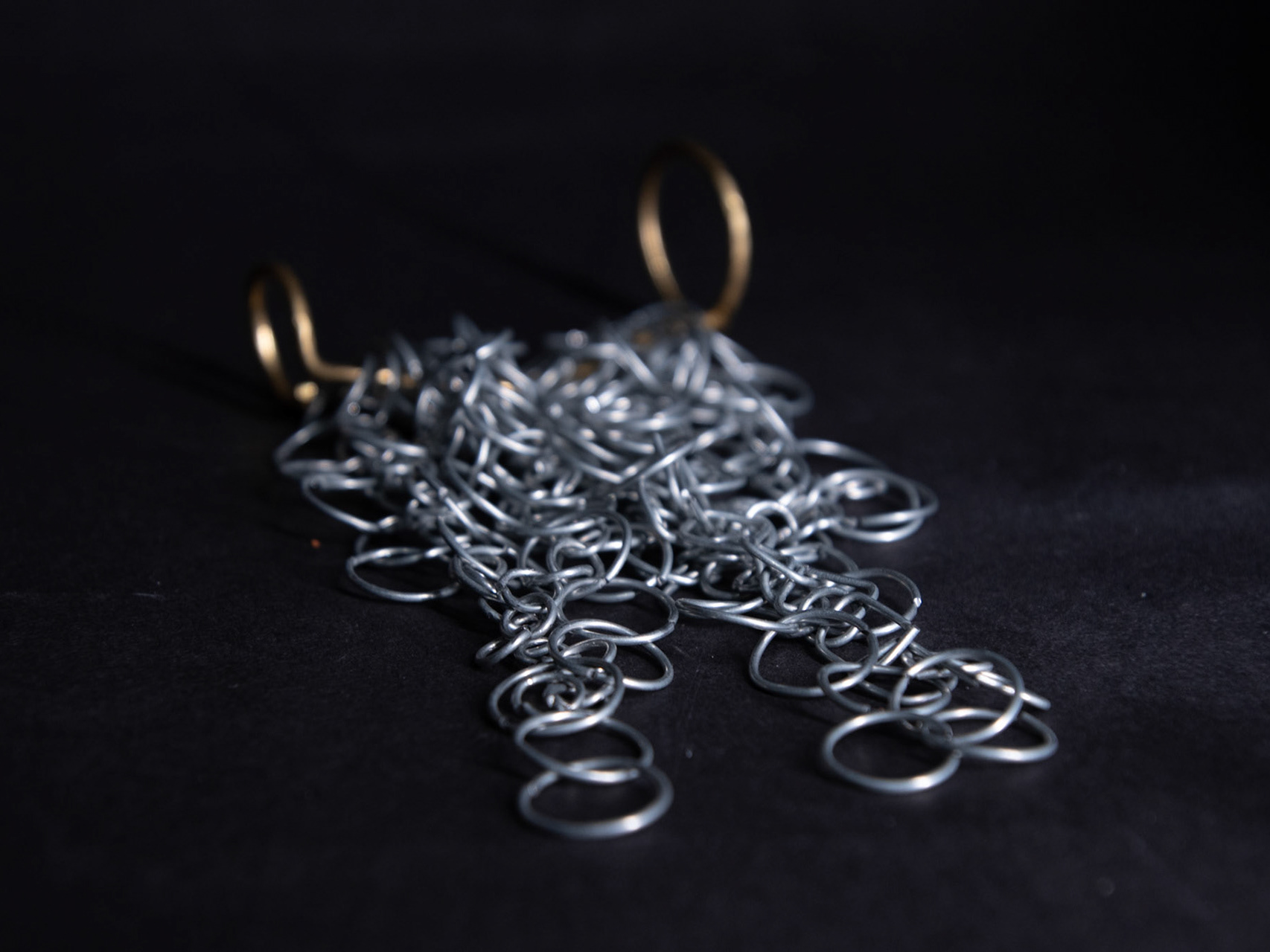
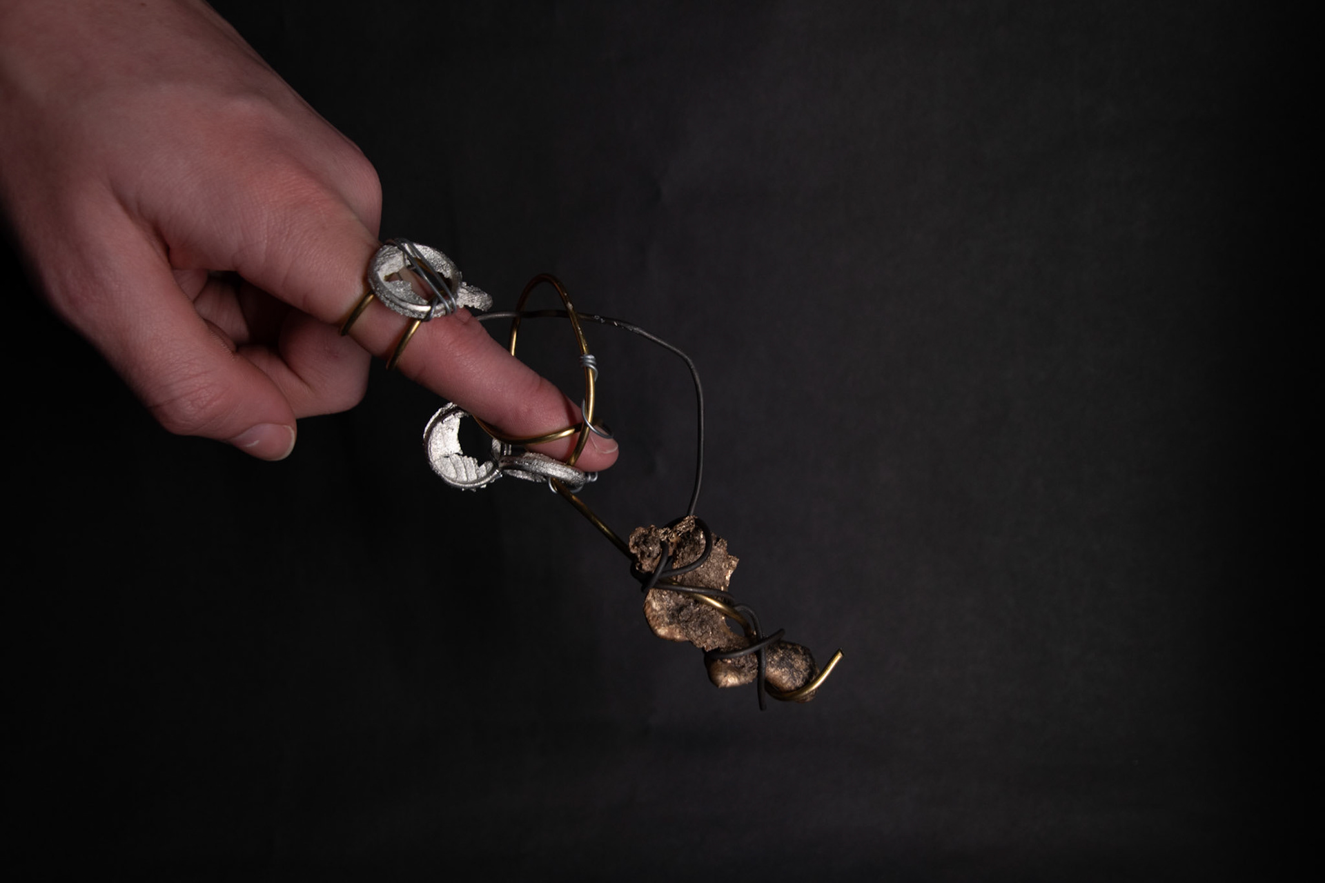
Exploring the brutality of angrily pointing through wire wrapping. Addition of bronze casting scraps adding weight, putting more emphasise on the wearer of their actions.
Investigating the effect of visual weight and the wearer using repeated and varying sized, handmade chain. The two rings hold the finger in a fixed position and the curved bar places the chain in a cluster when worn pointed horizontal.
Left:
I wanted to create a ring using the cuttlefish castings from the workshop. I designed a wire wrapped and casted element ring, exploring weight and texture. The base support of the ring is 2mm copper wire twisted around the finger to imply chaos of angrily pointing. The casting elements place a lot of weight on the wearer making them more aware of the action.
Middle:
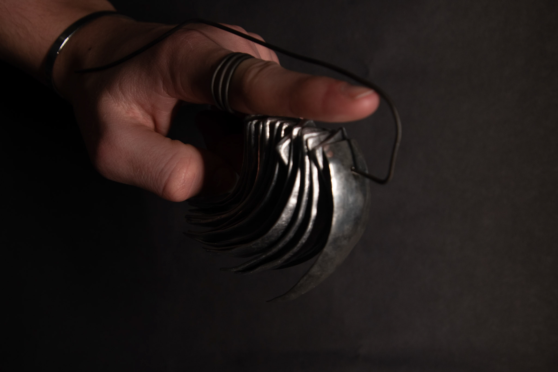
Exploring the effects of weight from my previous designs I focused on repetition alongside the motion of the finger. I wanted to synthesise the curve the finger made during the movement from fist to point with the weight that the motion puts onto the wearer. I created a series of same-sized pieces of aluminium that were hammered against a moulded piece of wood. I varied the thicknesses of the metal to create disorder. The thicker material required more force to be formed resulting in further differences in marks from the ball peen hammer. All the rectangles sit on black iron binding wire that curves around the finger resting on the tip, putting further weight on it, and wraps around the back of the hand. The aluminium pieces rotate around and create noise as the wearer moves.
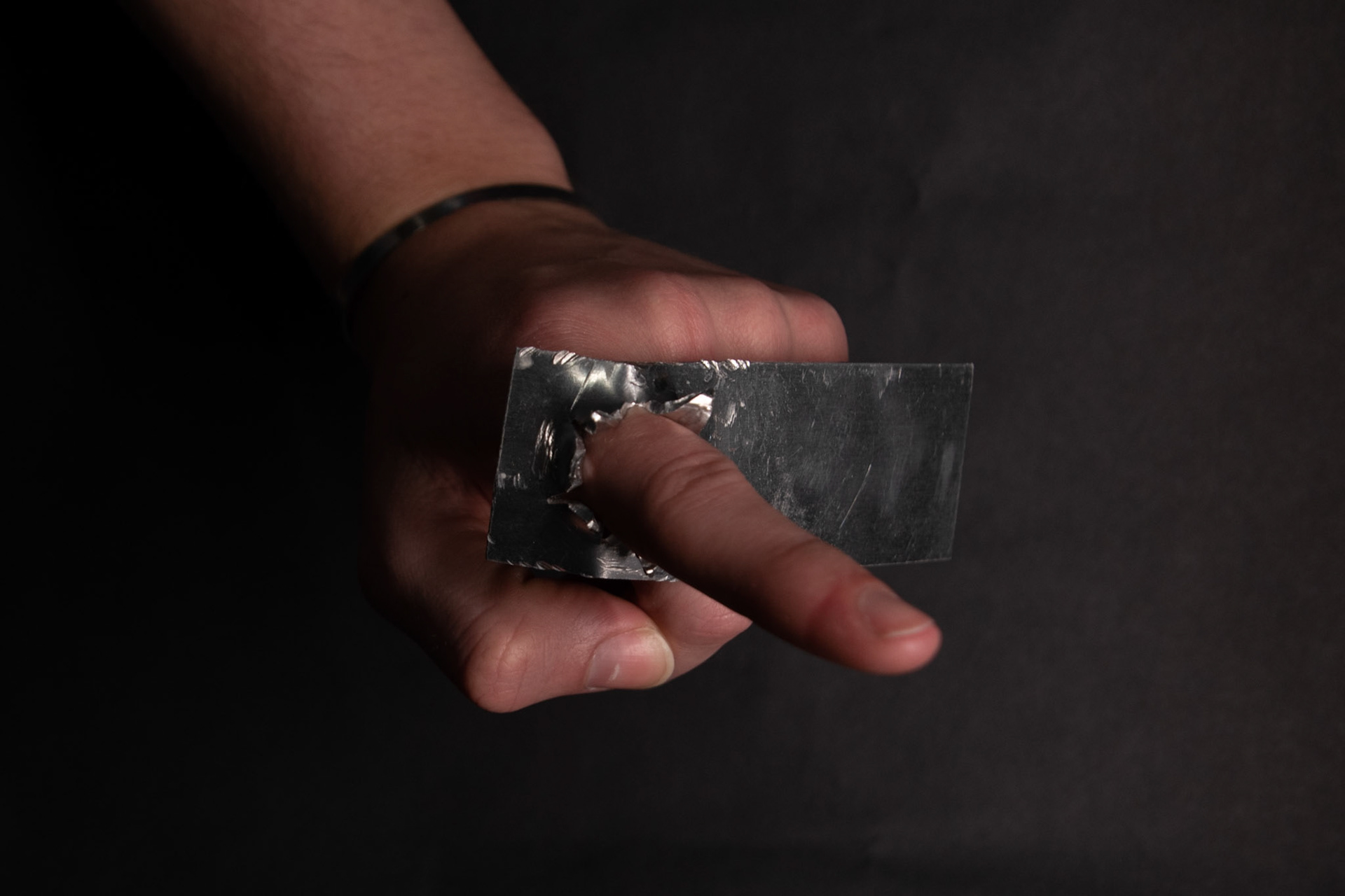
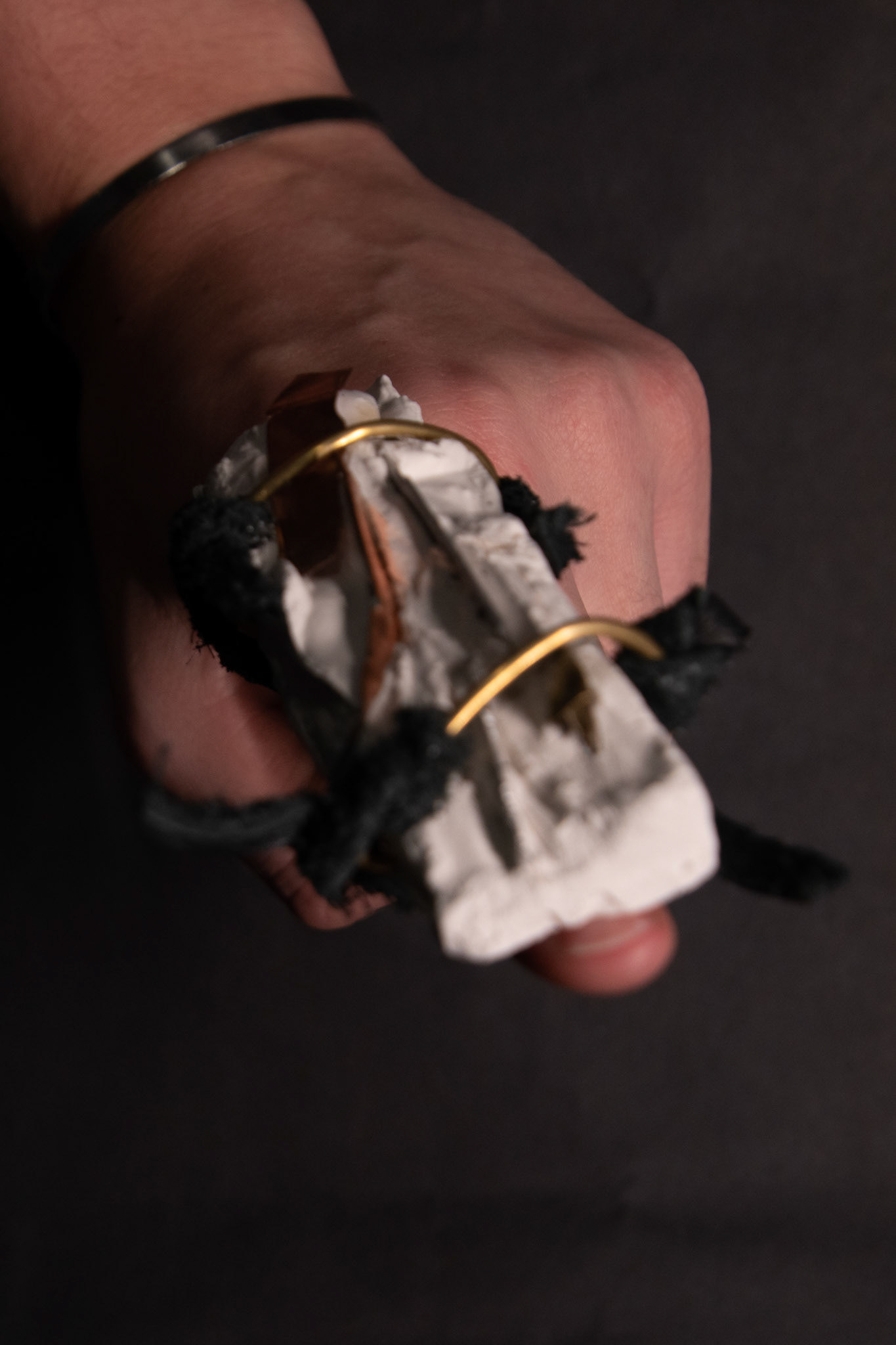
Right:
Investigating the aesthetic of harshness and anger through imbedding shards of metal into plaster. I viewed this piece as a clunky rejection of traditional stone setting, where there is an emphasis on delicately embedding stones into metal that comfortably sits on the finger. I decided to cover the whole finger in one large block. I used brass to create loops for rough-cut, fraying leather to be knotted onto it, acting as rings to go around the finger.
As previously done I built this piece with no set design in mind but a vision to use the techniques of wire wrapping and the shards of metal that were set in plaster to create a savage aesthetic of pointing.