Contemporary artist research
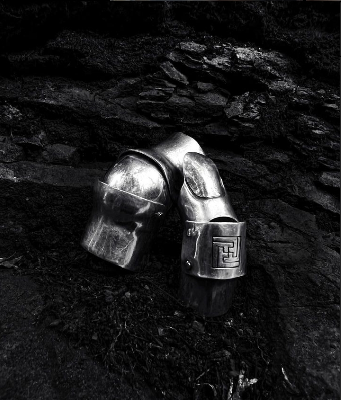
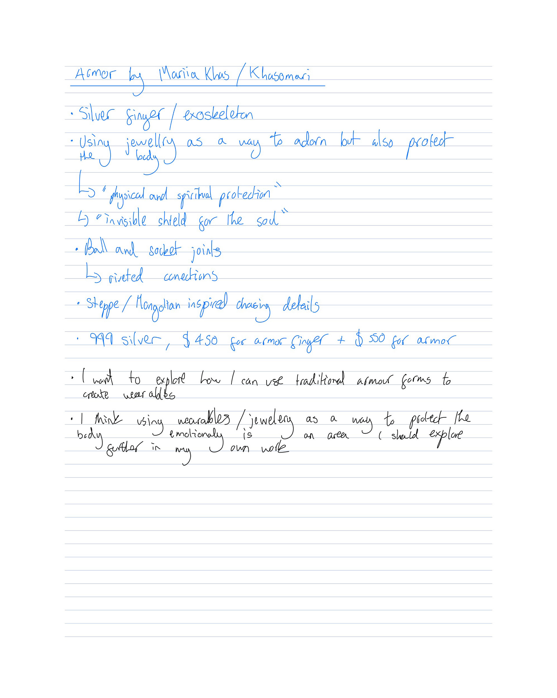
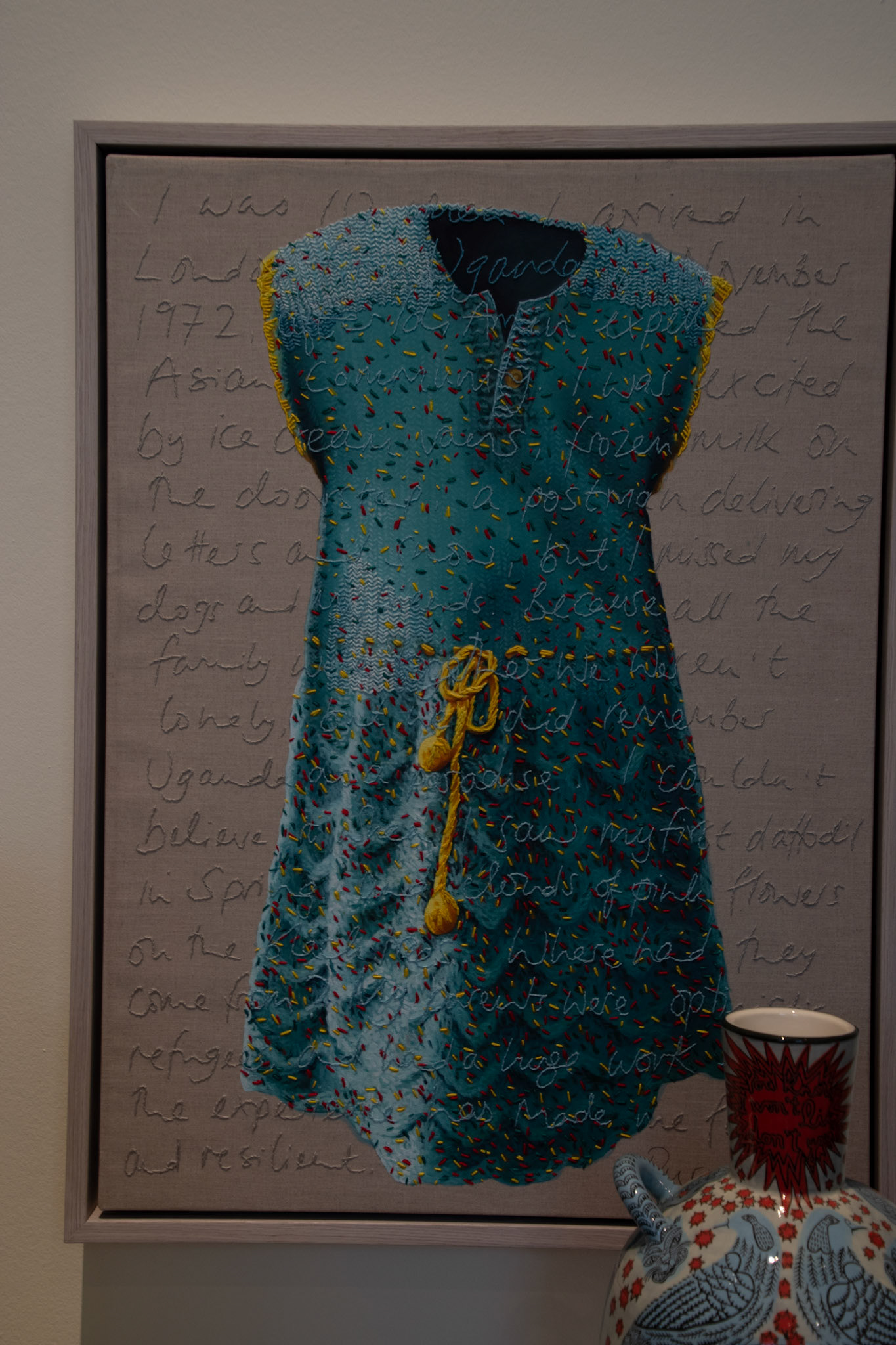
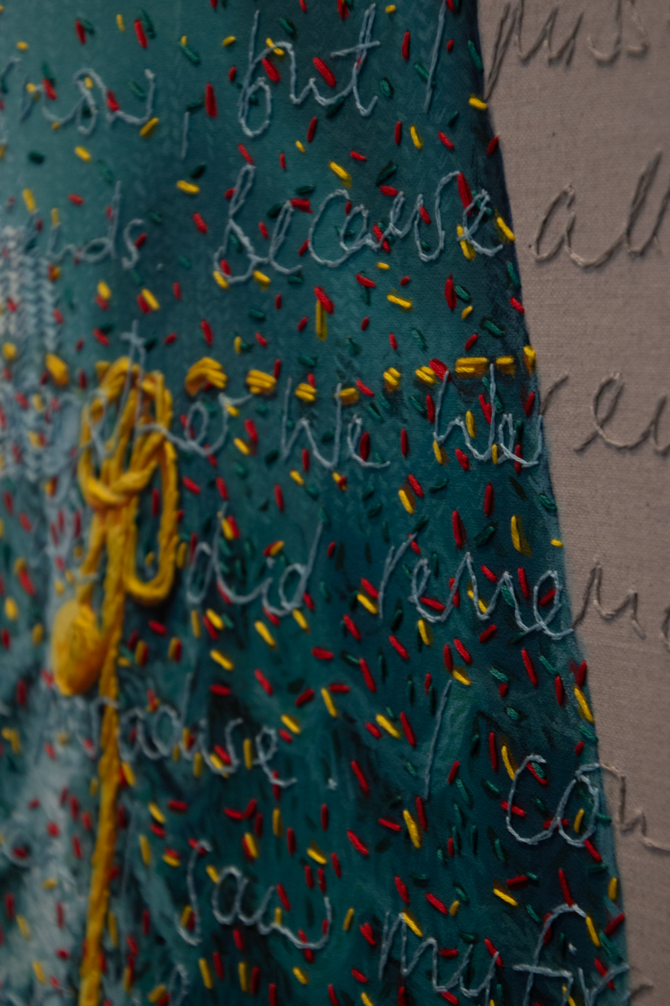
Khasomari

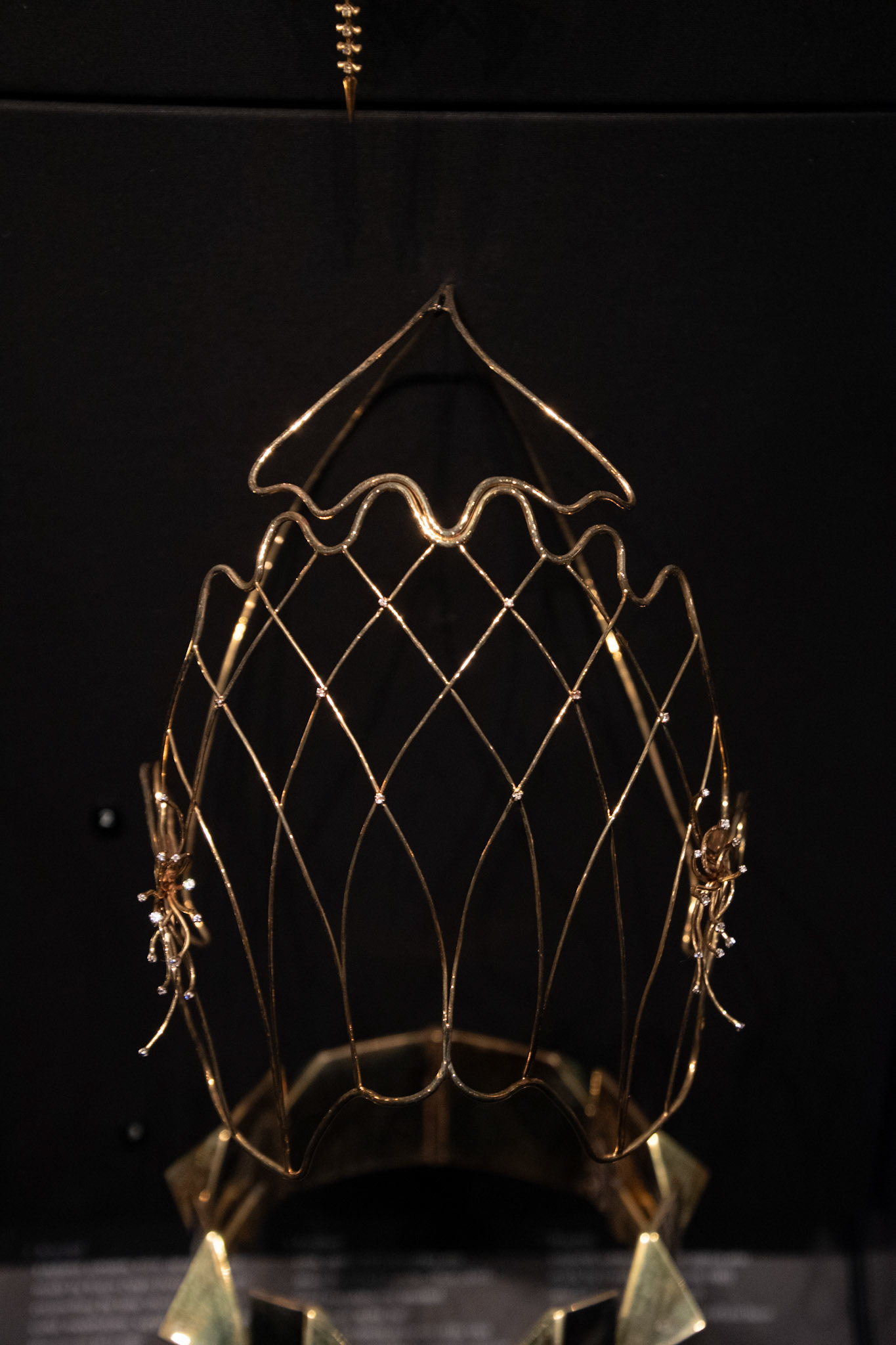
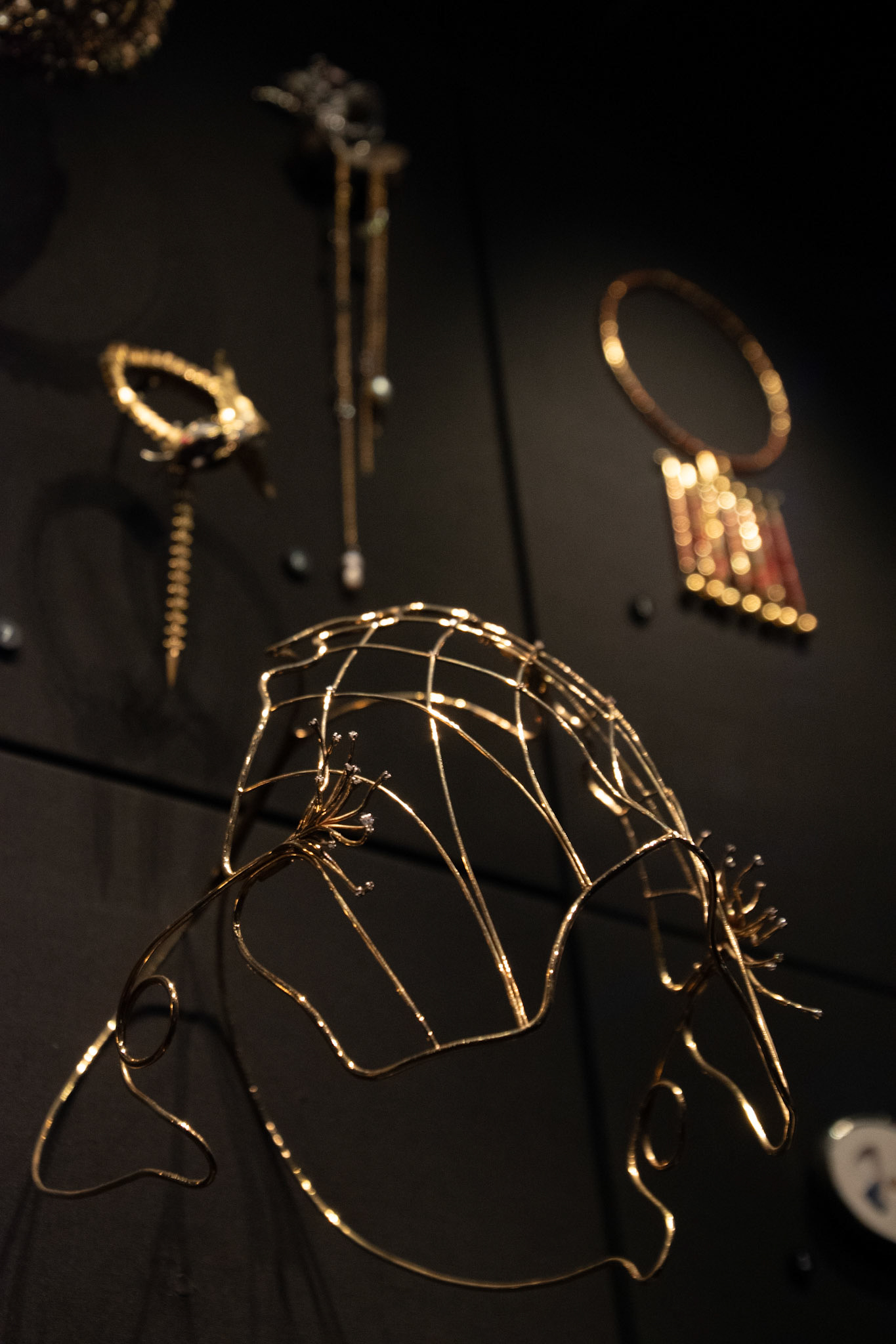
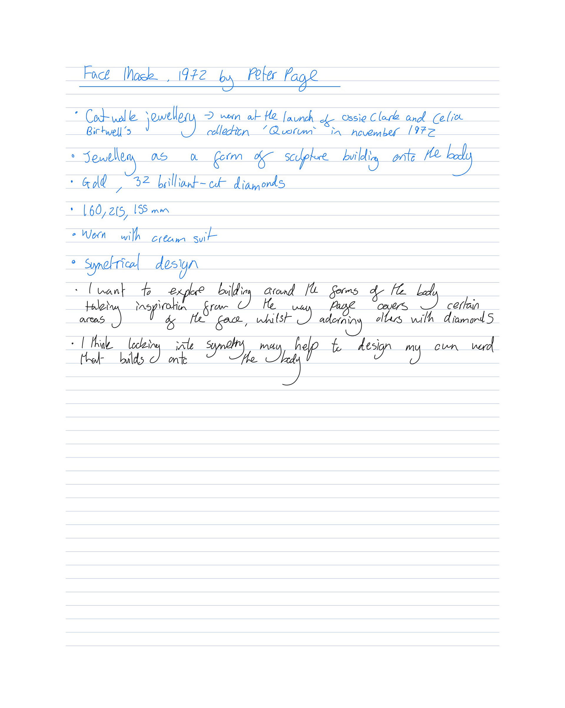
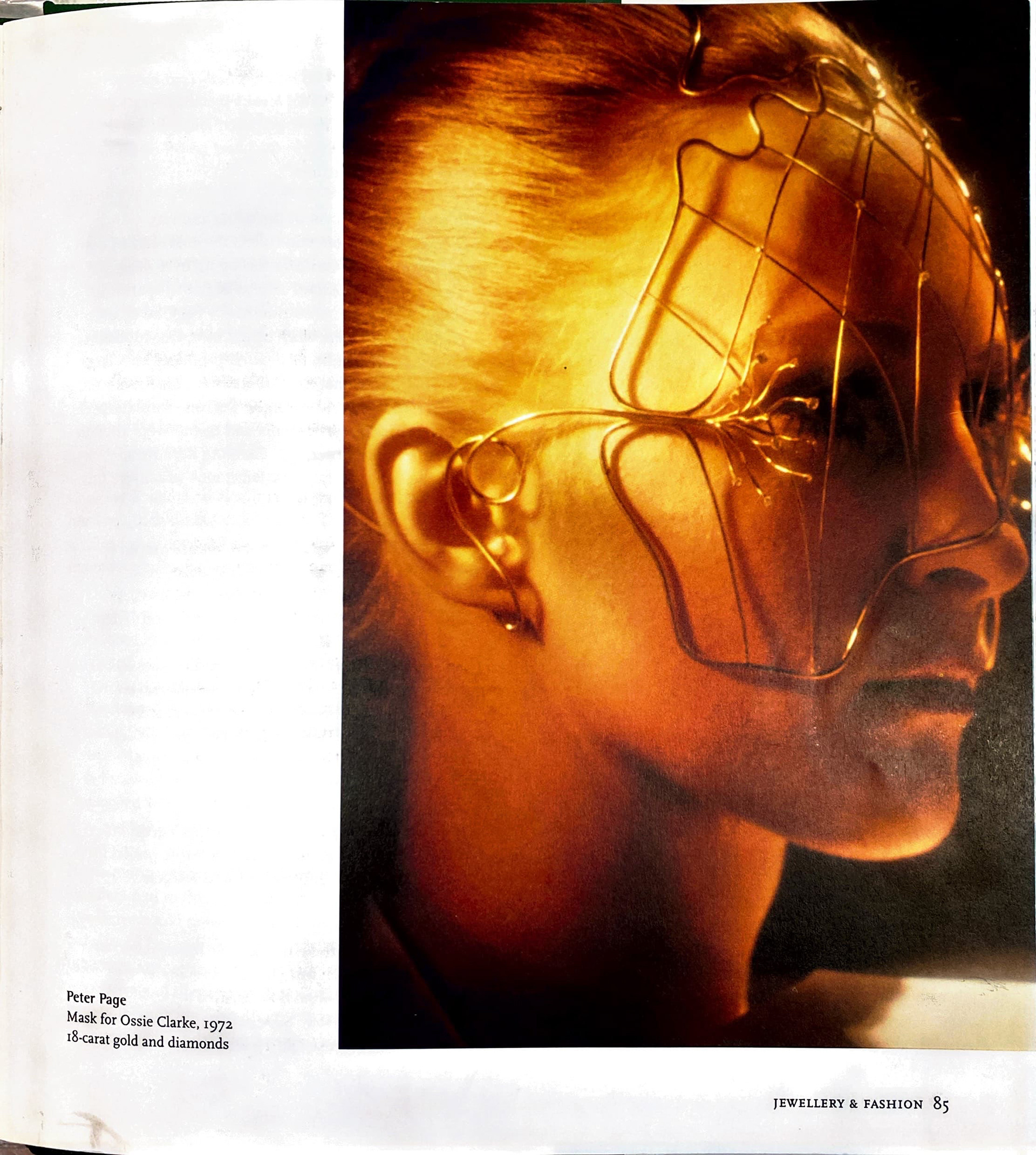
Peter Page

Own images from V&A
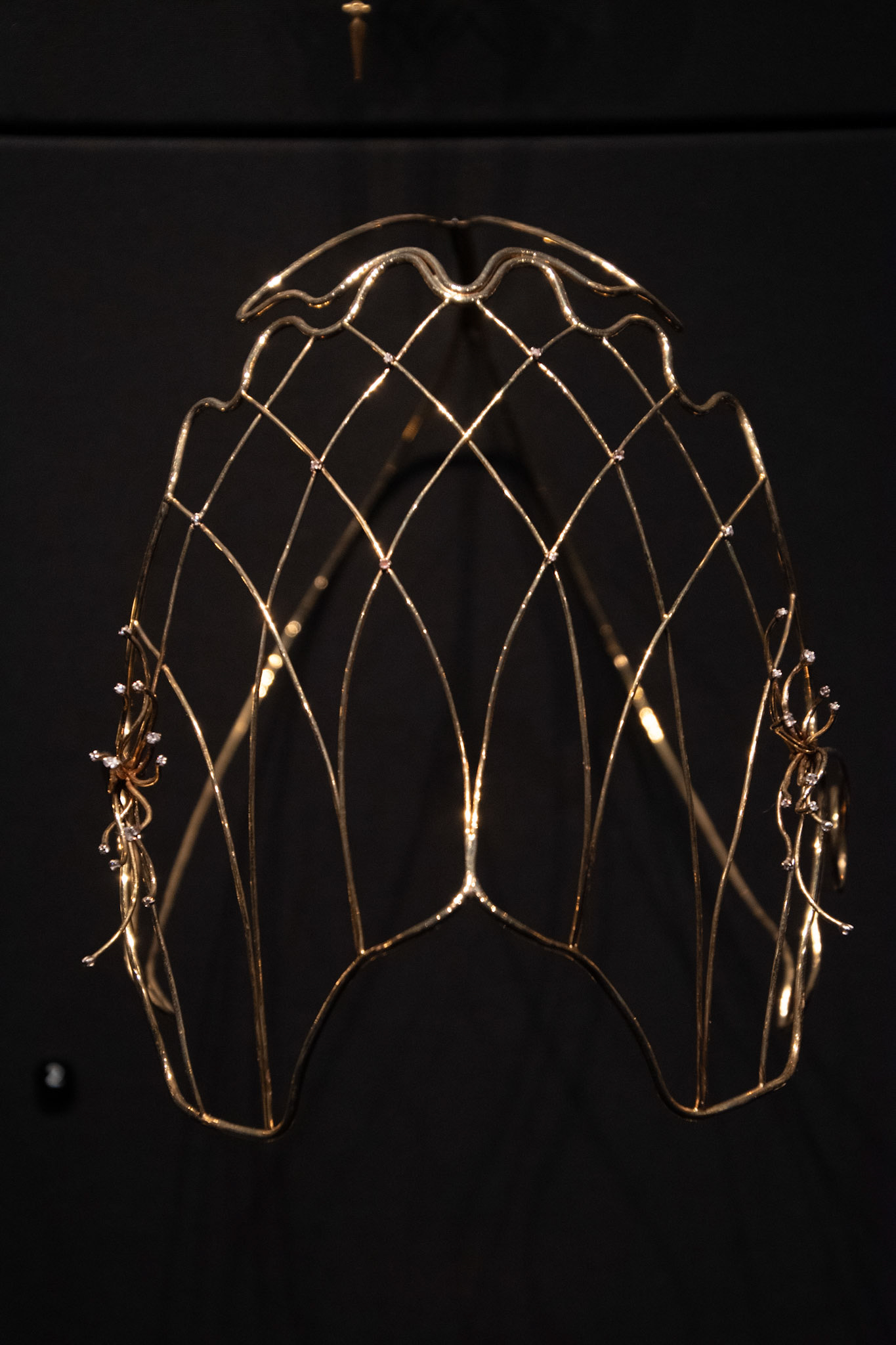
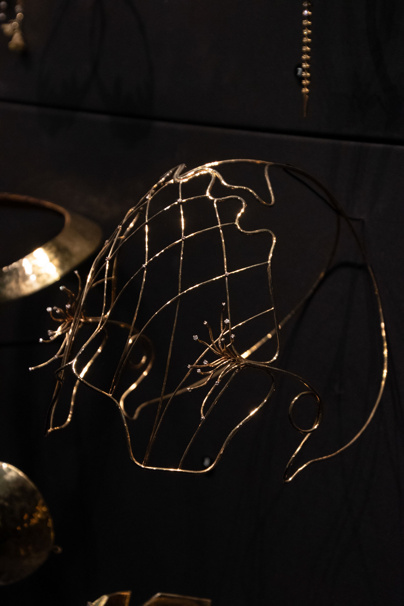
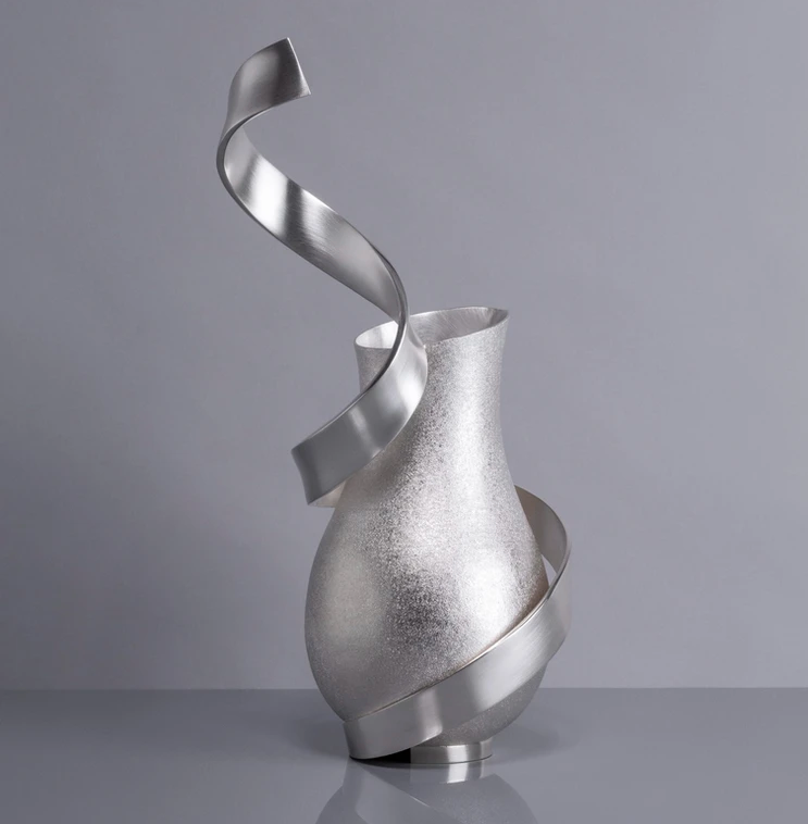
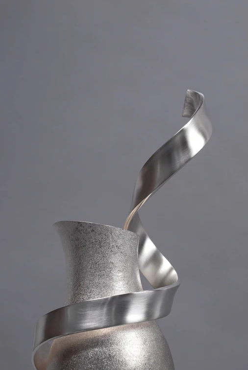
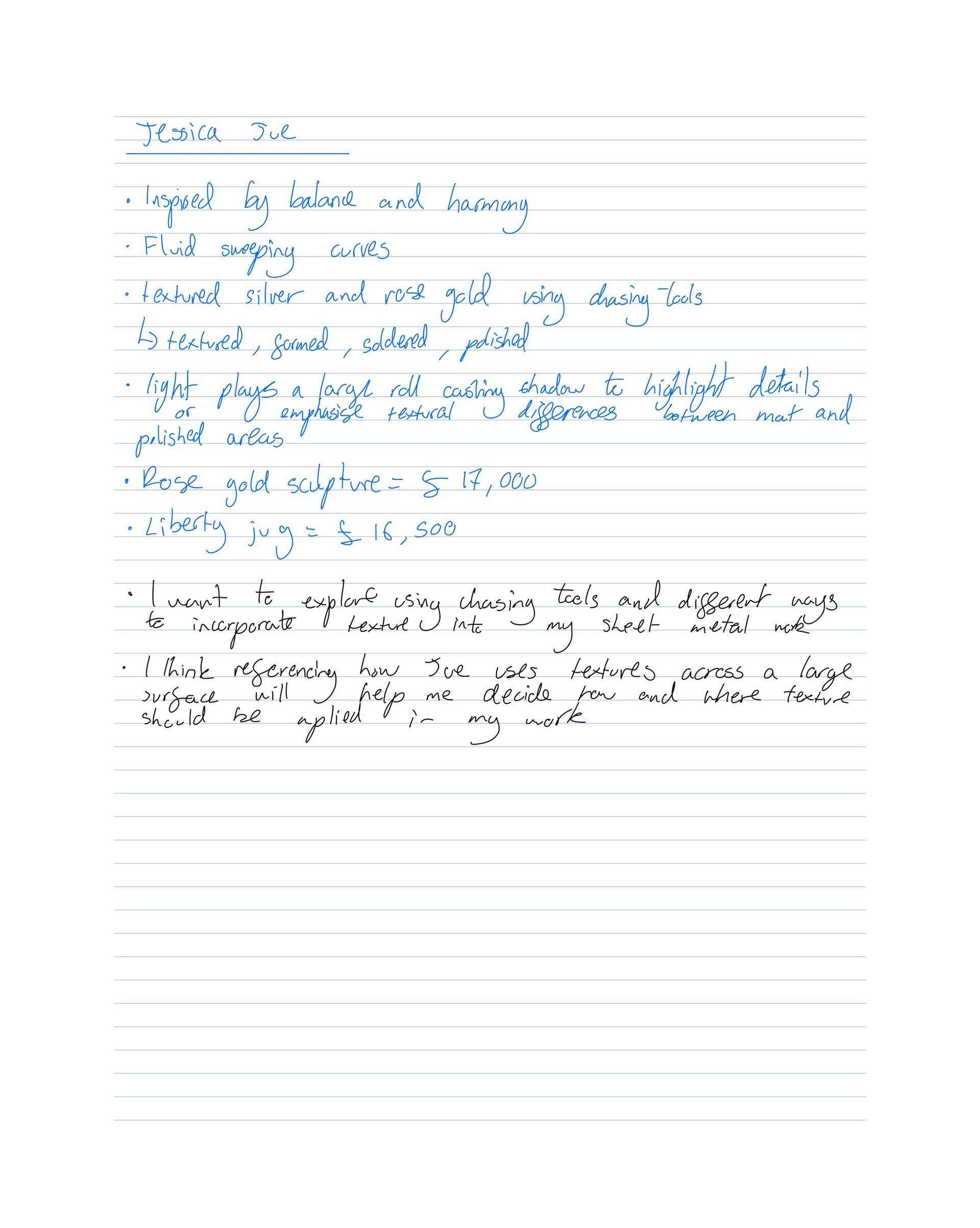
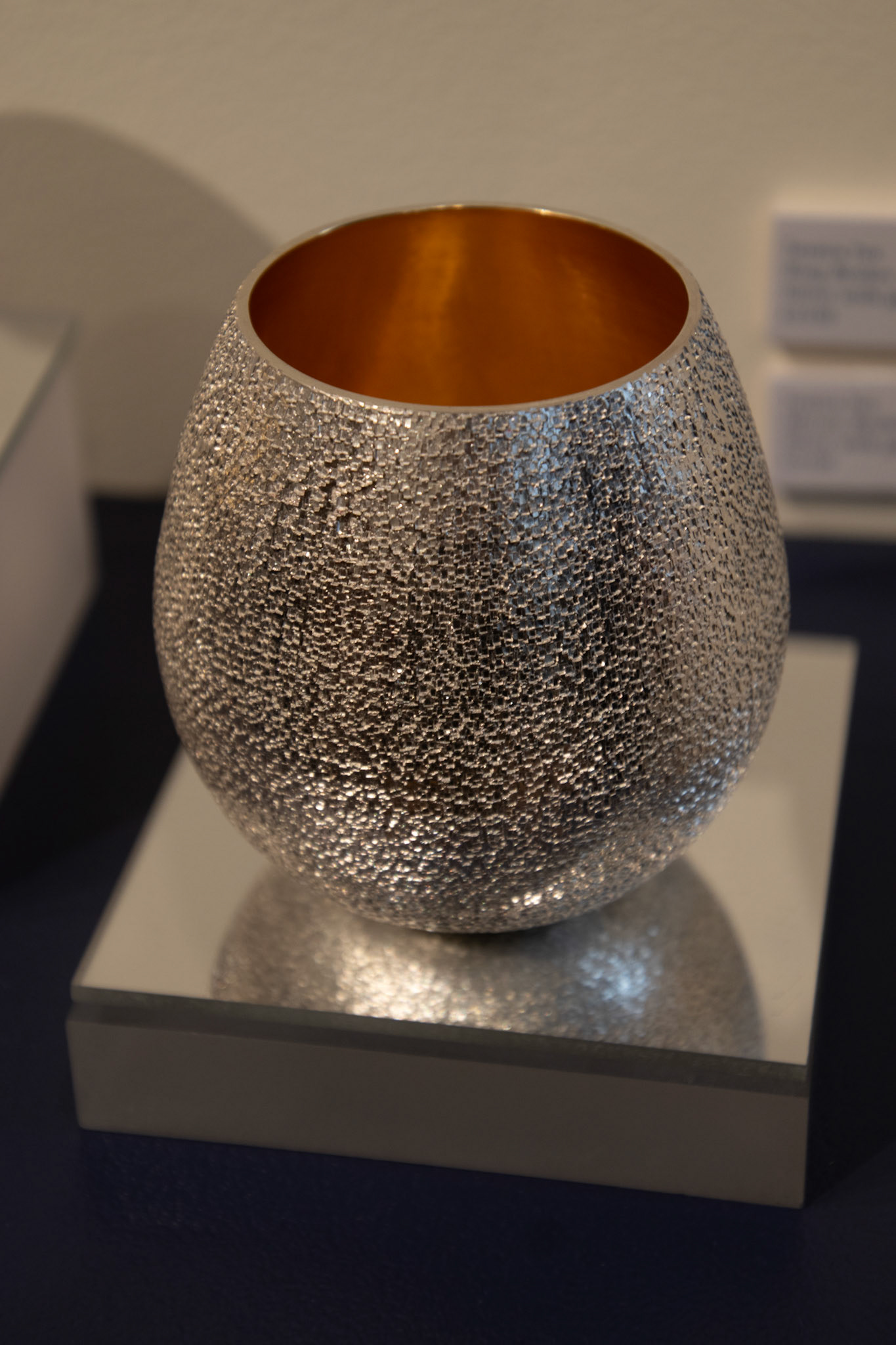
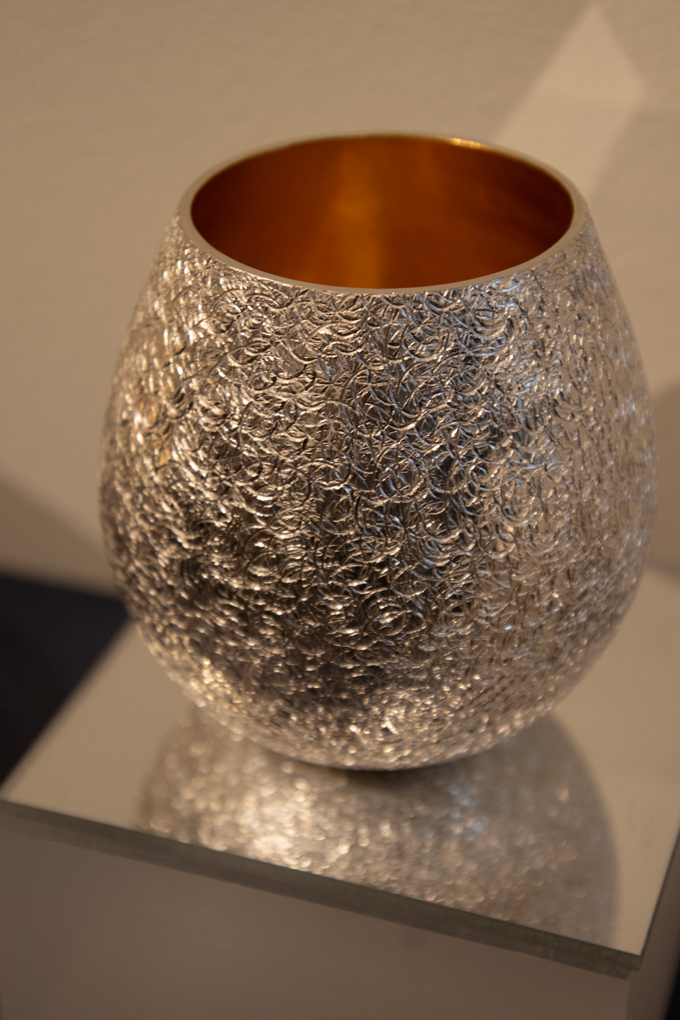
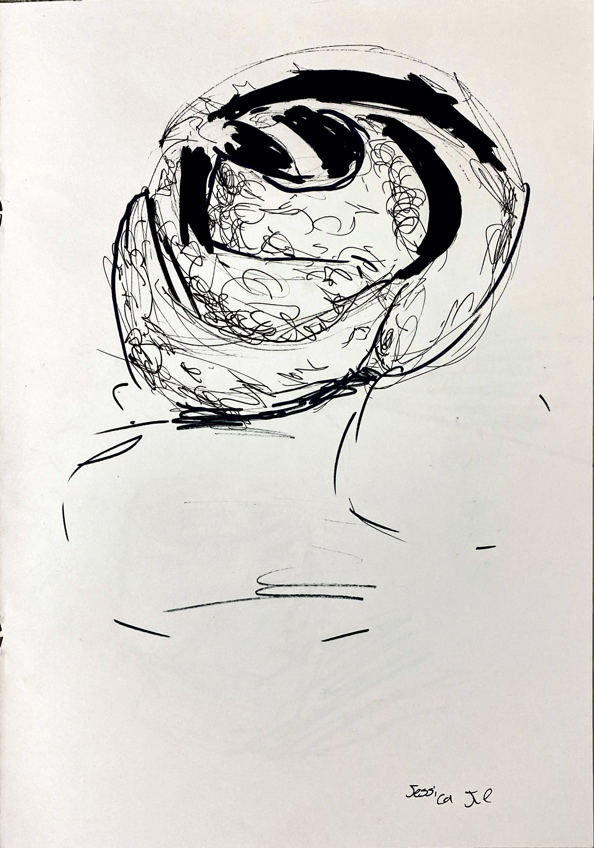
Jessica Jue
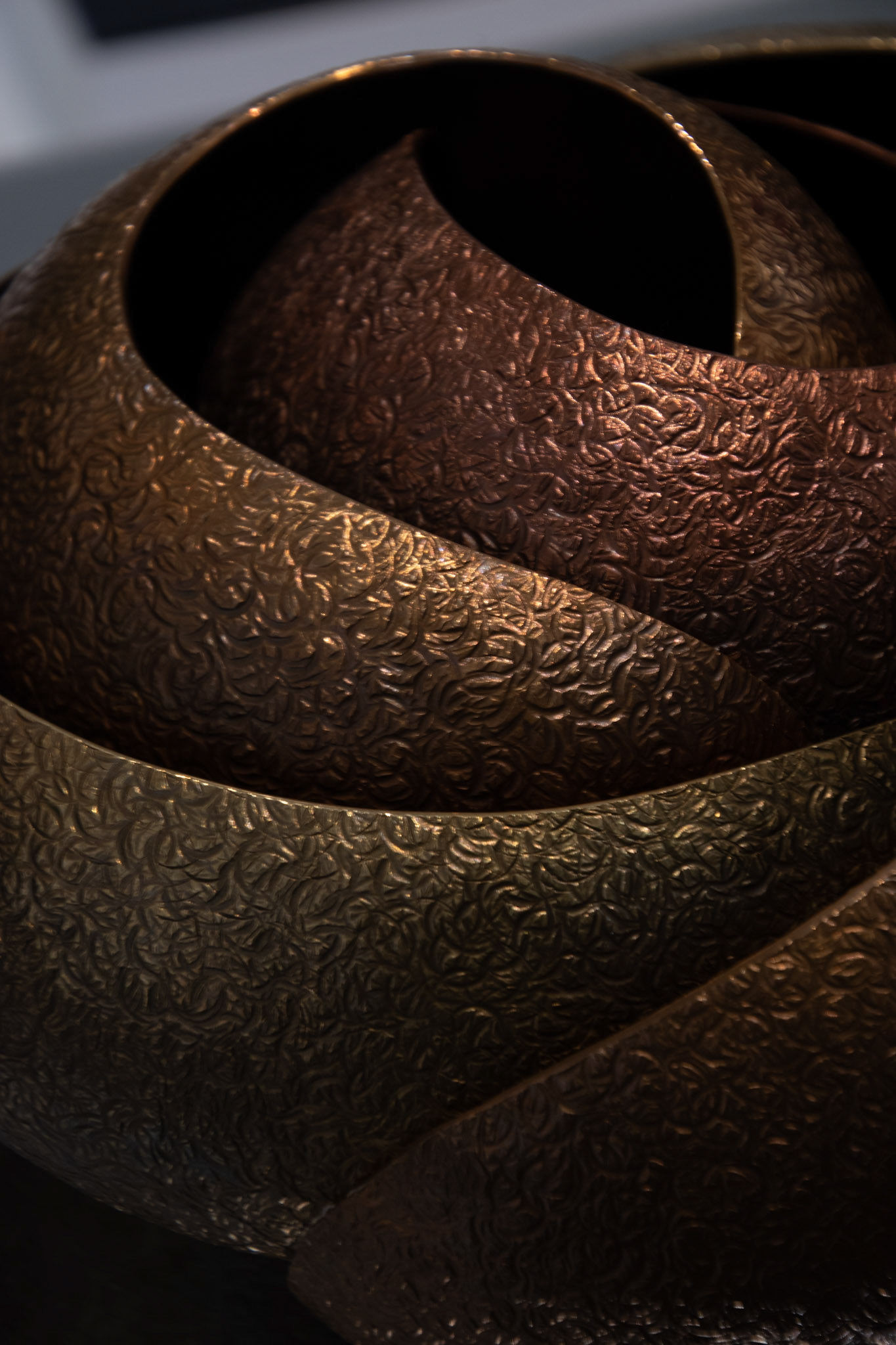
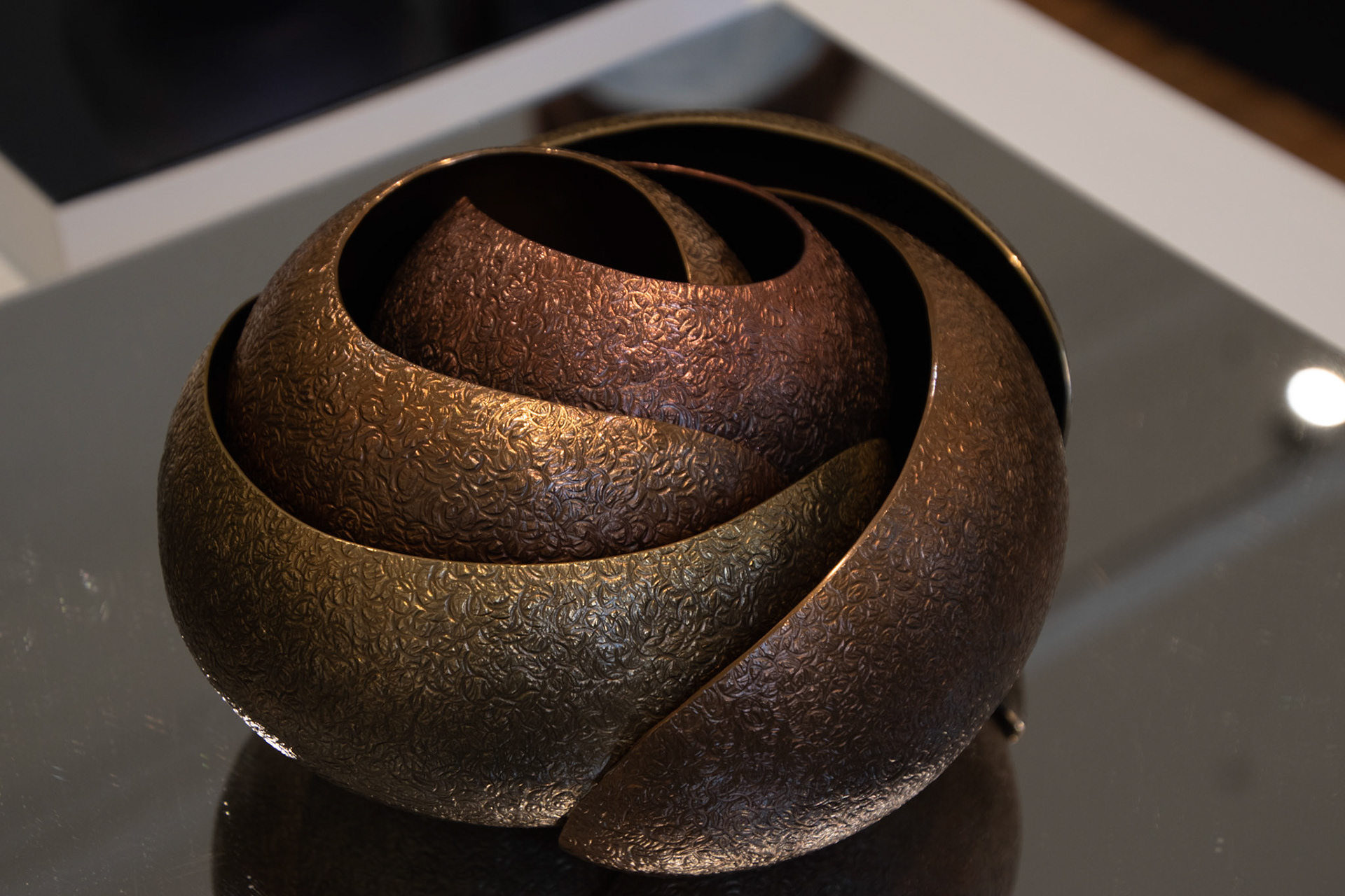
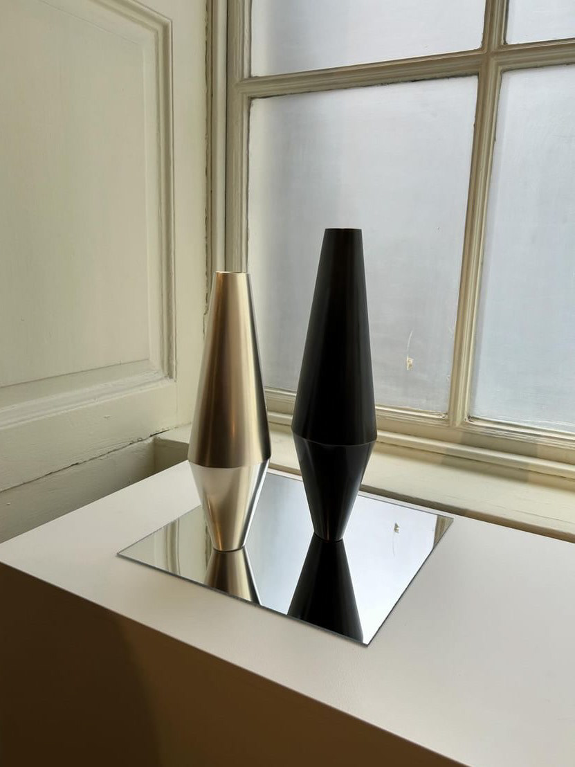
Own images from Collect 2024
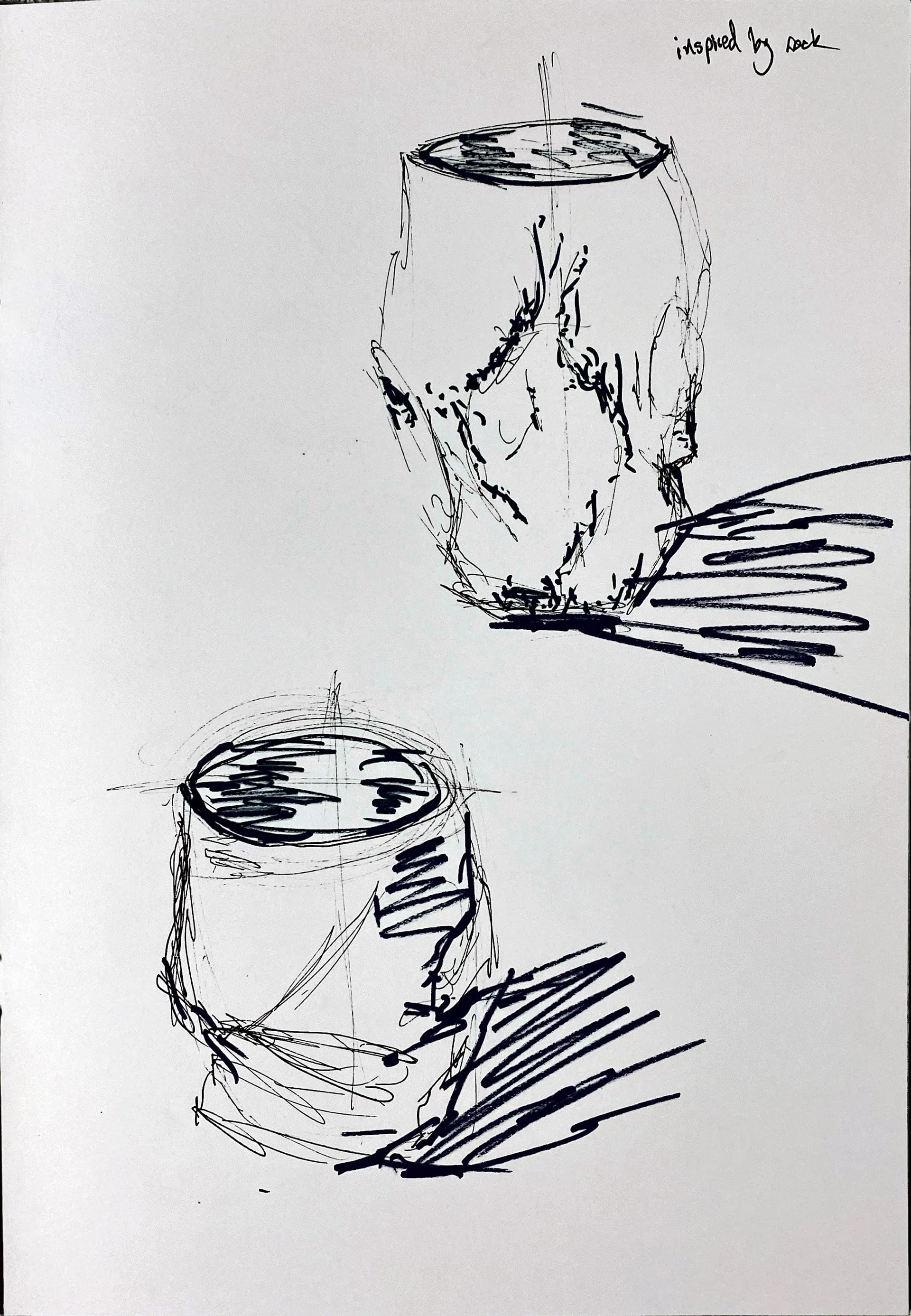
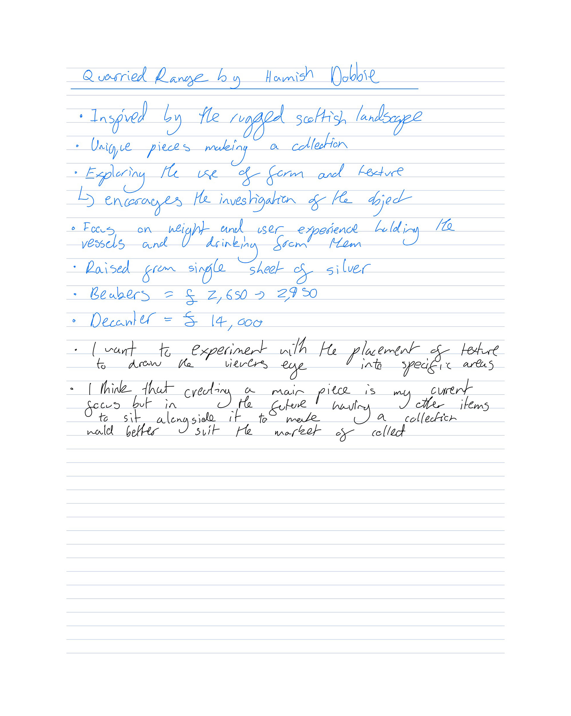
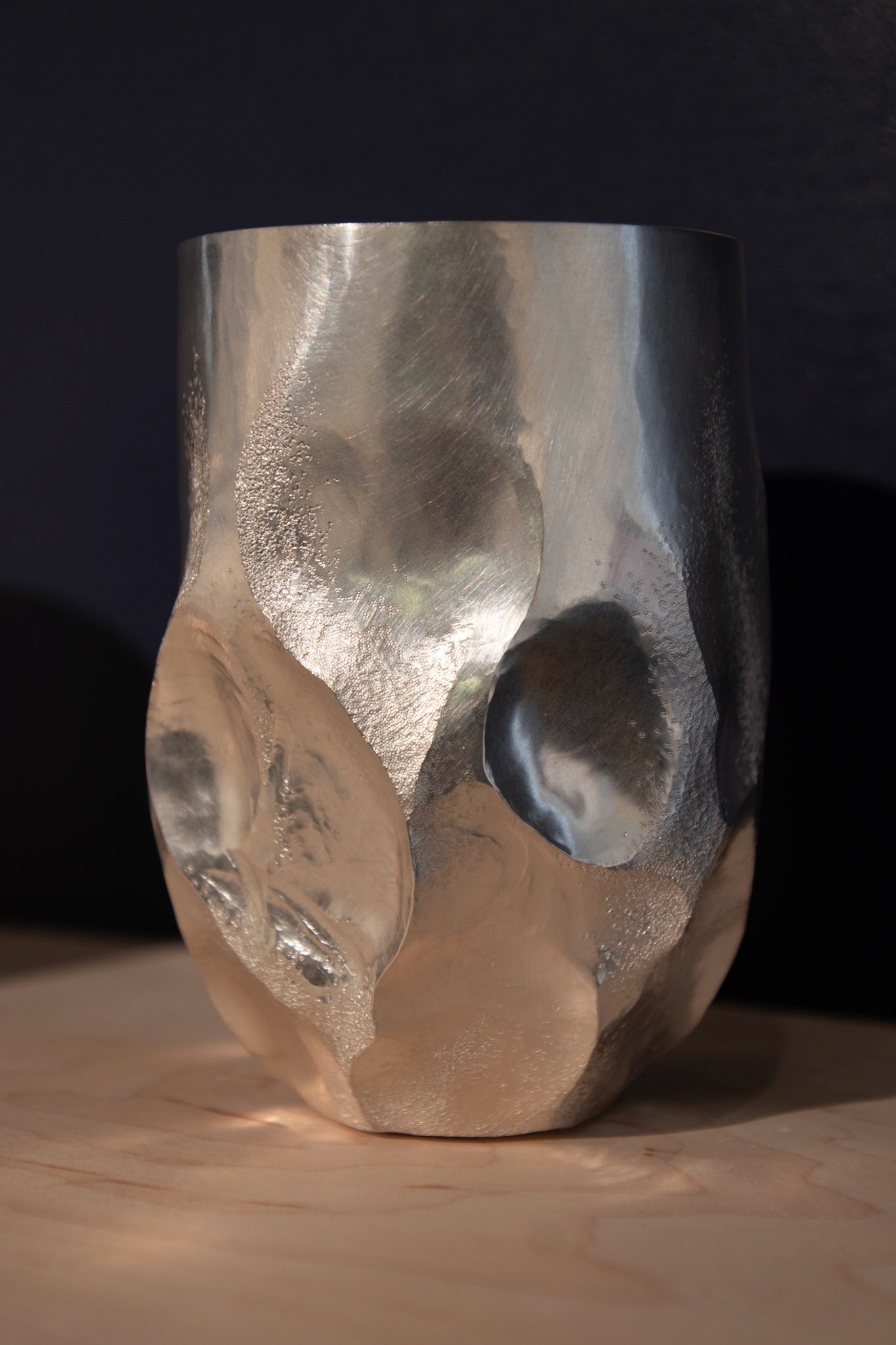
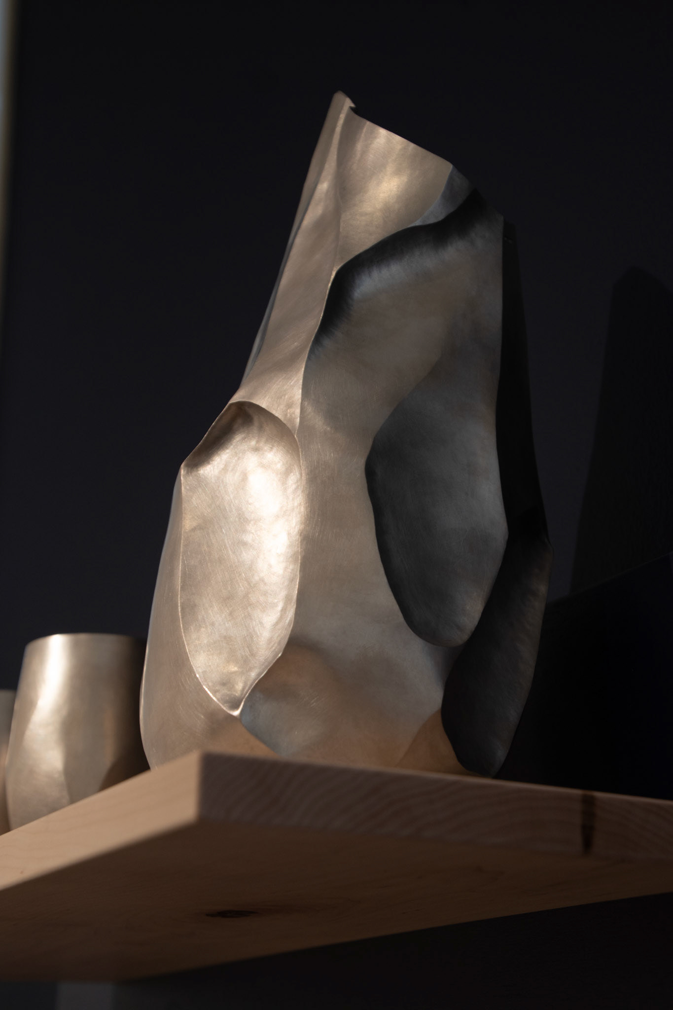
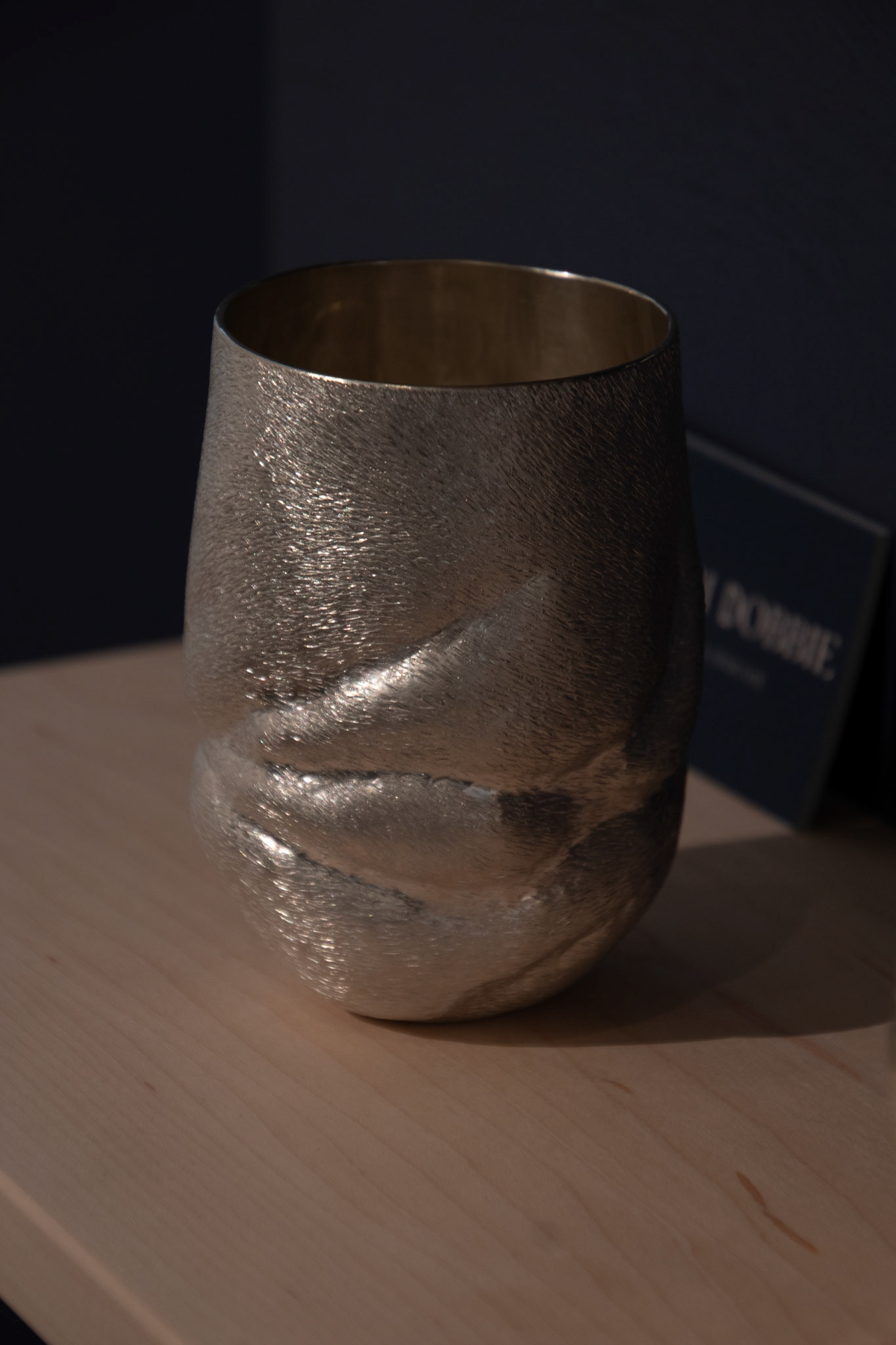
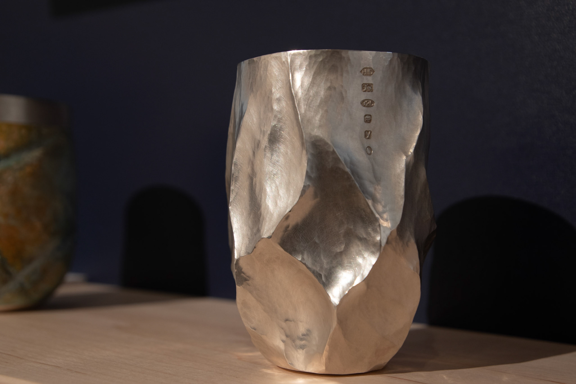
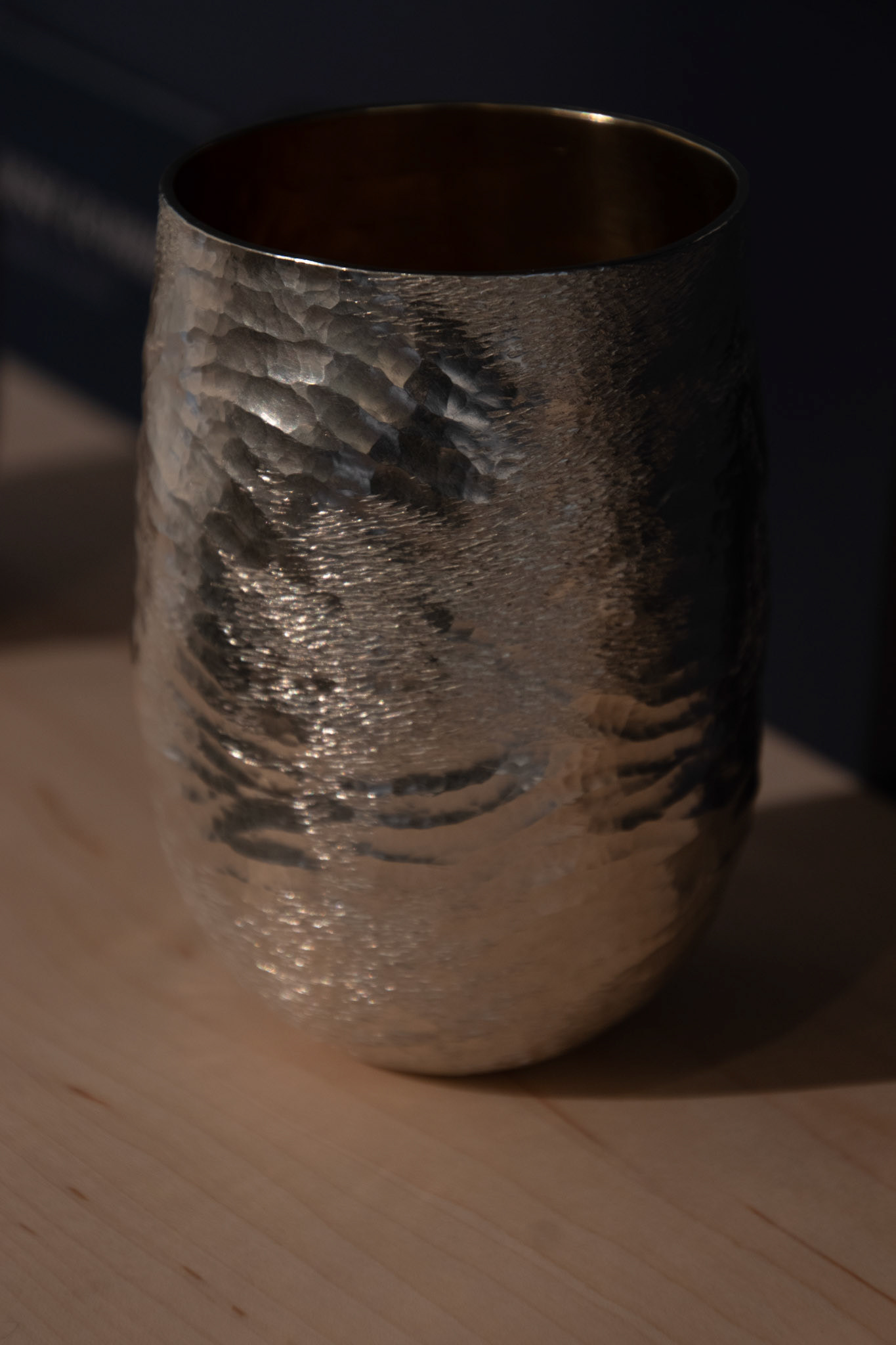
Hamish Dobbie
Own images from Collect 2024
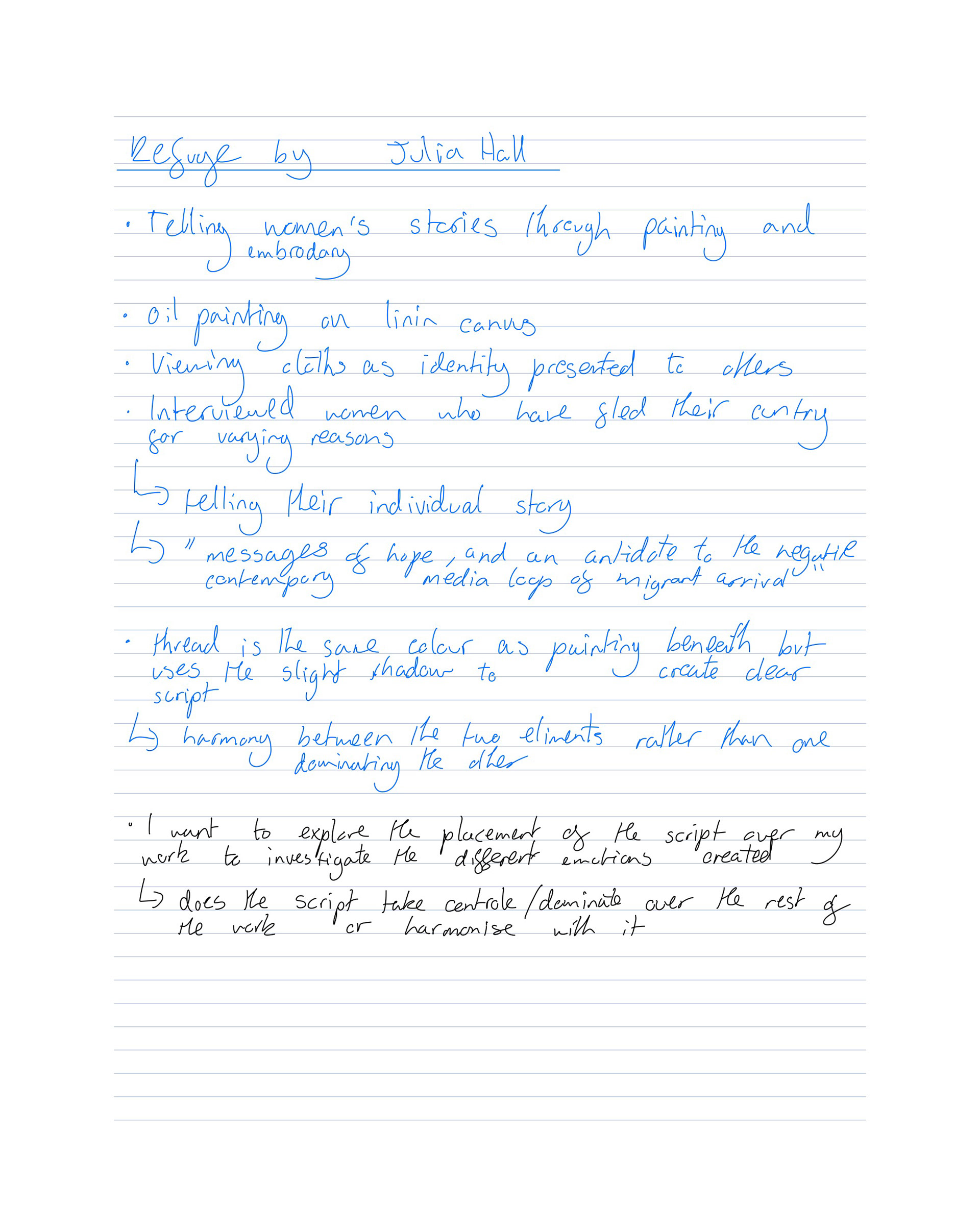
Julia Hall

Own images from Collect 2024
Reading into European Armour
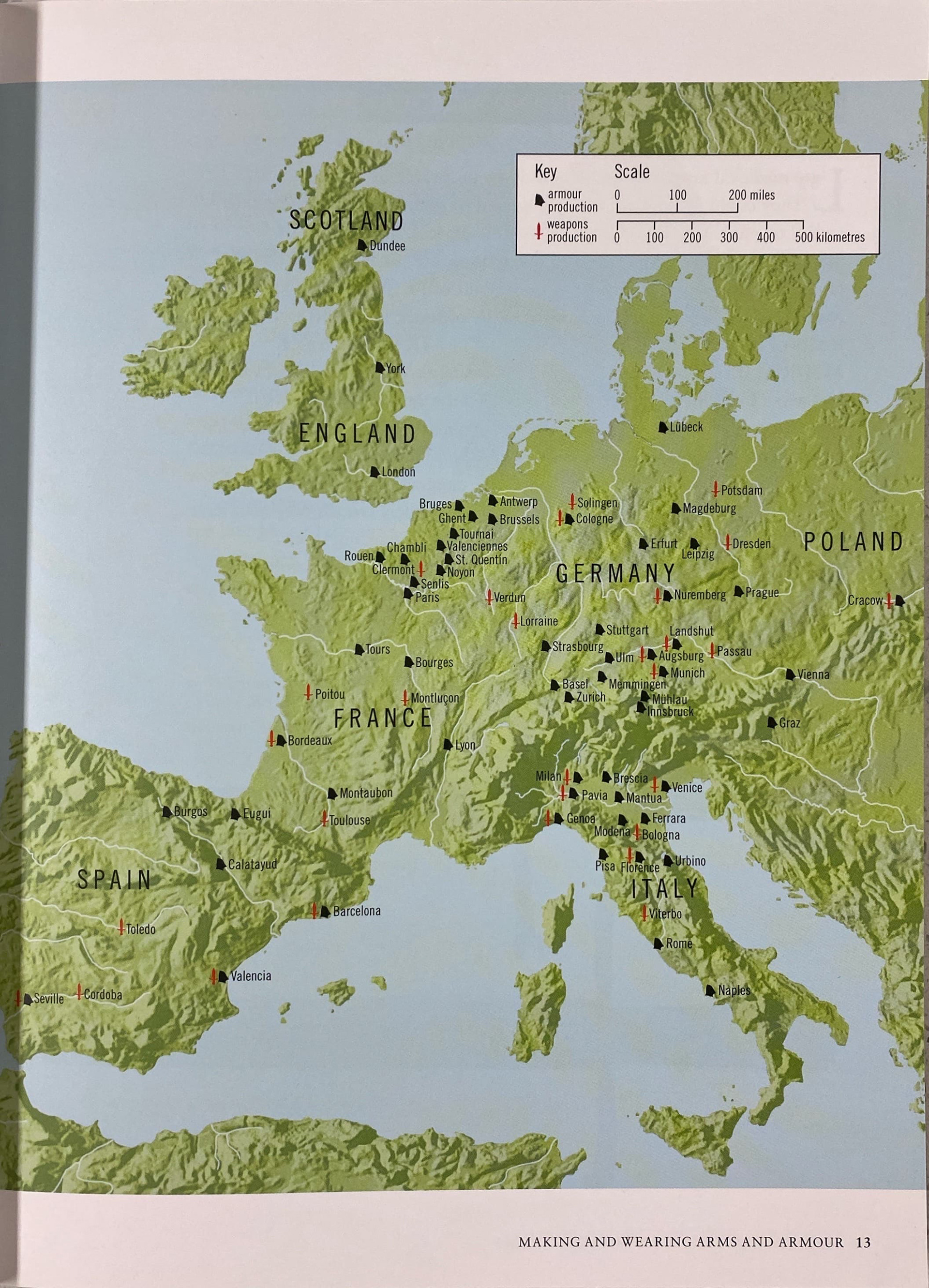
The map showcases the high density of armouries in Germany and Italy compared to the rest of western Europe in Medieval Europe. This was heavily influenced by the availability of raw materials needed in the manufacture of arms and armour.
Arms and Armour of late Medieval Europe:
· Marks were put into armour to show the town it was made in as well as meeting the approval of the Town Guild and the arsenal it belonged to
· Marks were also placed on the armour to grade them after testing, such as archery impact
· Inscriptions in armour were often religious phrases
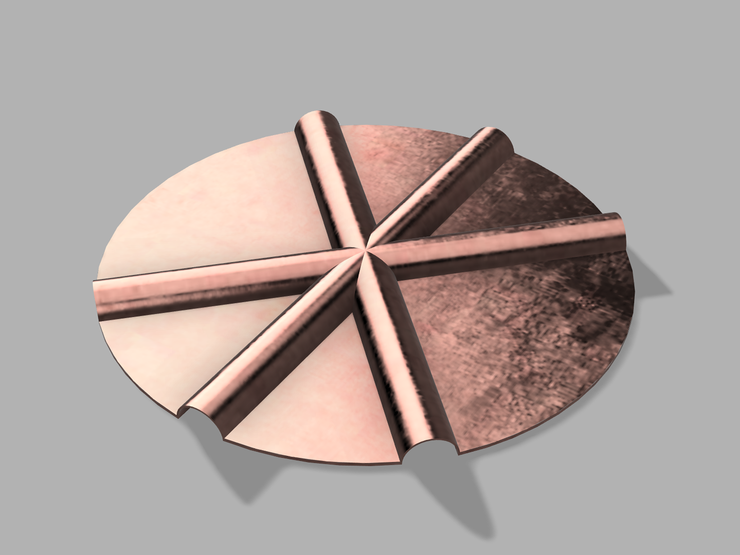
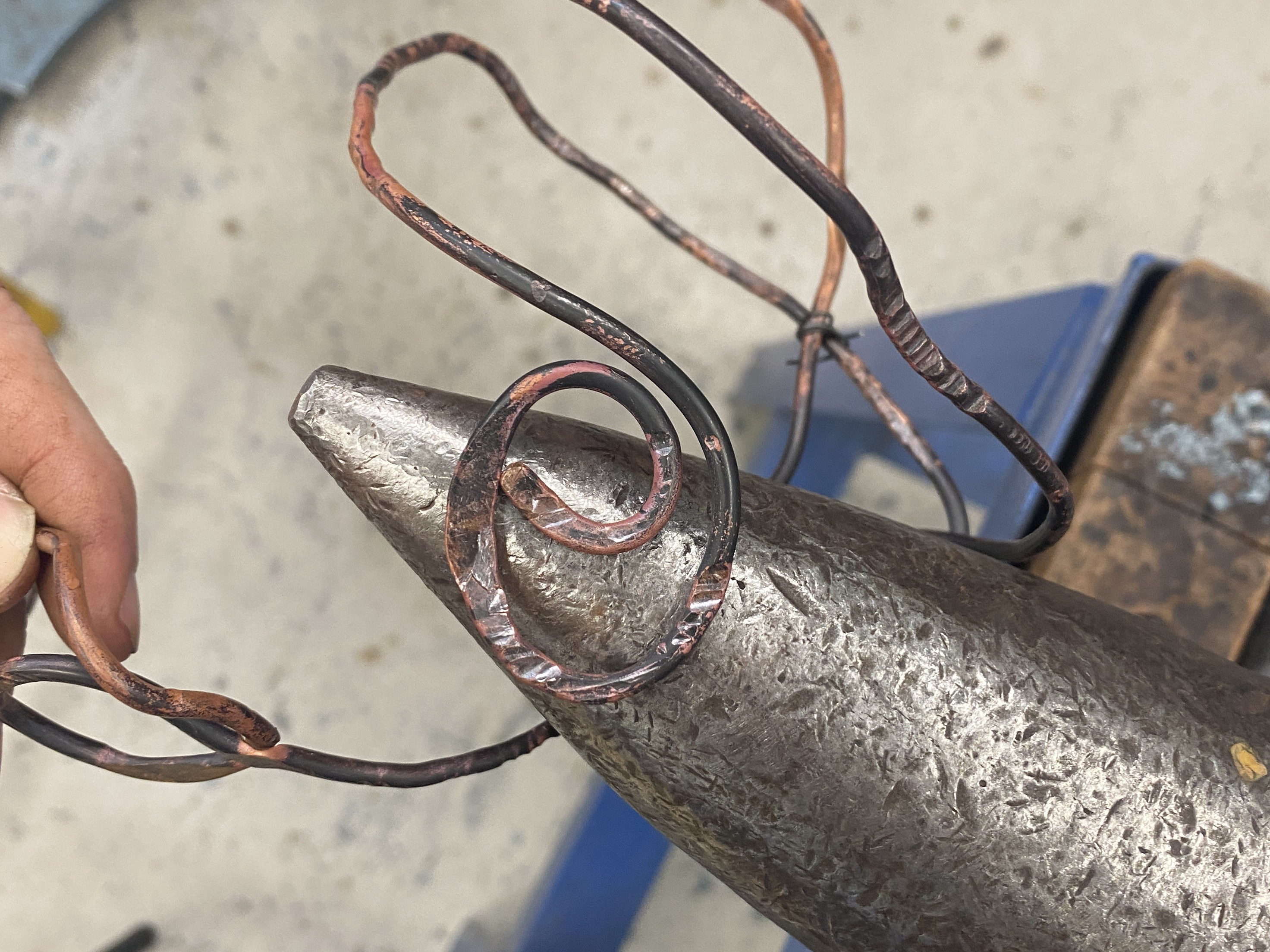
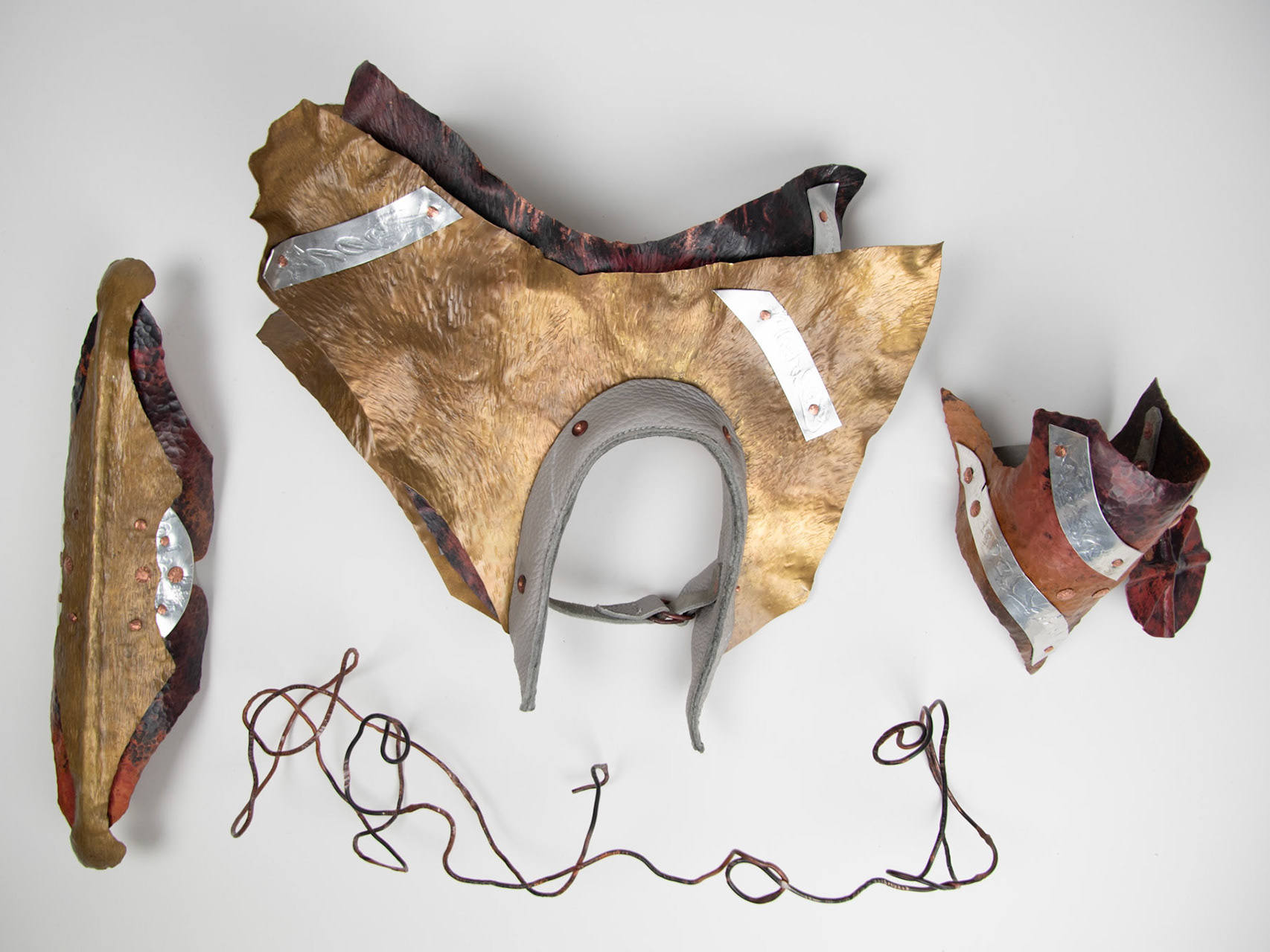
· In 14th and 15th centuries, copper alloyed boarders were added on the edges of plate armour with decorative details such as engraving which was a symbol of wealth
· In the 15th century additions were made to helmets of fabrics and gemstones
· Etching into steel plate came in sometime during the 16th century
· Tournaments began as a form of one on one combat training in the 11th century but transformed into specialised entertainment
· 13th century single combat jousts for war used sharp lances, and jousts for peace used blunt ones
· 14th century saw the development of the helmet into a ‘frog mouthed’ design where only a slit was open for the eyes to protect as much of the face as possible
· Over time the left side of the rider was increasingly protected to reduce injuries from the opponents' lances
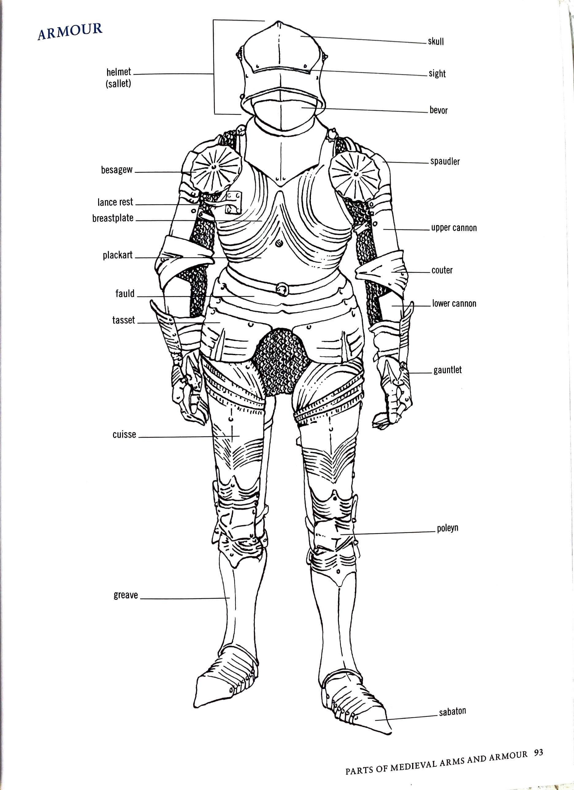
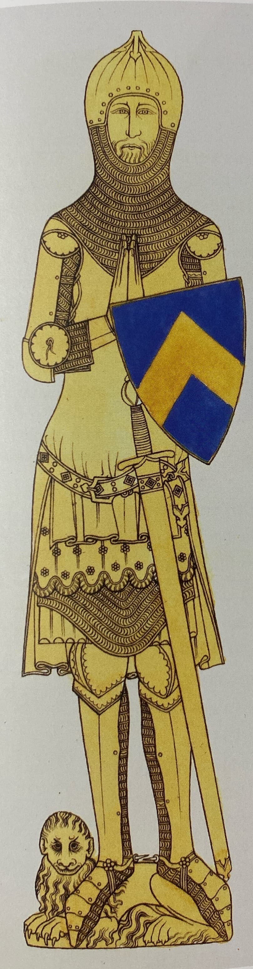
14th century Armour
· Moved from chain to plate armour
· The Hundred Year War and the increasing development of missile weapons such as long bow but importantly the cross bow, pushed the technological shift to plate armour
· Mail armour worked well against slash attacks from swords but less so from piercing stabs from lances and heavy blows could cause broken bones
· Layering of fabric underneath mail and plate provided padding and reduced impact of the strikes
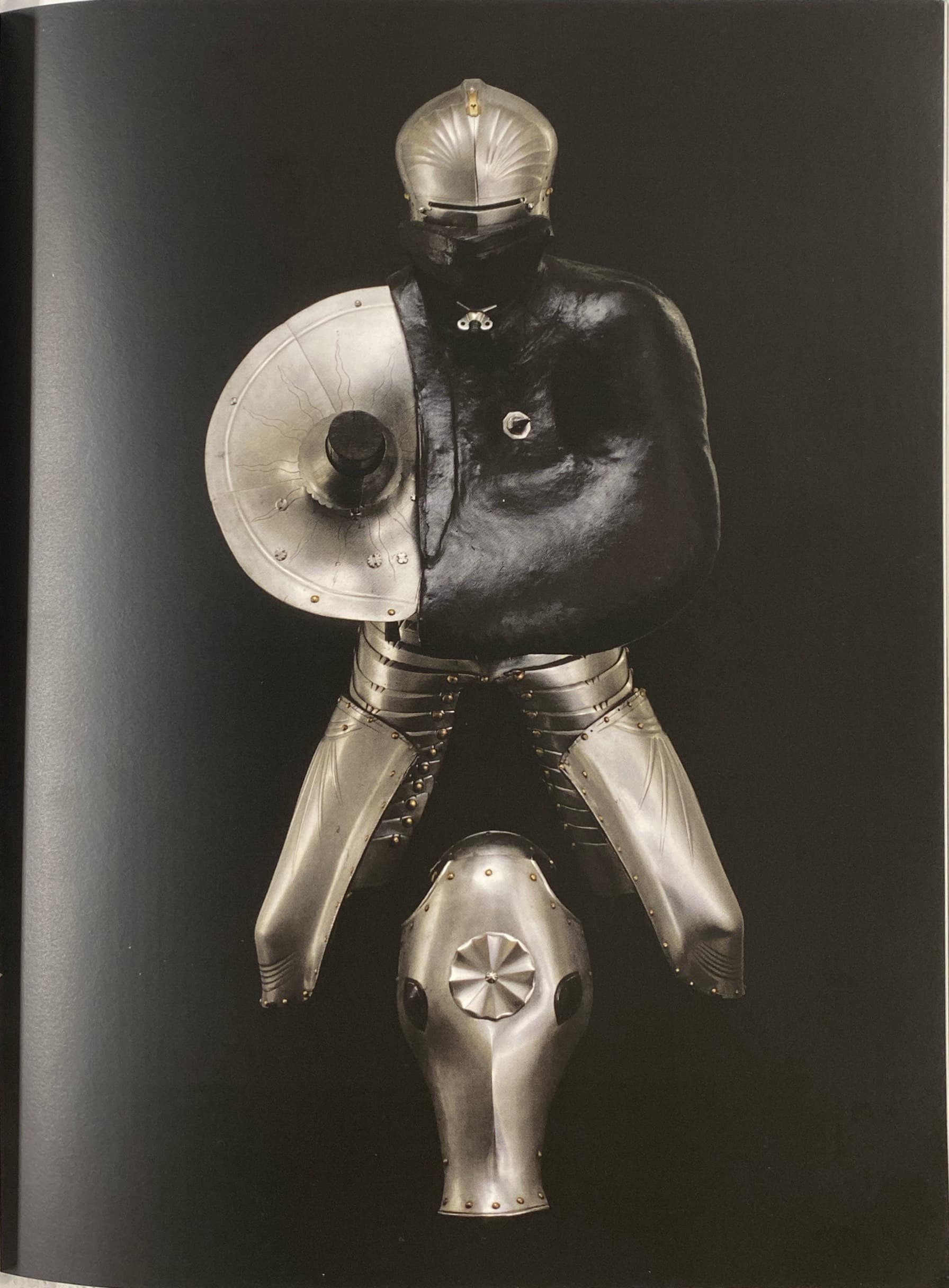
· Besagews (circular plates to protect the armpit and shoulder) were introduced
· Mid 14th century arm armour had become one flexible unit
· Shoulders were also covered with rounded or shell shaped plate defence and often adorned with animal heads such as the lion
· Progression through this century saw the development of fuller coverage and incorporation of joints and greater flexibility. Laminated designs where individual lames would move over each other riveted together or to the under garment
Examples of the versatility and uses of the Besagews:

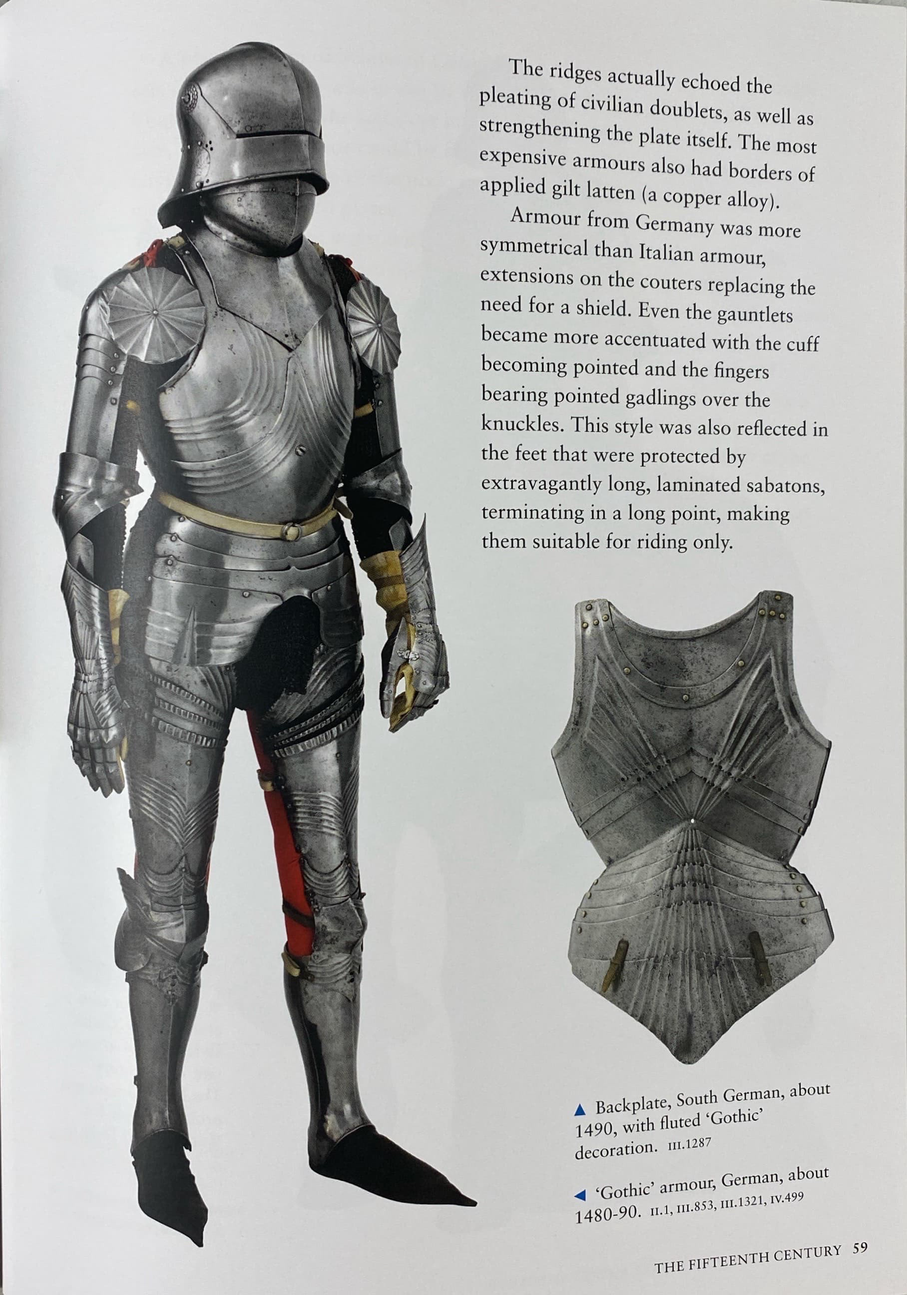
15th century Armour
· Development of national styles across Europe
· Italian armour had distinctive curved and rounded features with rolled over edges between plates to stop swords or arrows sliding off a plate
· Mail was still used to protect vulnerable areas, mostly joints
· Shoulder (Pauldrons) became larger and started to stretch over shoulder and the chest area
· Plate armour improved the decline in the need for shields
· German style was more box shaped but progressed to a rounded version
· German fluted and ribbed design was as much for defence as fashion. It often replicated the pleating of civilian doublets and strengthened the plate
· German style extremely focused on symmetry
The importance of this history in my work:
Through this research I have gained a greater understanding of the aesthetic and practical choices made in the manufacturing of medieval armour. This has also helped to explain the designs that I saw firsthand in the Royal Armouries Museum Leeds, such as the fluted and ribbed design of the German work. I think that I will focus mainly on the 14th century style where the suits of armour were less developed and consisted of individual components placed on the body rather than the 15th century highly flexible, full coverage, continuous suits. However, I think that drawing inspiration from the Germanic flutes and symmetry would elevate my work from plain sheet metal.
Investigating the environmental concerns of using real leather in my work
- Vegan leather is most commonly made from plastic polymers - polyurethane (PU) and polyvinyl chloride (PVC)
- Some vegan leather is made from natural plant based sources but is harder to source
- Consumers' perceptions of quality of real leather may result in them keeping or holding the item in higher value
- Vegan leather can be seen as more environmentally friendly due to the impact of raising livestock
- However, almost all real leather is a bi-product of the meat industry and using as much as possible of an animal is important, so the only concerns should be the production processes of the leather itself
- The heavy metals and chemicals used in the tanning process is the main concern
- Vegan leather made from plastic polymers will never biodegrade, only photodegrade into micro plastics which are entering our environment and bodies causing greater irreversible environmental impact
- Real leather is biodegradable
- “13 million tonnes of synthetic fibres enter our oceans each year”
- The Leather Working Group is a way that companies can track the leather back through the manufacturing process
- “These tanneries are rated on its energy and water use, emissions and chemical input, as well as having a clear supply chain that traces back to the slaughterhouse.”
- Vegetable tanned leather is the traditional way of tanning leather and if far more sustainable than most modern chrome tanned leather
- “vegetable-tanned leather does not contain any toxic substance (such as azo-dyes, nickel, PCP or chrome VI)”
In conclusion I believe that there is no clear answer over what type of leather to use in all applications. However, I believe using real leather is far better for my work. It has lower environmental impact by using a biodegradable material that is a bi-product from the meat industry. Additionally, I seek to only use leather offcuts from industry to create all my tests and experiments with, which also reduces the material going to landfill. For the final piece I will use vegtan leather which doesn’t use any harsh chemicals or heavy metals like chrome tan. Moreover, vegtan leather has a higher perceived value as it patinas over time.
Investigating how practitioners on instagram display body cast work
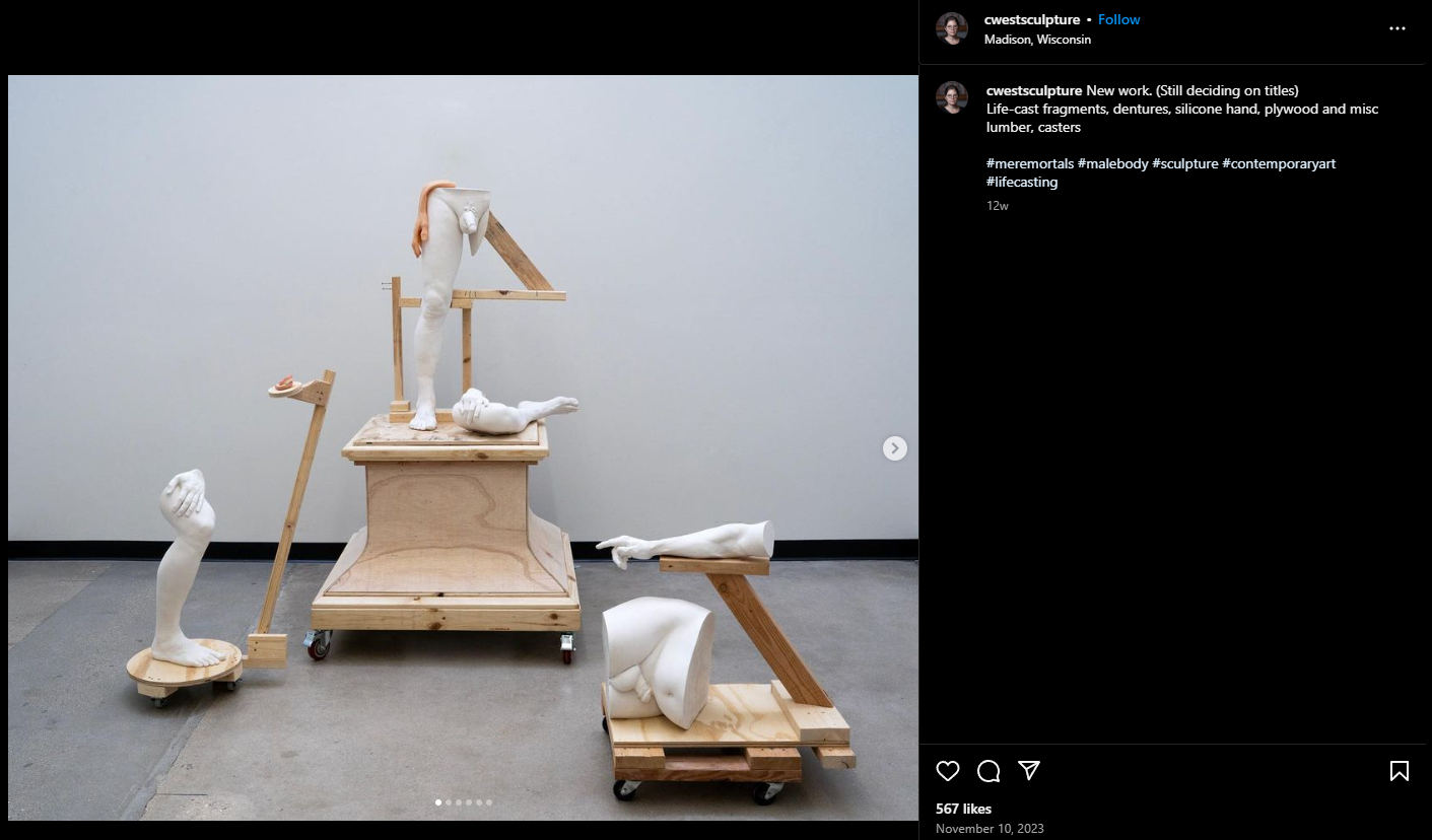
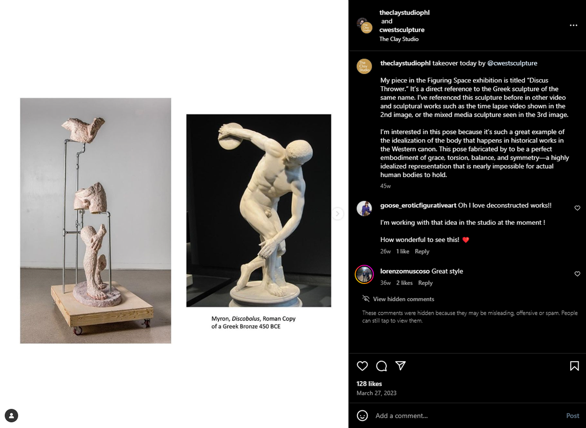
Christina A. West:
Building levels and placement of different body parts in the space
Simplistic construction materials to build supports doesn’t overcomplicate or distract from the castings
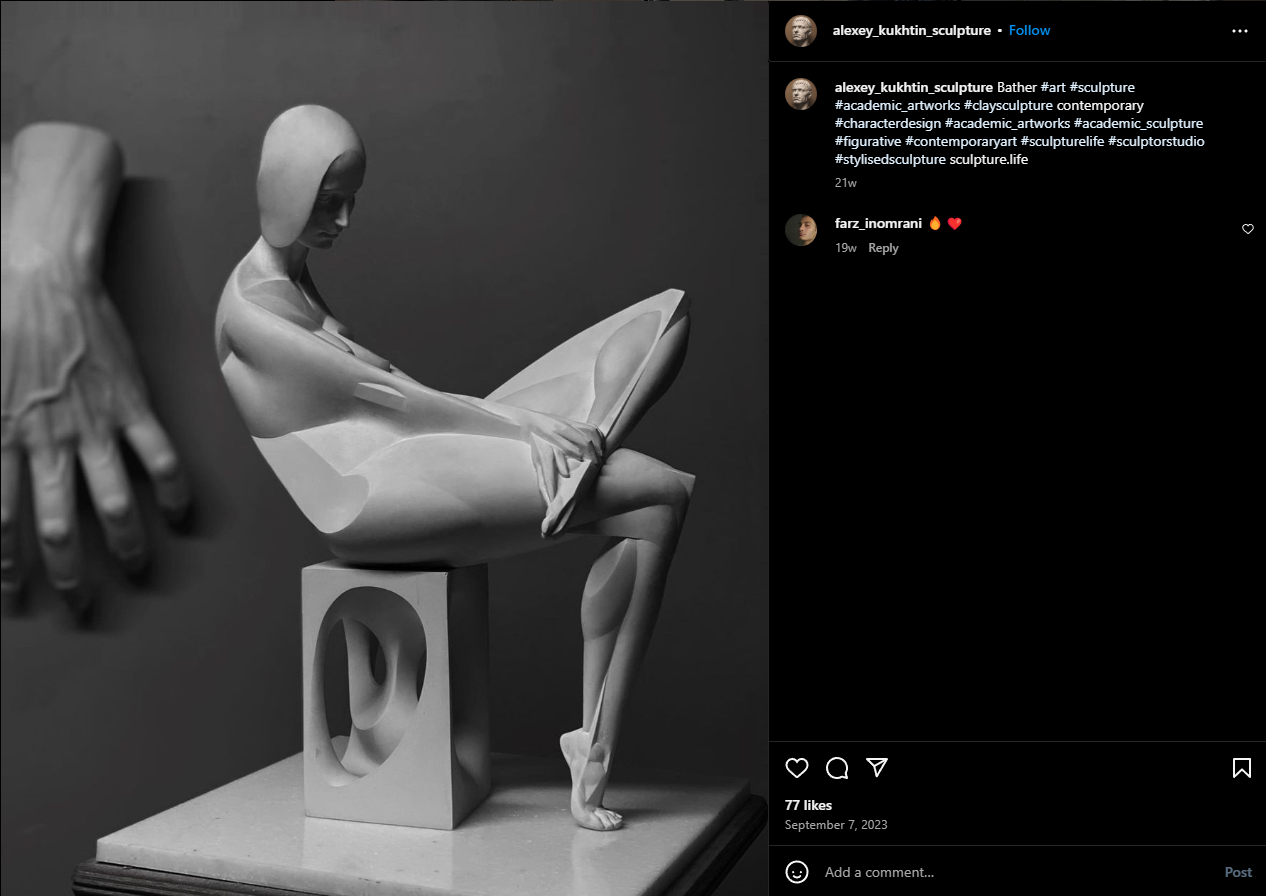
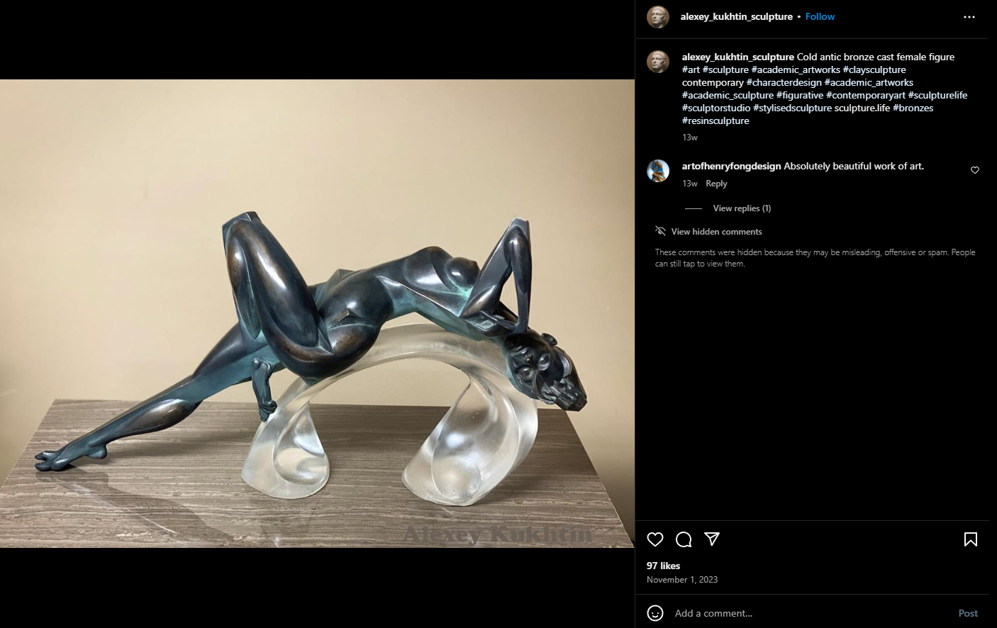
Alexey Kukhtin:
Dynamic forms replicating that of the style of the figures placed on top
Use of glass lifts the figure up and enhances the graceful and gentle motion of the figure
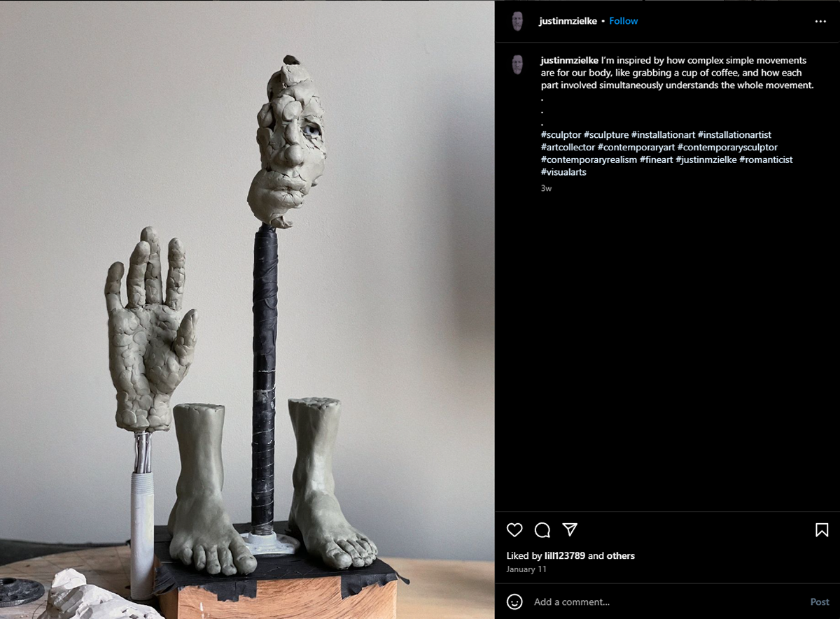
Justin M Zielke:
Visible armatures and use of duct tape enhances the raw and incomplete aesthetic
Simplicity
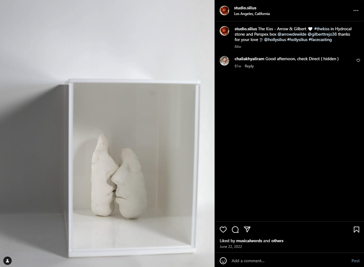
STUDIO SILIUS:
Enclosed space increases intimacy
Controlling the viewer's perspective
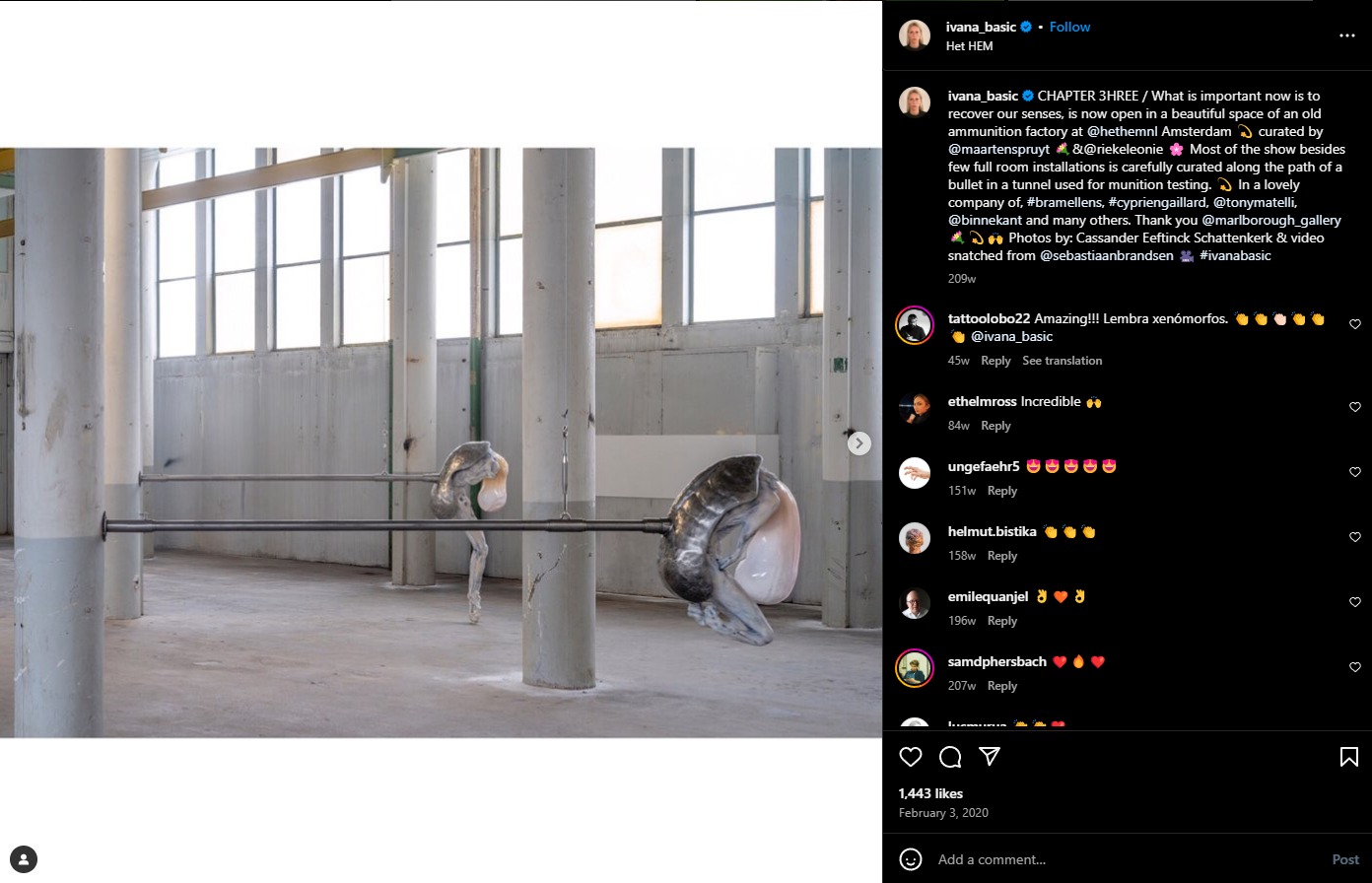
Ivana Basic:
Creating simultaneous disconnect and synthesis between the work and surroundings
Large steel arms bolt the alien like work, connecting it to the world
Manchester Art Gallery
Out of the Crate: Investigating the Sculpture Collection
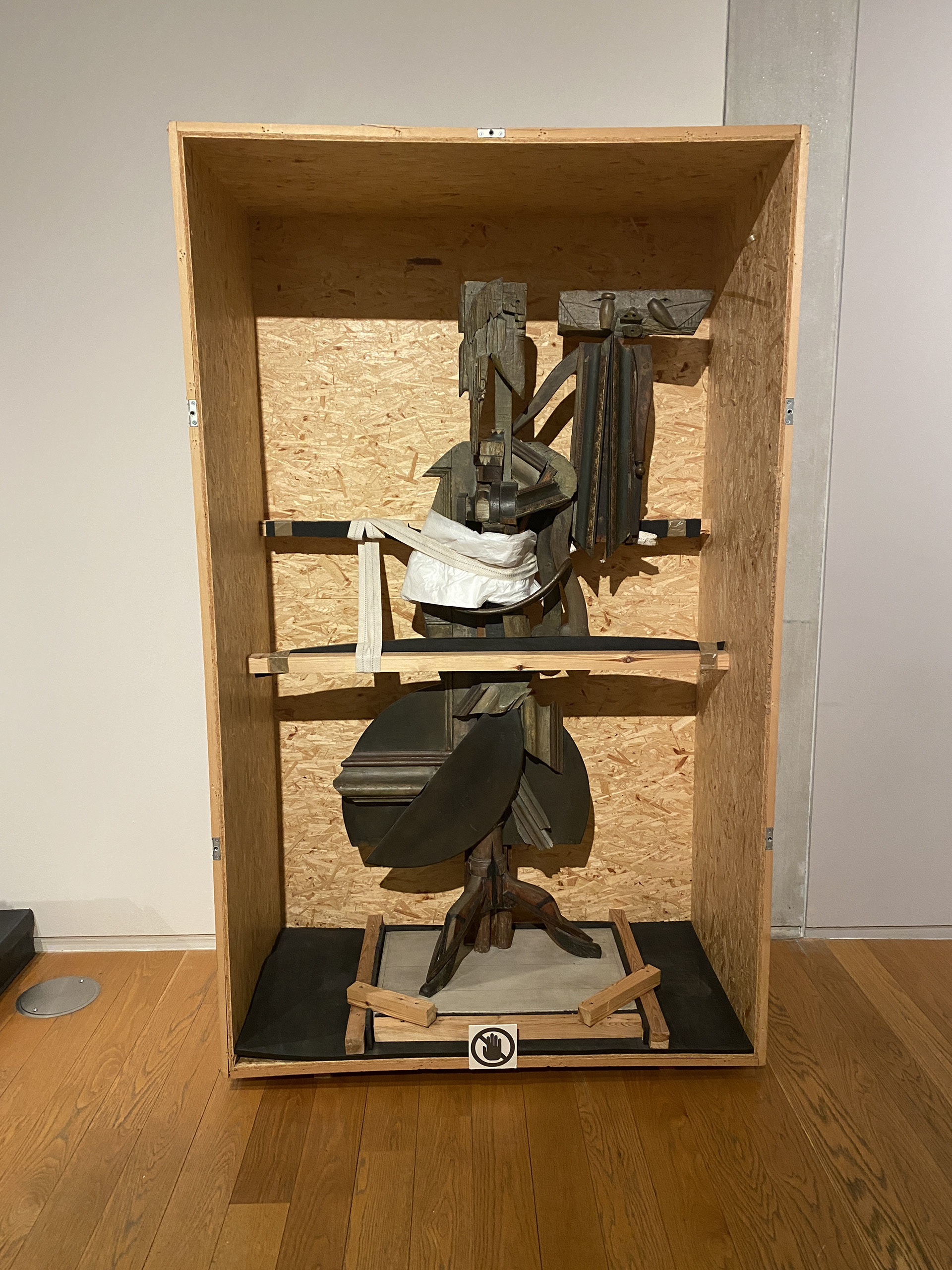
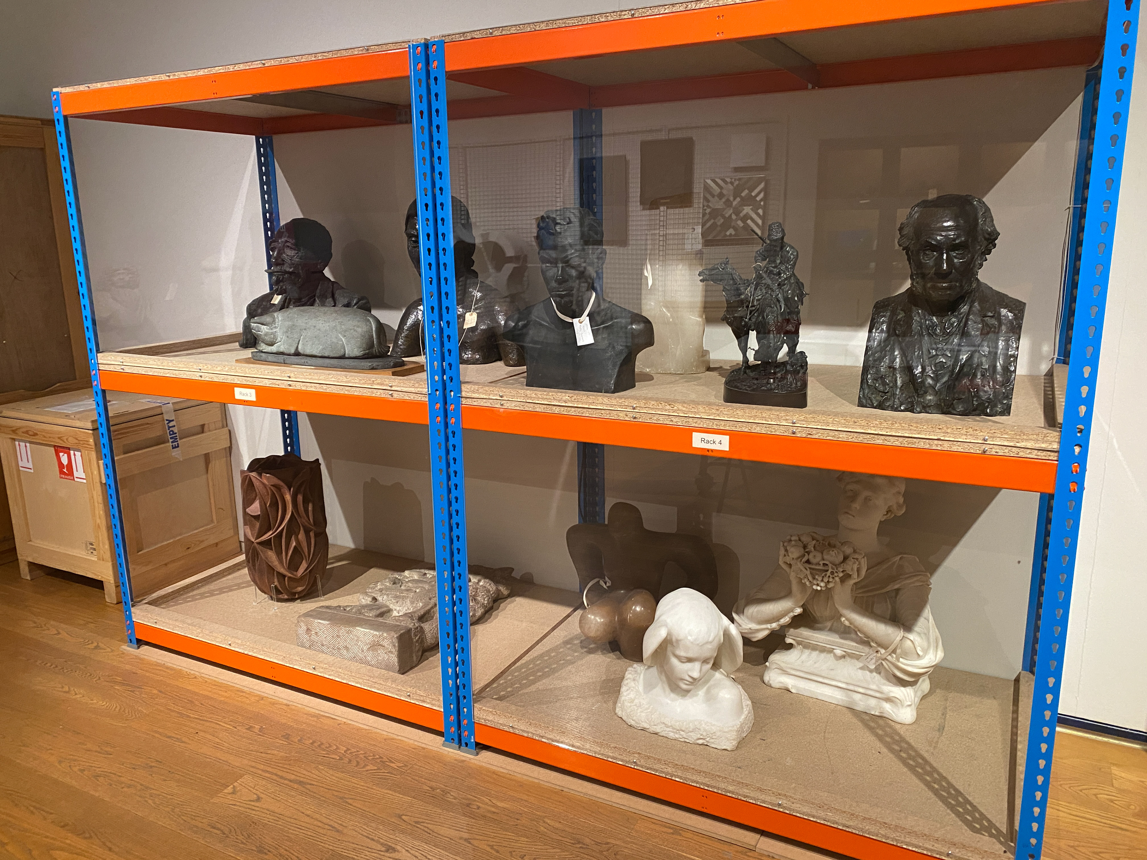
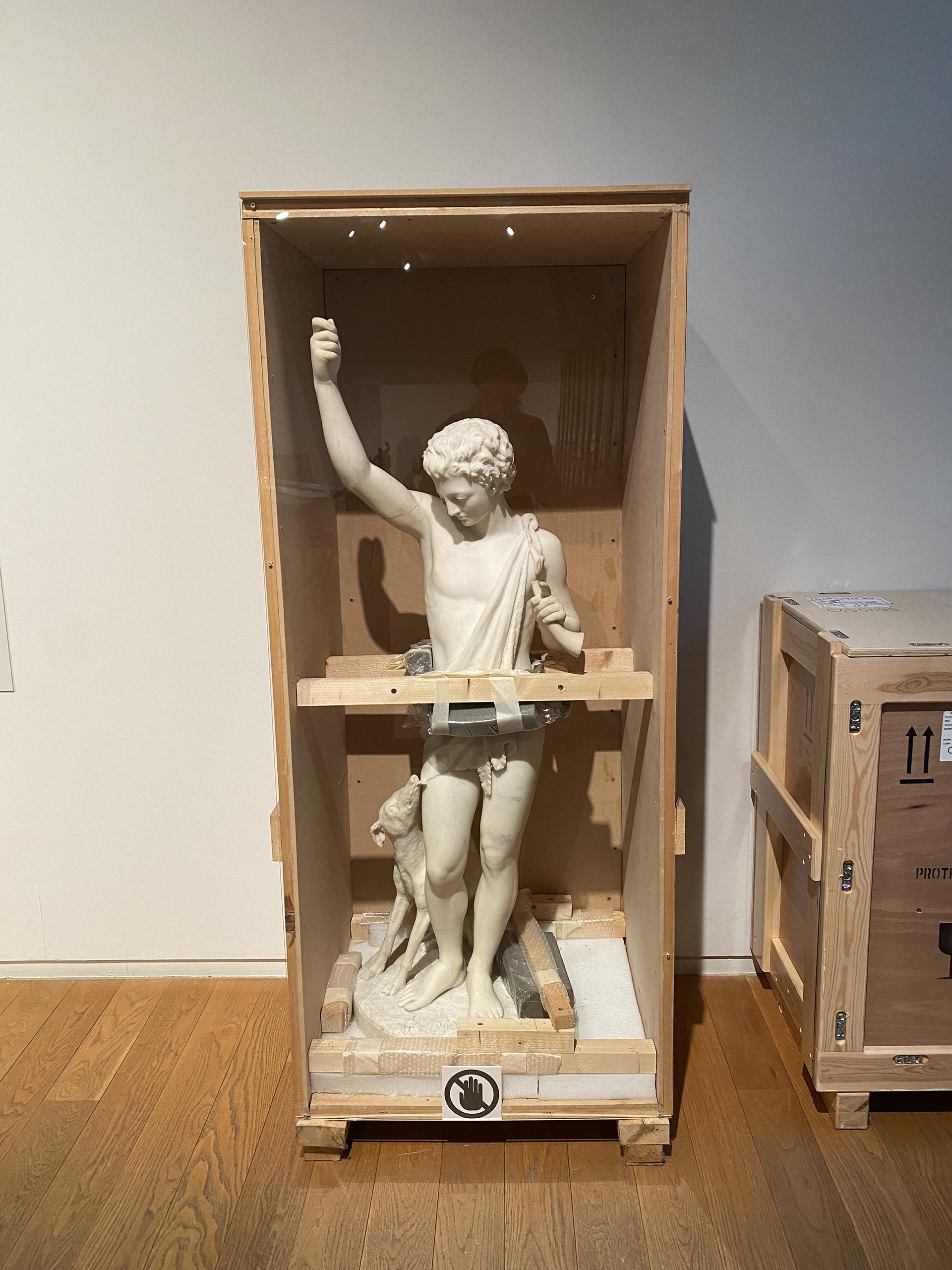
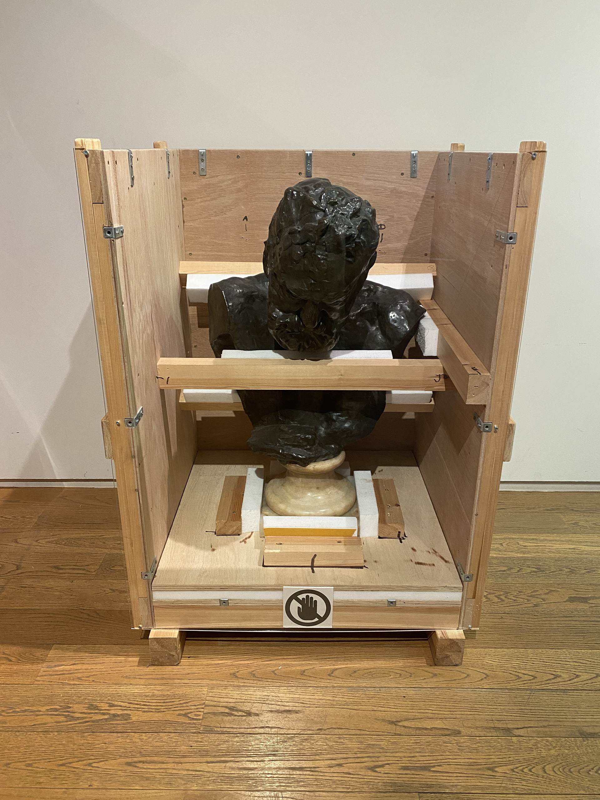
This exhibition seeks to bring attention to the work and quantity of work that is kept in museums' archives. The presentation style appears to be rough and unconsidered but rather than seeking to display the work in its best light, it showcases the work done behind the scenes to preserve the work. It utilises wooden support beams and blocks of foam to prop up and fix the work in place securely.
This demonstrates the importance of the presentation and curation of the work inside the gallery to convey the artists' or curators’ intention. I think that I could use the way I present my work to showcase method of design or manufacturing. Rather than making a simple white plinth I could explore textures and the form that supports my work. Additionally, I could investigate the way the presentation controls how the work is viewed, for example blocking areas off as seen above or the height at which the work is placed.
Exploring Galleries at Collect
Looking through the different artists and the type of work shown at Collect 2024, I believe my work sits alongside gallery FIVE the best.
"FIVE is a unique collaborative platform for silversmiths and fine metalworkers."
FIVE looks to explore contemporary approaches to material, process and ideas through metalsmithing. They state that FIVE "drive[s] to challenge perceptions and expectations of tradition" which I feel is a core component of my work. I take inspiration from the traditional armour of Medieval Europe and bring it into the conversation of contemporary wearables. Additionally, the theme this year is Colour, which I have started to explore in the patina and oxidisation of my work. However, I feel this is an element that I would have to investigate further to fit in with the rest of the work displayed at Collect 2024.
This year the artist showing at Collect are:
Ane Christensen, Angela Cork, Hamish Dobbie, Jessica Jue and Patrick Davison
Jessica Jue and Patrick Davison’s work have both been an inspiration in the textural elements of my work.
Exploring how FIVE present work at collect
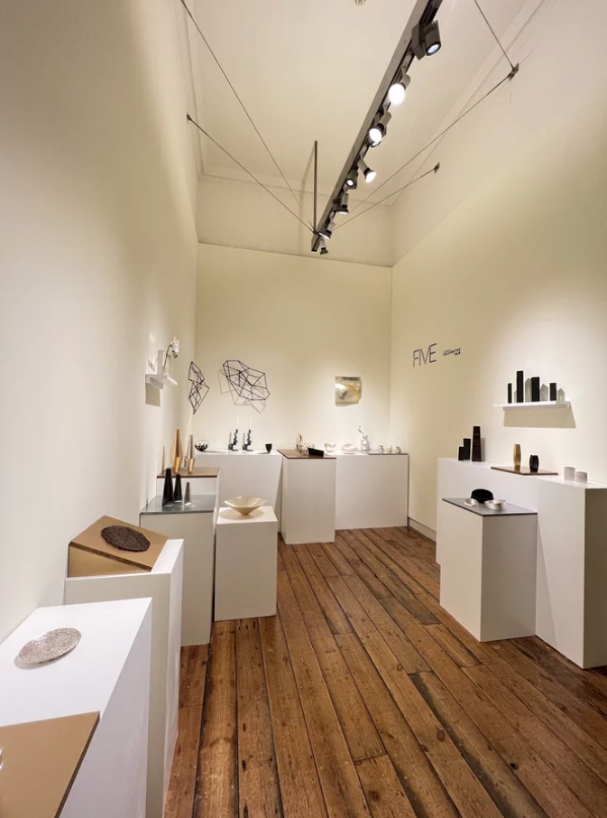
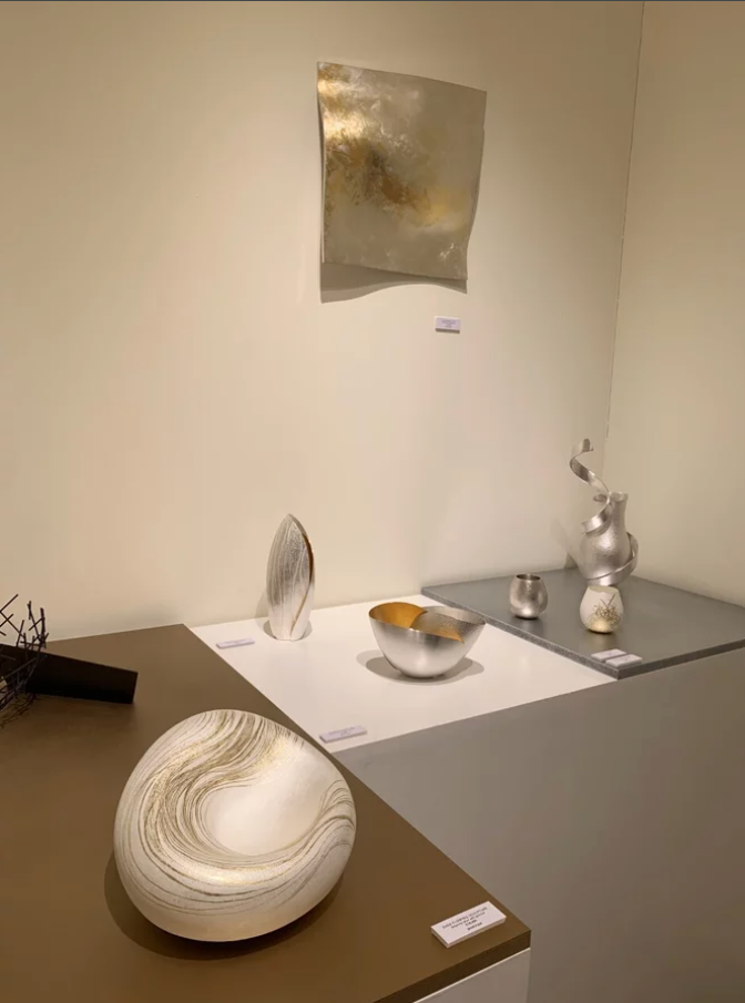
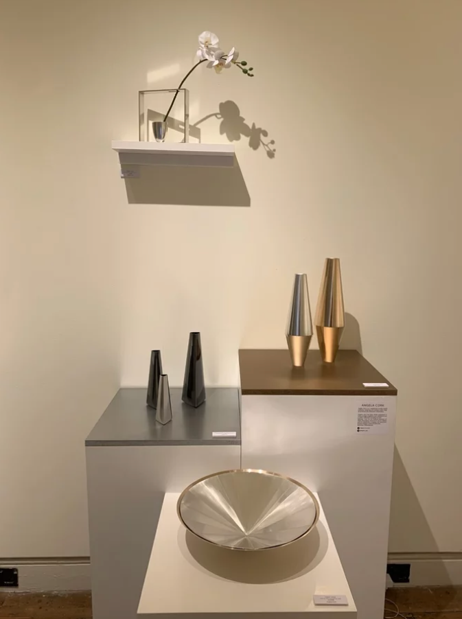
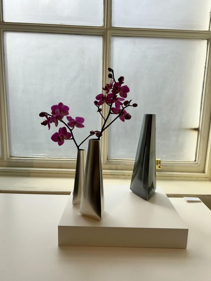
I found some photos of Collect 2022, which gave me an overview of how the gallery presents the artists' work. They use a series of simple white plinths and shelves to place the work on, at either eye level or standing desk height where the viewer can inspect the work from above and the side. The work placed on shelves or attached directly to the walls makes use of the empty wall space by exploring the effect of lighting and shadow.
They also add some different neutral slabs of colour underneath the work which helps to bounce light back up at the reflective surfaces or increase the contrast. There is also a lack of writing to accompany the work in the displays which I believe increases the clean, crisp look of the display. The written information is only the artists name and necessary details, additional information can be found with the accompanying paperwork handed to visitors upon entry.
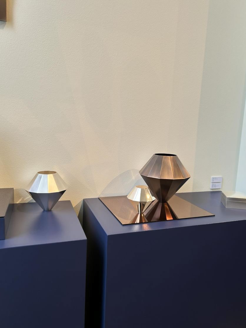
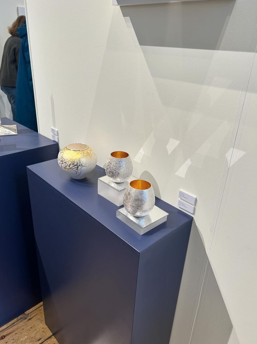

Visiting Collect 2024, I found that the presentation style hasn’t changed much but the introduction of dark blue plinths to display Ane Christensen and Jessica Jue's work and a dark blue wall behind Hamish Dobbie's work, introduced the theme of 'colour'. There has been a shift from using slabs of colour under the work towards white slabs or mirrors, which helped to create layers and depth in the work and display. Furthermore, the use of wooden shelves to display Hamish Dobbie's silver cups and jug brought in the inspiration of nature.
Reflecting on how FIVE and other galleries presented the work in Collect 2024, I feel that unless the plinth design is integral to the overall message or structure of the work, simplicity and uniformity is best. I found that the purpose of the plinth in a high-end gallery is to celebrate the work and provide a platform to view it rather than try and become additional decoration. Therefore, I will design a simple plinth that seeks to display the wearable as clearly as possible with as little distractions as possible.